

Wear OS 6 Preview: Google’s Next-Gen Smartwatch UI Starts To Take Shape

Adamya Sharma / Android Authority
Google has officially rolled out the first Developer Preview of Wear OS 6 based on Android 16. This early release introduces the new Material 3 Expressive design language to smartwatches, bringing dynamic theming, fluid animations, and improved scrolling. We spent some time exploring the preview. Here’s what’s new and what we’ve noticed so far.
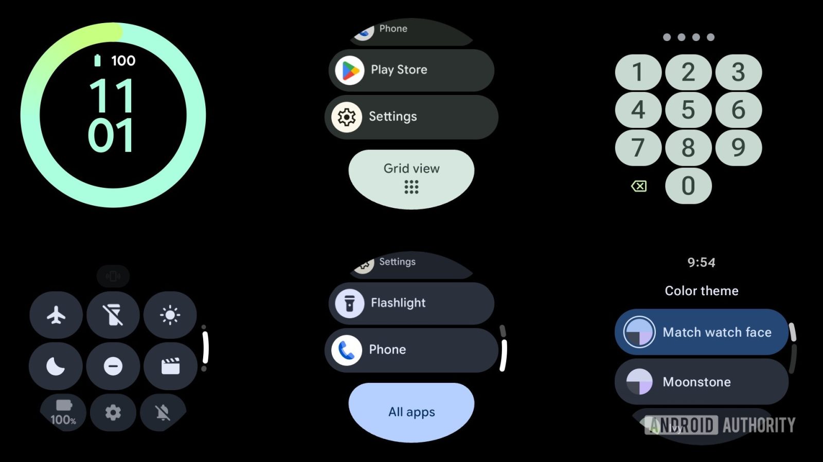
Curved buttons and new UI elements
As previously announced, Wear OS 6 embraces Material 3 Expressive’s design cues, with UI elements now curving to follow the circular shape of devices like the Pixel Watch. This design shift is immediately noticeable in areas like the recents menu and app drawer, where new display-hugging buttons appear at the bottom of the screen. These buttons also dynamically adjust their size as you scroll, giving the interface a more responsive and lively feel.
However, this updated button style isn’t consistent across the entire UI just yet. In areas like Settings, the older pill-shaped buttons are still present, highlighting that Wear OS 6 is very much a work in progress. That said, this is only the first developer preview, so it’s likely that Google will continue to refine and make the interface more unified in upcoming builds.
Beyond the curved buttons, Material 3 Expressive’s influence can also be seen in larger, bolder Quick Settings icons, new lock screen animations, and smooth transitions throughout the system. These changes not only enhance aesthetics but would also improve usability, especially on smartwatches with smaller screens.
Dynamic color theming
One of the most noticeable upgrades in Wear OS 6 is its dynamic theming system. You can now set your color theme to match your watch face by default or pick from a set of preset color palettes, which feel inspired by Pixel phone colorways:
- Peony
- Moonstone
- Ivy
- Porcelain
- Iris
- Lemongrass
- Jade
- Indigo
Once a theme is applied, it consistently permeates throughout the system UI. You’ll even see a brief “Applying theme” prompt as the watch updates its interface to reflect your new choice. It’s worth noting, however, that theming still remains local to the Wear OS 6 watch. Your phone and wearable won’t sync color themes despite the update.
This is only the beginning for Wear OS 6. Google has hinted at more changes on the horizon, including bouncier transitions, motion effects, and refreshed Tiles. Wear OS 6 apps are also expected to start adopting the new Material 3 Expressive design language.
We’ll be keeping a close eye on future updates, but even in its early stage, Wear OS 6 is shaping up to be a meaningful visual and functional upgrade for Android smartwatches.
