


The Fullscreen Google Account Switcher On Android Is Just Bad
Google is currently in the process of redesigning the Account switcher in the top-right corner of every first-party Android app to go fullscreen. It looks to be aligned with Material 3 Expressive, but I just think it’s a superfluous design.
9to5Google has a rebooted newsletter that highlights the biggest Google stories with added commentary and other tidbits. Sign up here!
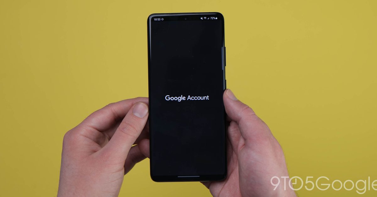
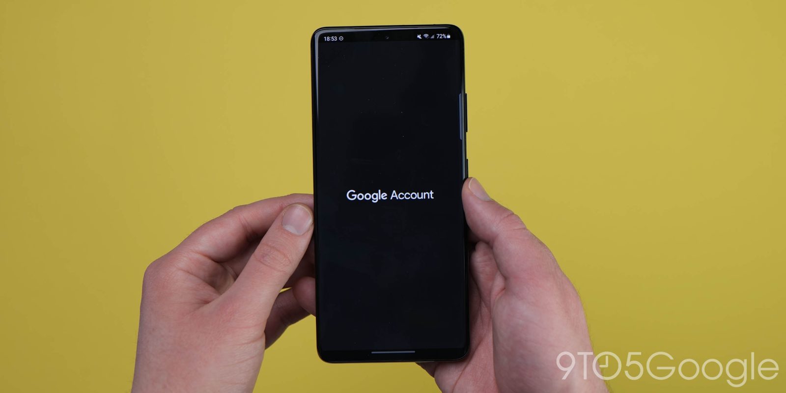
Google is replacing the card that appears when you tap your profile image. Notably, the old rounded rectangle appeared above what you were previously viewing and interacting with. The background would darken but you could still see content, like emails or the map layer, as well as the bottom bar.
This new design takes over your entire screen. There’s a greeting and large profile image that I don’t think needs to be in every instance of the profile switcher, while “Manage your Google Account” was clear enough in the old look.
Old vs. new
I think this full takeover is wasteful, especially in apps where the entire page is primarily dedicated to listing accounts and nothing else. More damning is how it removes key navigational and spatial context.
Other apps, like Google Maps, use the account menu to list notable parts of the service (Your Timeline, Location sharing, Offline maps, etc.) and Settings. In switching to a full page UI, Google is divorcing those key elements from the rest of the app, so much so that somebody thought “More from Maps” was a needed header. While I don’t think people will immediately forget what application they’re currently in, it’s still a disservice to in-app navigation.
If anything, I think this disconnect might lead Google apps to move content out of that profile menu for someplace less isolated. This fullscreen account switcher feels like a system element wanting to be its own thing. While Google Accounts are important, the profile switching page should exist in service of the application, and not the other way around.
In the comparison above, you see how the list no longer fits into one screen, thus requiring some scrolling that leads to a weird cutoff at the top in the third screenshot.
Material 3 Expressive might not help here, as one of Google’s “Expressive tactics” is to “Organize content into logical groupings or containers.” In this case, I don’t think that list needed any emphasis. Having “Turn on Incognito mode” at the top is already quite obvious, with the extra padding needed to achieve the new separation wasteful.
Another quibble I have is how fullscreen UI slides in fully-formed with sharp edges. To me, this blunt transition belongs to the early paper era of Material Design where there might now have been enough graphical resources to do graceful animations. It just doesn’t fit with today’s soft, organic vibes.
What’s annoying is that on tablets, the fullscreen Google Account switcher is just a floating window, like the old phone experience. The Material 3 Expressive redesign here looks nice. If Google just updated the previous card with new elements, I think people would be content with the modernization. Instead, by going fullscreen, it feels like Google is trying to introduce a new UI concept to its Android apps that adds some visual complexity with no real upside.

Add 9to5Google to your Google News feed.
FTC: We use income earning auto affiliate links. More.
