


Reviewing Material You In Google Apps Before Material 3 Expressive
Ahead of Material Design’s next evolution, let’s review Material You through the lens of first-party Google apps on Android. Specifically, I want to look at the adoption of Material 3 components, color, and adaptive layouts.
9to5Google has a rebooted newsletter that highlights the biggest Google stories with added commentary and other tidbits. Sign up here!
Components
By components, I’m referring to FABs (floating action buttons), navigation bars, progress indicators, sheets, cards, switches, and more. Compared to Material 2, everything is bigger and more apparent, like how bottom bars are taller and have more obvious pill-shaped indicators.
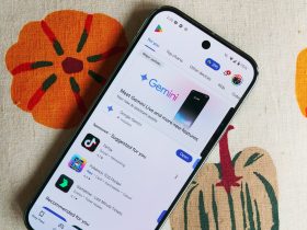
The overwhelming majority of Google’s Android applications now use Material 3 components. Apps that are still on Material 2 don’t see active development and are clearly on their way out. Play Books (February 2024) and Google Authenticator (November 2024) were the last big holdouts on the consumer side. Meanwhile, Google Classroom is somewhat of a mainstream app that still hasn’t been redesigned.
Tall, short, shorter, shortest
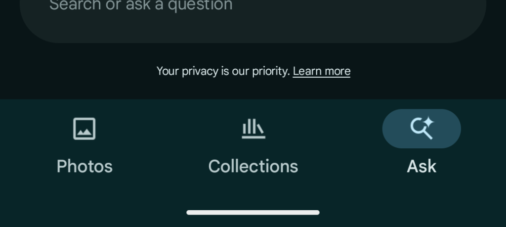
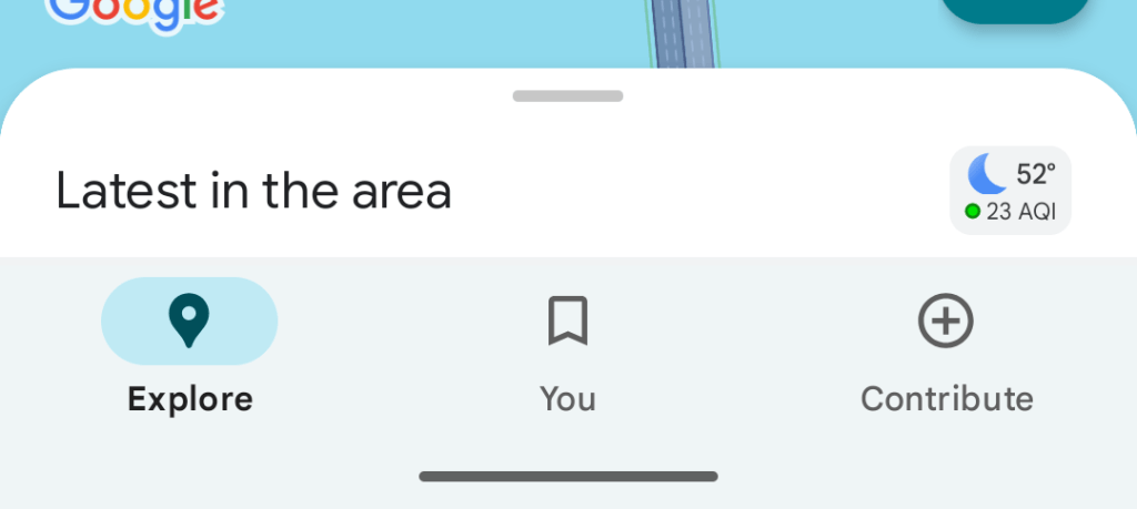

That said, there is variance across implementations. Most apps use tall bottom bars, but there are exceptions like Gmail’s short, label-less component. Then there are apps like Google Maps and Play that are taller than the bar in Material 2, but don’t match the new height. It’s somewhat justified in Maps with the peeking/docked bottom sheet, but less so in the Play Store.
(On the topic of bottom bars, the floating version used by Google Chat remains a one-off occurrence. I’m still split on what it brings to the table. On one hand, there’s a modernity in the component not extending from the left-to-right edge. However, it doesn’t meaningfully show you more content or context.)
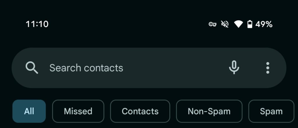

Elsewhere, the top search bar is very slowly transitioning to a thicker design (like Gmail and Phone), but adoption is pretty slow. Other components in that boat are animated image carousels and progress bars.
Dynamic Color
A color palette for apps based on your wallpaper is the defining element of Material You for most people. Again, most apps have Dynamic Color, but there are big exceptions. Play Books was the most recent update in April, while there are some big exceptions (Google Home is in Public Preview):
- Google Maps pairs a light/dark gray background with its teal accent color for non-map components. It’s unfortunate, but makes sense if the goal is to always ensure visual cohesiveness with the all-important map layer.
- Similarly, Google Search wanting to maintain a consistent experience across third-party mobile and desktop is fine. However, it comes at the expense of other aspects of the Google app like Discover, which has Dynamic Color to the left of the Android homescreen.
- Fitbit is also sticking to its teal accent color.
- Google Play doesn’t have a good justification, especially since Dynamic Color was implemented before it was pulled.
- YouTube is of course the biggest exception across components and Dynamic Color. More thoughts on that soon, but the fact that the main app, Music, and TV have their own opinionated design language/system somewhat softens the blow for me.
Adaptive Layouts
In the context of Android, this is primarily referring to large screen Android devices like foldables and tablets. This might extend to laptops and desktops in the near future.
Google’s tablets have come a long way from the 2021 guidelines. As a daily tablet user, I’d say app quality ranges from fine to good. Nothing that I actively use from Google is letterboxed, with navigation rails and dual-pane layouts the norm. The next update appears to be adjustable panes, with Gmail (and Chat) updated just last week to join Keep.
Next Up
The initial surge of Material You updates in Fall 2021 alongside Android 12 and the Pixel 6 was great. It took a bit too long for other apps to get their initial update, while current adoption of smaller components (like switches and progress bars) has been inconsistent.
Given that what comes next just adds a modifier (“Expressive”) after Material 3, I’m hopeful that adoption will be on the faster side. It does not seem like we’re in for a massive rethink of how apps are visually architected. Meanwhile, the new or updated components might be easier to plug-in to existing designs.
Add 9to5Google to your Google News feed.
FTC: We use income earning auto affiliate links. More.
