


Poll: What Do You Think Of Android’s Upcoming UI Overhaul?
Mishaal Rahman / Android Authority
Android has taken on a lot of different looks in the 16+ years since its debut — some loved, some reviled. Lately, though, it’s felt like we haven’t been seeing a ton on focus on freshening up the system UI very much. But that could soon be about to change, with new Material Design standards incoming. While it could still be some time before Google is ready to push its new design live, we just managed to bring you an early preview of how this major Android UI overhaul looks like it’s taking shape.
Mind you: This is still probably a very early preview, and we don’t have a ton of confidence that much of this will be ready in time for Android 16’s formal arrival. But even if the bulk of these changes don’t roll out until sometime in the Android 17 cycle, what we’ve uncovered sure suggests a cohesive effort towards bringing Android a new visual identity. But is this new look one that you’re a fan of?

Mishaal Rahman / Android Authority
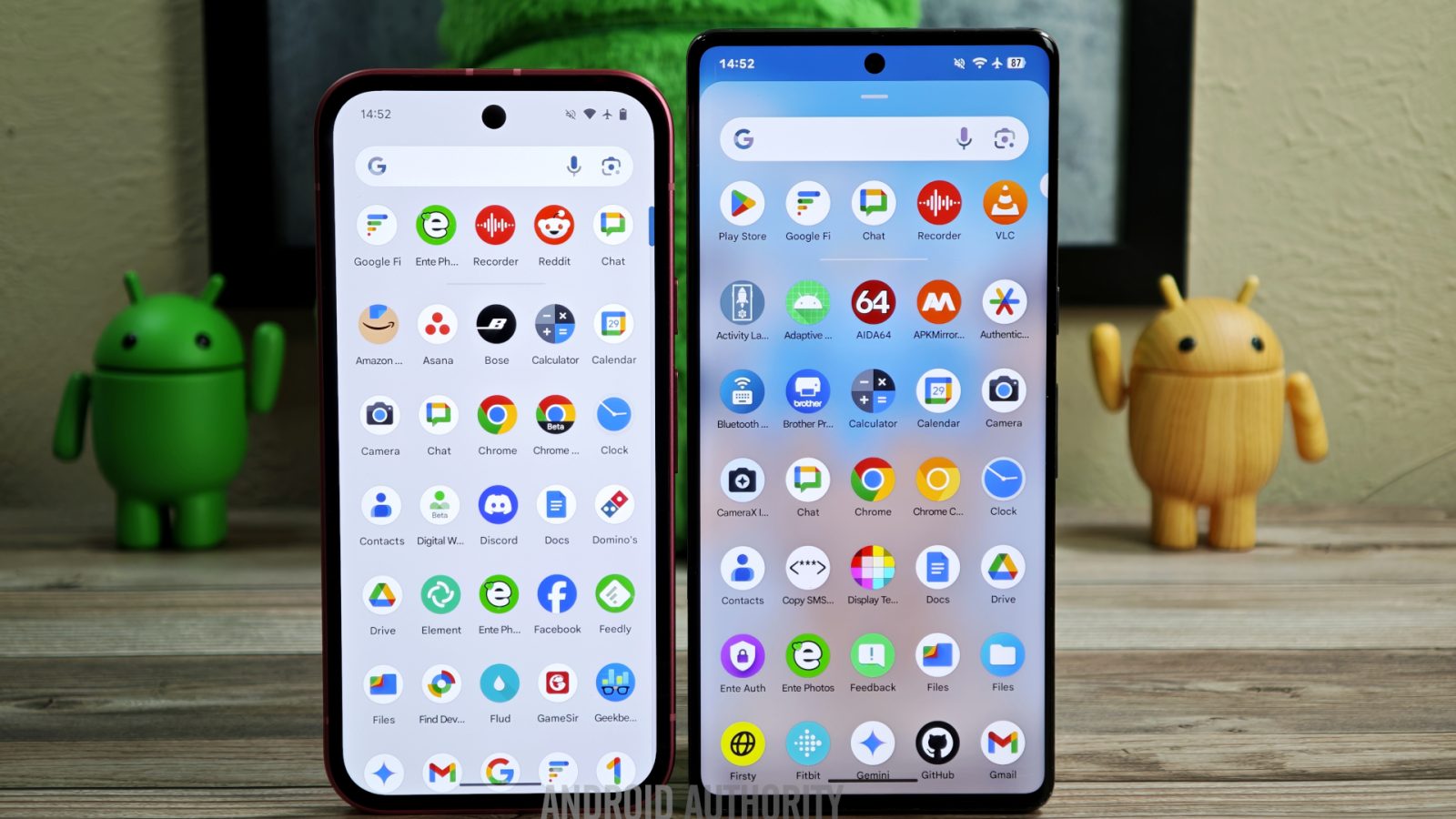
Old vs new Quick Settings panel design in Android
If we were making a word cloud to highlight all the directives contributing to these revisions, “BLUR” would have to be front and center in giant letters. From Quick Settings and notifications, to the app drawer and even your lock screen, Google’s been preparing some changes that replace the solid, generic backgrounds with which we’re familiar with a compelling new blurred-background effect, letting device wallpaper shine through.
We’ve also noticed a number of efforts towards modifying how volume sliders are implemented across the system, going for a more squared-off appearance and featuring a conspicuous handle to drag. Add to that some colorful new Settings icons, and new icon shapes for your home screen, and we’re getting to the point where these updates really feel like a substantial reenvisioning of how Android should look and feel.
Change can be hard, though, and not everyone’s going to be jumping at the chance to get used to a whole new look for their smartphone. Does that include you?
What do you think of Android’s upcoming UI overhaul?
69 votes
We spared you the “Google should turn back the clock; Honeycomb was perfection” option, because wrong answers aren’t going to help us any.
Of course, there are a lot of individual changes we’ve highlighted as part of this new look, and maybe you’re digging some of them more than others. Rather than overwhelming you with more poll options, why don’t you just scroll down to the comments below and take the opportunity to make the case for your most loved (or most hated) change there?
Got a tip? Talk to us! Email our staff at [email protected]. You can stay anonymous or get credit for the info, it’s your choice.
