One UI 7 Is Better Than I Thought, But Google’s Pixel Software Still Beats It
Contents
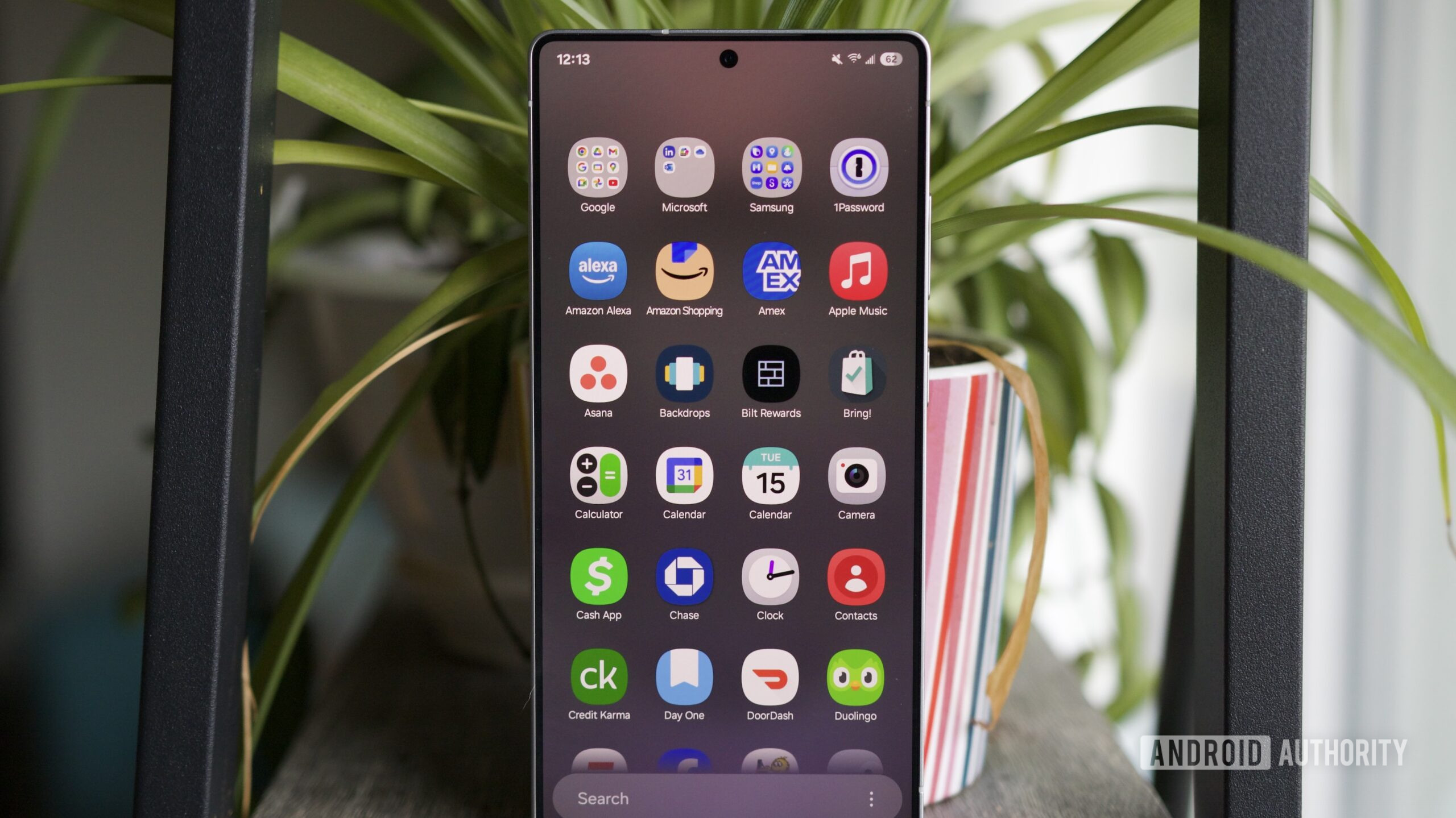
Joe Maring / Android Authority
We’ve spent more time than I care to count debating which Android skin is the best here at Android Authority. I’ve always leaned towards Google’s light, smooth Pixel UI, but I have friends who will defend Samsung and its customizable One UI until their batteries run out. Somehow, they’ve found a comfort in the endlessly customizable menus, replaceable icon packs, and side-scrolling app drawer that’s never quite clicked for me.
But, I am nothing if not open-minded. When a major Android update lands, I tend to make my rounds through all of the usual suspects, checking out Google’s take on it, along with Samsung’s, OnePlus’s, and Motorola’s, often in that order.
Right now, that means a good, long look, or a second look, at One UI 7. And as happy as I am with the new update, it still hasn’t swayed me.
Samsung vs. Google vs. OnePlus vs. Moto: Which Android skin do you prefer?
19 votes
This is (mostly) what I wanted my Galaxy Z Flip 6 to feel like
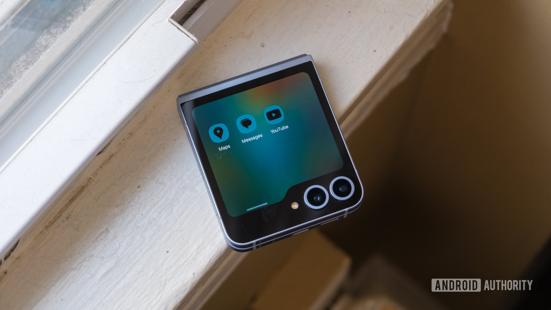
Ryan Haines / Android Authority
First, I should clarify that this isn’t my first dig into the world of One UI 7. I’ve used Samsung’s latest software on all three — or, rather, four — of the Galaxy S25 models, including the new Galaxy S25 Edge. It felt natural across the entire lineup, almost as if the features were specifically designed for Samsung’s newest, most powerful devices, because they were.
However, to me, there’s a difference between using the software a phone launches with and giving it a significant update that promises a bunch of new wrinkles. Usually, the former is the best a phone feels, with the least wear and tear on its battery and chipset, combined with perfectly optimized software. Not this time. When I loaded up One UI 7 on my Galaxy Z Flip 6, I realized its previous Android version felt incomplete.
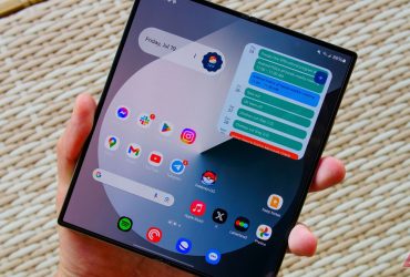
Everything feels better, from the redesigned camera UI that makes controls easier to reach to the Now Bar that offers more glanceable updates for sports, timers, and calendar reminders. It’s almost like I can do more with my Galaxy Z Flip 6 without spending as much time thinking about it or asking Galaxy AI to think for me. And, as a stubborn Android user who still likes to do things semi-manually, I appreciate that.
However, not just those more noticeable changes have made One UI 7 an experience worth keeping around. I’m just as drawn in by the smaller tweaks, like a vertical-scrolling app drawer (at long last), and the split notification menus. Although I couldn’t stand the latter at first, I’ve come to appreciate it. I’ve come to terms with swiping down on opposite sides of my display much better than I ever did with the old OnePlus Shelf design. Even the animations in One UI 7 feel more polished — yet another simple task that makes an $1,100 flip phone feel like it meets its price tag.
One UI 7 improves a lot, but several Galaxy Z Flip hiccups persist.
Then again, because we’re talking about one of Samsung’s more interesting form factors, I know that One UI 7 still has some work to do. Although it boosts the day-to-day experience on traditional candy bar phones, it doesn’t fix any of the quirks with the Galaxy Z Flip line, like the lack of a proper cover screen app drawer, and neither the split notifications nor the Now Bar are present on the phone’s Flex Window.
I probably shouldn’t have expected massive Galaxy Z Flip changes in One UI 7, given the significantly delayed — and very unlike Samsung — rollout of One UI 7, but it’s still disappointing to see one of the two major flip phone players leave its software feeling second-best. I’m optimistic that the Galaxy Z Flip 7 series will bring changes, especially now that the cover screen is likely getting a refresh, but I refuse to get my hopes up.
More is still more, and sometimes that’s too much
Ryan Haines / Android Authority
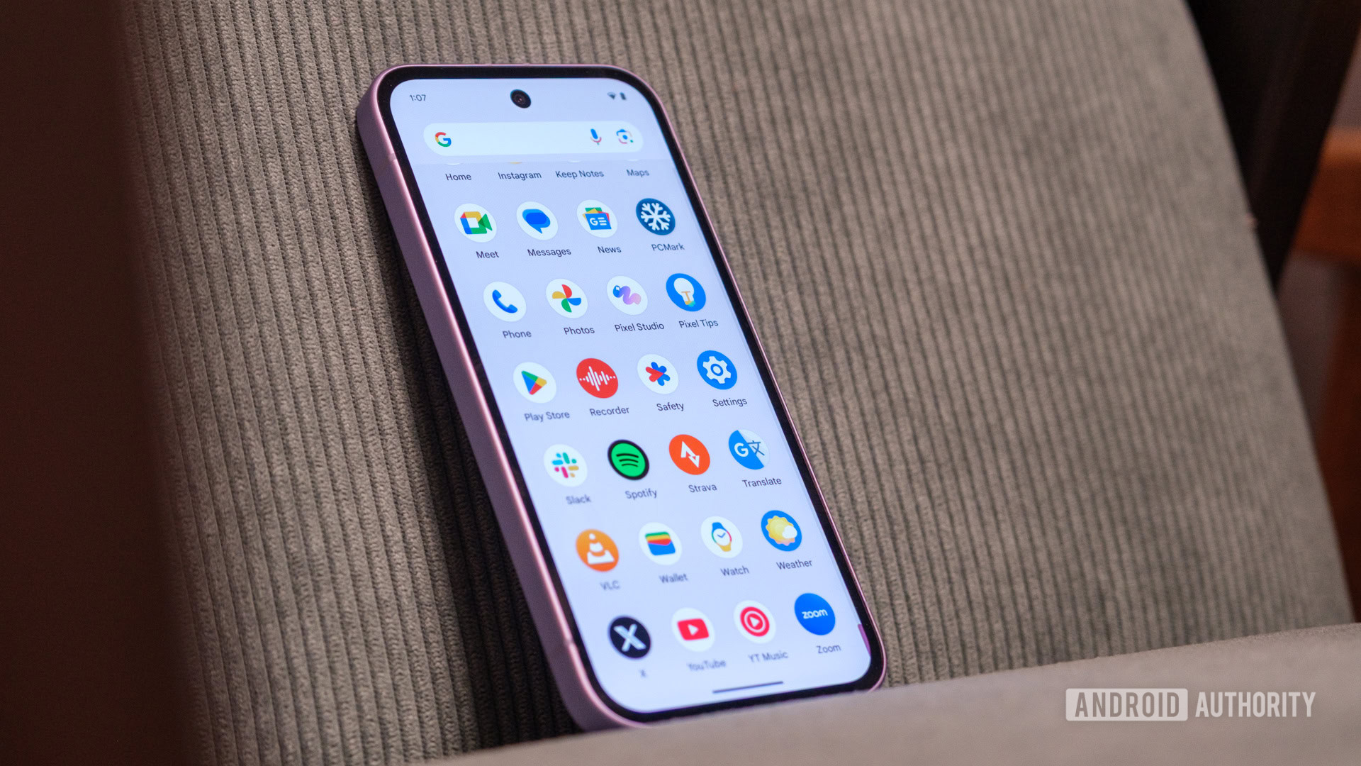
In the introduction, I mentioned that I liked Google’s Pixel UI for its light, clean interface. I know it’s not the same as stock Android — and I don’t think I’d like it if it were — but its less-is-more approach has always felt most comfortable. It’s like the simple, streamlined iOS interface of the Android world, just with the customization options to make it feel more like home.
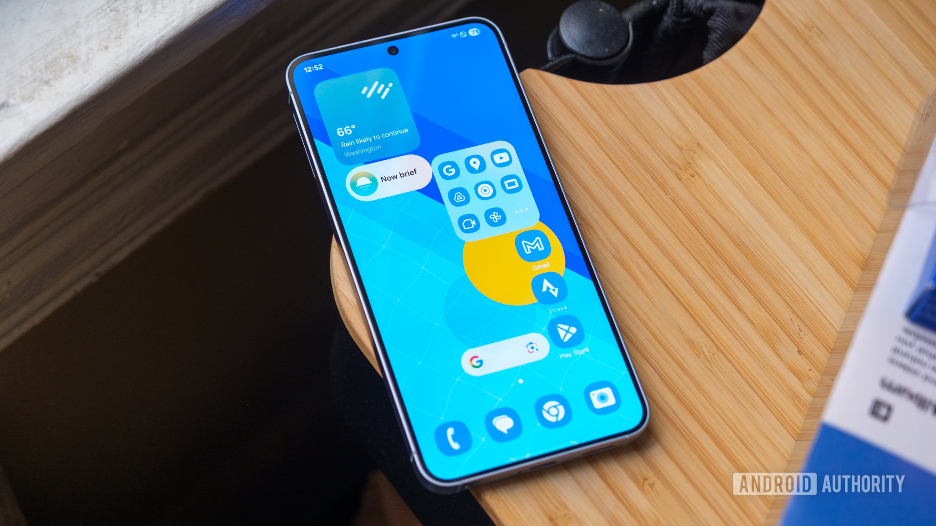
One UI 7, on the other hand, remains the opposite. Yes, it’s been cleaned up and feels more functional and efficient than ever, but it’s still pretty maximal as far as Android skins go. It’s highly customizable — you could (and I did) spend hours picking out a new launcher and swapping to a new app icon pack — but now Samsung has ways to go even further with DIY Home in Good Lock.
So far, DIY Home has caused a bit of a rift in the Android Authority team. A few of us love the flexibility it offers, while others, like me, find it as overwhelming as overfilling a plate at Thanksgiving. Sure, it’s nice to experience the true freedom to drop apps and widgets anywhere and everywhere, grid or no grid, but as soon as you step off Samsung’s guardrails, all bets are off.
DIY Home is more proof that Samsung’s overwhelming customizations are alive and well.
I accidentally selected two apps and one widget at the same time and hit one of Samsung’s align buttons, only to find out that it aligned them… on top of each other. Yes, it set them perfectly along the right side of my Galaxy Z Flip 6 display, but it did so in a way where I’d then have to drag and drop each one to access them. Worse, there’s no good way to toggle DIY Home off and on again to restart your layout — everything is aligned to the grid or exactly how you left it in chaos mode.
Honestly, if Samsung had added DIY Home without needing Good Lock, I might not have minded it so much. However, the fact that it falls into the classic Samsung trap of needing extra apps to cover a basic task tells me that One UI 7 hasn’t learned many lessons after all. It’s still overloaded with Microsoft and LinkedIn partnerships that keep bloatware on the default home interface, and Samsung can’t decide whether it wants you to opt into features (like the vertical app drawer) or out of them (like returning to the traditional notification shade).
One UI 7 is Samsung at its best, but Pixel UI still has my heart
Ryan Haines / Android Authority
Overall, I shouldn’t be surprised by my One UI 7 experience. I knew going in that it would feel pretty good in the hand following my time with the Galaxy S25 series, and I was probably mostly excited to try it on my Galaxy Z Flip 6 simply because I love the form factor. For the most part, Samsung’s software has met my expectations. It improved what Samsung could improve on its candy bar devices, yet left most of the flip phone issues hanging in the wind, pretty much as expected, even if it wasn’t the most exciting.
That said, my return to One UI also helped crystallize just how far behind Pixel UI it is in my mind. Many of the things that I was excited to see Samsung embrace, Google has already been doing for years. Pixels still have the better, more streamlined camera experience, and I’ve never questioned how my app drawer would pop up when I fired up a new Google device. Mix in that Google’s combination of hardware and software feels more fun than Samsung’s functional, efficient approach, and I’ll keep grabbing a Pixel every time.
My return to One UI also helped crystallize just how far behind Pixel UI it is in my mind.
And then, there’s the chaos of the One UI 7 rollout itself. The constant delays and uncertainty got to the point where my colleague Joe Maring called them bad enough that he wouldn’t recommend a Samsung phone, and after watching my brother struggle with One UI 7 tanking the battery life on his phone, I’m inclined to agree. Sure, Samsung will probably smooth some of those cracks over time, but I don’t think we’ll have forgotten about delay after delay by the time One UI 8 rolls around in just a few months.
What’s your reaction?
Love0
Sad0
Happy0
Sleepy0
Angry0
Dead0
Wink0


Leave a Reply
View Comments