

Now Bar Is My Favorite One UI 7 Feature, But This Tiny Change Would Make It Even Better
Contents

Andy Walker / Android Authority
I’ve really enjoyed using One UI 7, even if it does have a few niggles. It’s always exciting to have a shiny new toy, even if that toy is software. But my fondness for it goes beyond its new car smell. The new Samsung Android skin packs plenty of practical features I’ve grown to like, and the Now Bar tops that list.
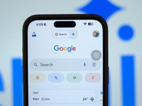
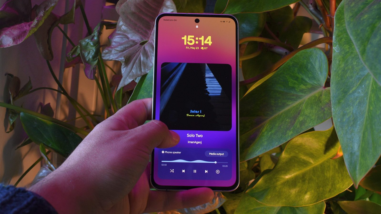
For the uninitiated, the Now Bar is a UI addition that displays context-relevant information on the lock screen and always-on display. The pill-shaped info box doesn’t support many apps at launch, with clocks and timers, sport scores, modes, and Google Maps directions some of its more useful list items. However, I’ve found it great for monitoring currently playing music.
Do you want Samsung to add Now Bar customization options?
18 votes
My morning work routine goes a lot like this: I’ll make a strong cup of coffee, sit down, slap on a Spotify playlist, and get keyboard mashing. My Galaxy S24 FE sits on a stand below my monitor, and the Now Bar makes it so easy to glance at the screen to see which track is playing (even if it’s locked). The feature has been a lovely quality of life improvement for me as I no longer have to tap to wake the screen or have Spotify baking my display, which would no doubt distract me from my current task and ruin my phone. Despite everything I like about Now Bar, it’s far from perfection and there is plenty of room for improvement.
Where are my Now Bar customization options, One UI 7?

Andy Walker / Android Authority
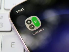
Let’s start with my biggest annoyance: its rigidity.
One UI 7 lets users customize more features than ever before, and with Good Lock, almost no element is out of reach. Now Bar is not one of those items.
Now Bar makes monitoring currently playing music so simple, but it should allow me more control of its look and functionality.
On the lock screen, the Now Bar pill displays minimal info, including the track’s name, a play/pause button, and previous and next options. That’s it. There’s no option to switch these buttons for others or display other details, like the artist’s name or current track position. I’d really like to know who composed or performed the track I’m listening, too. I wouldn’t say no to size and position adjustments for the pill, as you can do with almost all other UI elements on the lock screen. However, no such options exist, forcing me to use Now Bar as Samsung dictates.

Andy Walker / Android Authority
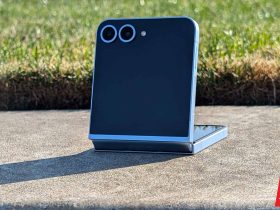
My second big issue isn’t so much a missing feature but how an existing feature is implemented. Tapping the bar while a track is playing expands it into multiple elements that display much richer information — essentially what I’m calling for above. I get a large album art view, the track’s name and artist below, and a control box, with the current output device, an animated seek bar, and additional shuffle and add to library controls. The color of these elements also changes based on the album art’s primary hues, which isn’t true on the always-on display.
You can see the expanded Now Bar design below.
Gorgeous, right? Visually alluring and practical, this view would solve many of the problems I have with its current barebones design. So what’s the fuss? Well, there’s no option to make this a permanent fixture. As it’s restricted to the lock screen, I’m back to the threadbare Now Bar display when my phone relocks. The solution here is simple: allow this view on my always-on display when playing music. Easy.
Small changes will have a massive impact

Joe Maring / Android Authority
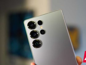
Now Bar in One UI 7.
To give Samsung credit, I do really like the concept of the Now Bar, and overall, my grievances are minor. They don’t ultimately detract from its purpose of delivering quick bites of info, and, if I need to, I can draw more details from it. Additionally, it works well, I haven’t encountered any bugs yet, and the apps that support it are all made better by it. However, I’m not going to say it’s the finished article. That’s to be expected. It’s a new feature, and it’ll take time to mature.
However, I don’t want Samsung to just sit on its hands with the Now Bar. It’s here, but now it needs further refinement. I have hope that it will, though. The company has handed over the reins of One UI to users with glee, and I can’t see why it wouldn’t include Now Bar with it.
In short, I’m optimistic. With Android 16 just around the corner and One UI 8 hopefully following in short order, I trust the changes I seek will come sooner rather than later.
