It’s been a minute since Android got a fresh coat of paint. Google debuted the colorful Material Design 3 design language in Android 12; since then, subsequent releases have stuck pretty closely to the template introduced back in 2021, the year that gave us the Pixel 6.
Years later, I’m still a fan of Material Design 3. But for as long as I’ve been using Android, visual changes have always been what I get most excited about in major updates, and after four consecutive OS versions that look and feel very similar, I haven’t had much to get excited about on that front lately. So I’m happy to see that Android is finally on the cusp of a new visual shakeup in what Google is calling Material 3 Expressive — and that we’ll be hearing more about it in just a couple of weeks.
We’re overdue for a visual overhaul
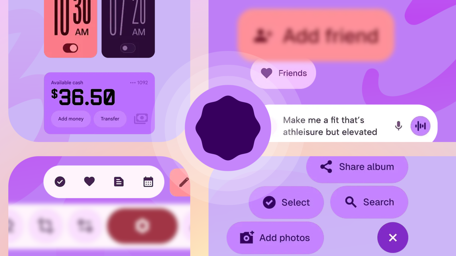
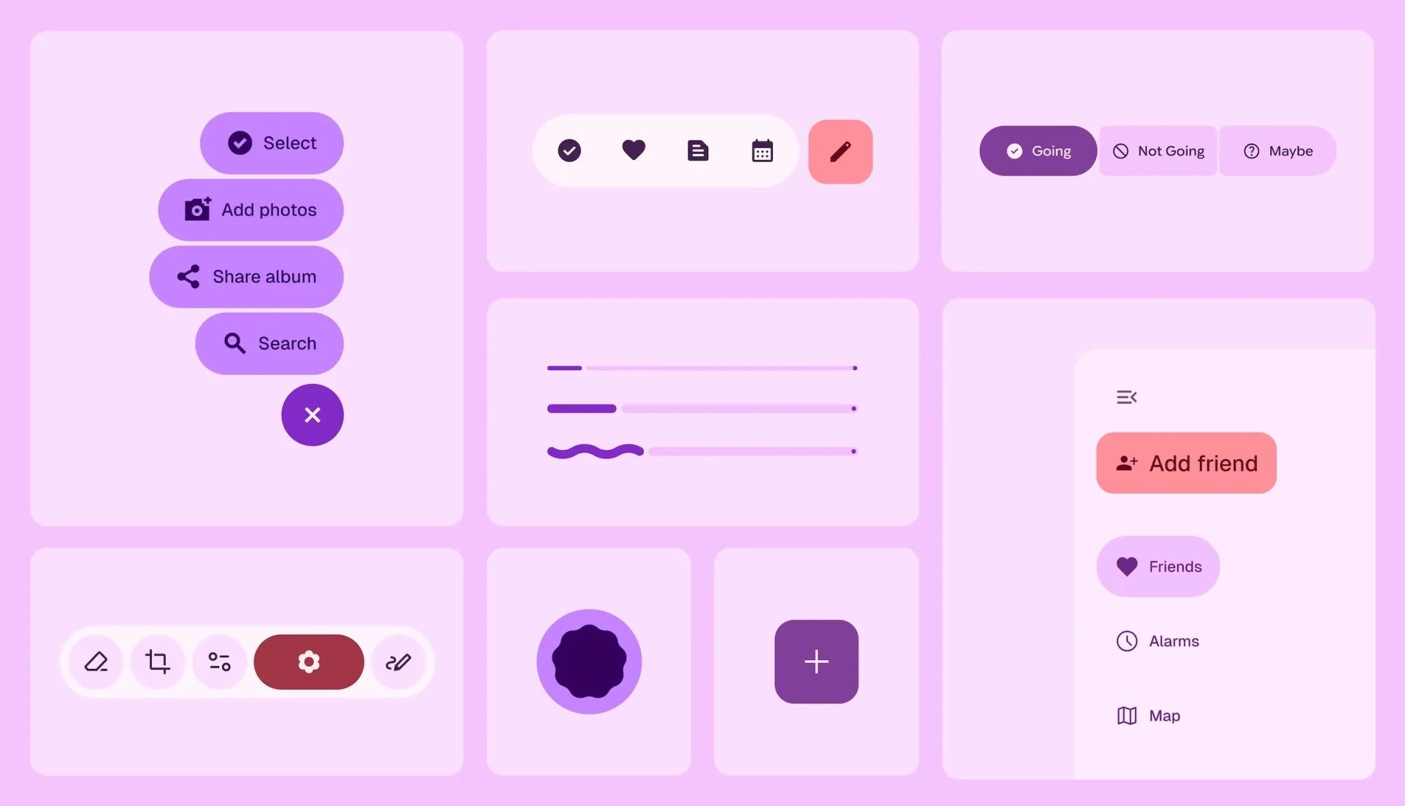
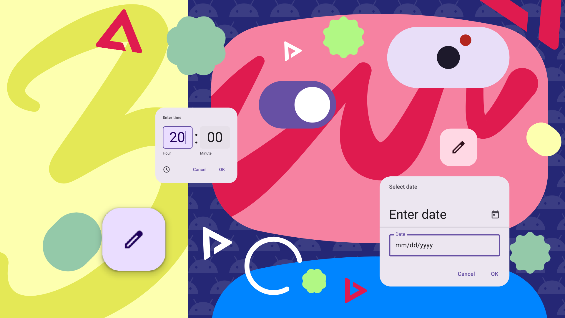
Material 3 Expressive has been making quite a few unscheduled appearances lately, and I like what I’ve seen: big, bold shapes and new animations that seem, well, very expressive. We’ve been getting leaks for weeks, from a redesigned settings interface to refreshed Android UI elements and a new version of Google’s Clock app.
Seeing Material 3 Expressive in motion really sold me. Earlier this week, Android Authority published a trove of Android’s new Expressive animations. Highlights include bouncy new animations when swiping on notifications and recent apps, and a black border that gradually pushes in from the edges of your screen when you hold the power button to activate your phone’s assistant app, only to snap back out when the assistant initializes. (There’s a lot of nuance that’s easier to understand in motion, so be sure to check out Mishaal Rahman’s writeup for AA, which includes screen recordings.)
Source: Google (via 9to5Google)
For me, these reactive visual flourishes bring to mind the type of feedback you might expect in a video game. In both settings, animations that fluidly respond to your inputs make experiencing the software more enjoyable by increasing tangible interactivity — the actions you take cause predictable effects that you can see and feel. Ideally, that heightened interactivity also makes interfaces feel easier to predict and more intuitive.
It looks cool — and Google says it’s easier to use
It seems Google had both of those aspects — enjoyability and intuitiveness — in mind when creating Material 3 Expressive. Earlier this week, 9to5Google spotted that Google had accidentally published a blog post that both detailed some of the principles and research behind its latest design language update, as well as showed off a number of previously unseen visual assets. You can read an archived version of that blog post here (heads up: there are no visuals in the archived version, but 9to5 saved them before the original blog was taken down).
In its blog post, Google says that it ran “46 separate research studies with hundreds of designs, and more than 18,000 participants from around the world” to land on a final version of Material 3 Expressive. The post highlights some of the general vibe Material 3 Expressive is going for, detailing study participants’ perceptions of the design language as cool, modern, and even somehow rebellious.
Source: Google (via 9to5Google)
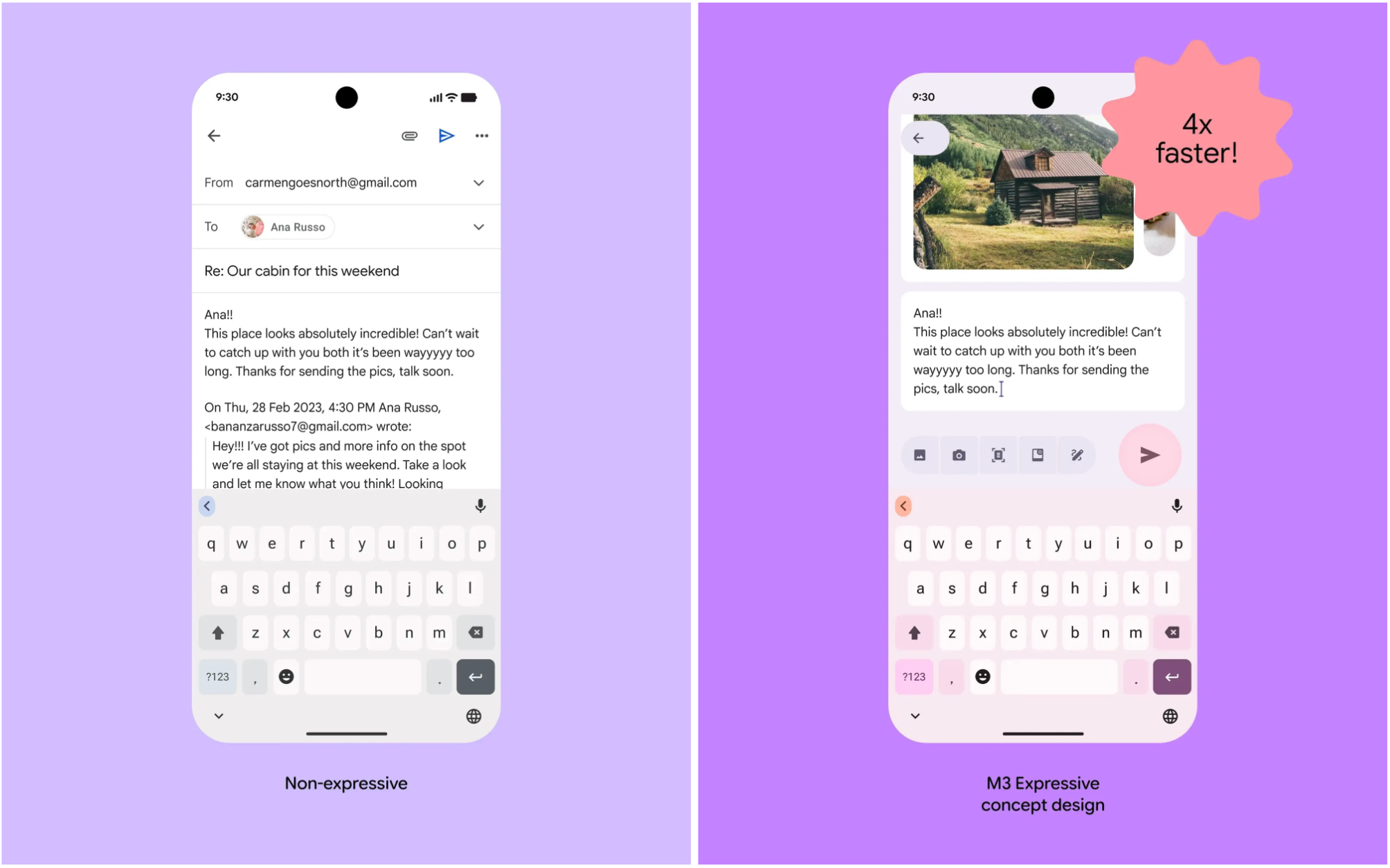
I’m all for that — as an Android fan, I’m excited to see the software on my phone get cooler and more modern (though I don’t expect it to rebel against anything). But more importantly, Google says the new look makes Android easier to use. Its blog post says the company’s research indicated expressive design helps “steer a user’s attention to the most important part of the screen.” It even claims that in one particular eye-tracking experiment, users’ attention landed the send button in an email interface four times faster in an Expressive UI than in a “non-expressive” version. Of course, the real yardstick for usability will come when Material 3 Expressive rolls out and our non-techy friends and relatives start using it in the wild.
Related
5 things we want for the new “expressive” Material Design 3
Google could make its software more interesting and practical
Android’s been visually consistent for the past few years — Android 15 looks and feels very much like Android 14, 13, and 12 did. There’s something to be said for that reliability, but after so many years, Material You has started to feel a bit stale. In branching out with Material 3 Expressive, Google’s finally set to move the ball forward both aesthetically and, ideally, in terms of usability. I’m looking forward to spending some time with Expressive interfaces in both apps and Android itself.
As for when I’ll get the chance, it’s not entirely clear just yet. We know that Material 3 Expressive will have its own session at Google I/O later this month, but Google hasn’t outright confirmed whether the first stable Android 16 release will include any of these visual updates. Fingers crossed we find out at I/O.


![what-google-messages-features-are-rolling-out-[may-2025]](https://betadroid.in/wp-content/uploads/2025/05/19916-what-google-messages-features-are-rolling-out-may-2025-280x210.png)