

![google-just-showed-off-android-auto’s-upcoming-light-theme-[gallery]](https://betadroid.in/wp-content/uploads/2025/05/22015-google-just-showed-off-android-autos-upcoming-light-theme-gallery-280x210.jpg)

Material 3 Expressive Is Bringing A Fresh Look To Your Google Photos Memories

Summary
- Android 16, launching next month, provides the foundation for the Material 3 Expressive redesign, which will arrive in a later Pixel Feature Drop but is testable now in the Android 16 QPR1 Beta.
- Google Photos is undergoing a UI overhaul in line with Expressive, featuring a cleaner homepage, tweaked Memories carousel with heart-shaped image cutouts, and potential future elements like a floating bottom bar.
- The Google Photos redesign, along with similar changes in Calendar and Files, may roll out before the full OS-wide Expressive update, but the exact timing remains unclear.
Android 16 is poised to go stable next month, laying the foundation for Google’s upcoming Material 3 Expressive redesign. Slated to arrive in a subsequent Pixel Feature Drop (September or potentially December), the redesigned UI is available to try out now with Android 16 QPR1 Beta 1.
If you’re in the QPR beta channel, you would already have seen some of the new elements, including a redesigned Quick Settings panel with the option to resize tiles, a revamped recent apps experience, new battery and Settings app icons, more ‘blurry’ background UI elements, and more. However, changes are also starting to appear in areas that are not directly controlled by the operating system.
For reference, signs of the Expressive redesign have already been spotted in apps like Google Calendar and Files by Google, and now Google Photos is reportedly receiving the same treatment.
As spotted by the folks over at Android Authority after enabling certain manual flags within the latest Google Photos version 7.30, it looks like Google Photos is poised to get a significant homepage UI overhaul.
Memories get an Expressive new frame
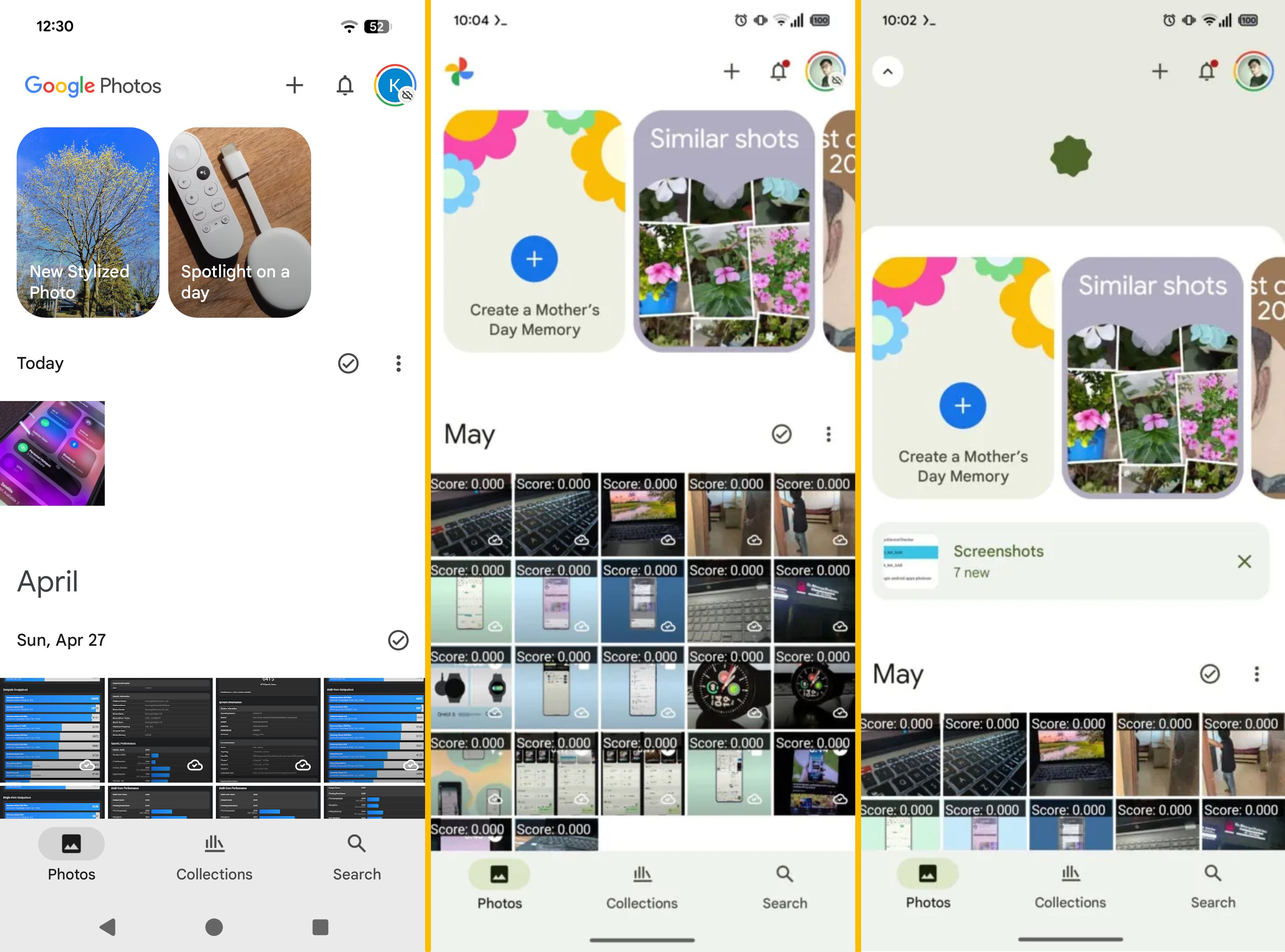
Source: Android Authority
Current UI (left), upcoming UI (right)
The first screenshot in the image above highlights Google Photos’ current UI, while the other two highlight the Expressive redesign that users can expect to see in the coming weeks and months.
Starting at the very top, eagle-eyed users would have spotted that the updated UI replaces the ‘Google Photos’ branding with an overall cleaner look that highlights only the app’s icon. This wasn’t a necessary change, but it is a welcome one, especially considering how visually noisy our Google Photos’ homepage can be.
M3 Expressive’s strategic use of color, size, shape, and containment follows from long-standing design principles and best practices, drawing attention to key elements and helping users navigate more quickly — Google Design
Elsewhere, the visual update also brings a slightly tweaked Memories carousel. Previously, the cover image dominated the Memory card, with its title overlaid on top. Now, the card appears divided into two sections. The bottom section highlights the cover image within a heart-shaped cutout, while the section on top displays the Memory card’s name on a solid background derived from the cover photos’ dominant hues. Other expected changes that haven’t yet made their way to the app include a floating bottom bar and rounder photo cards.
It isn’t entirely clear whether Google will wait until the full Material 3 Expressive redesign rolls out OS-wide with an Android 16 QPR release, or if this Google Photos app redesign, paired with similar changes spotted within Google Calendar and Files by Google, will roll out via app-specific updates.
