
Material 3 Expressive Brings What I Love About Android Into The Modern Day

Contents
If you’re not fully on board the AI hype train, I would understand if you feel that Android has lost its way. When Google, Samsung, and Motorola are packing AI features into places you never thought they would fit, you would be justified in asking, “Hey, what about us? What about the user experience?” Gemini feels like a product Google is trying to sell us, rather than a solution to a problem. The last few years of AI-focused updates have led me to become apathetic about the future of Google, but at Google I/O 2025, we saw that there’s still some consideration for the user experience in Google.
Admittedly, Google I/O 2025 was dominated by AI (again). The feature I’m talking about, Material 3 Expressive, was actually shown off a week earlier in a separate presentation. This surprised me, as the more I dive into this refresh of the Android UI, the more I think this is the most positive change to the Android UI in years. Here’s why.
Related
Material 3 Expressive taps into core human needs
A UI that is satisfying and fun to use
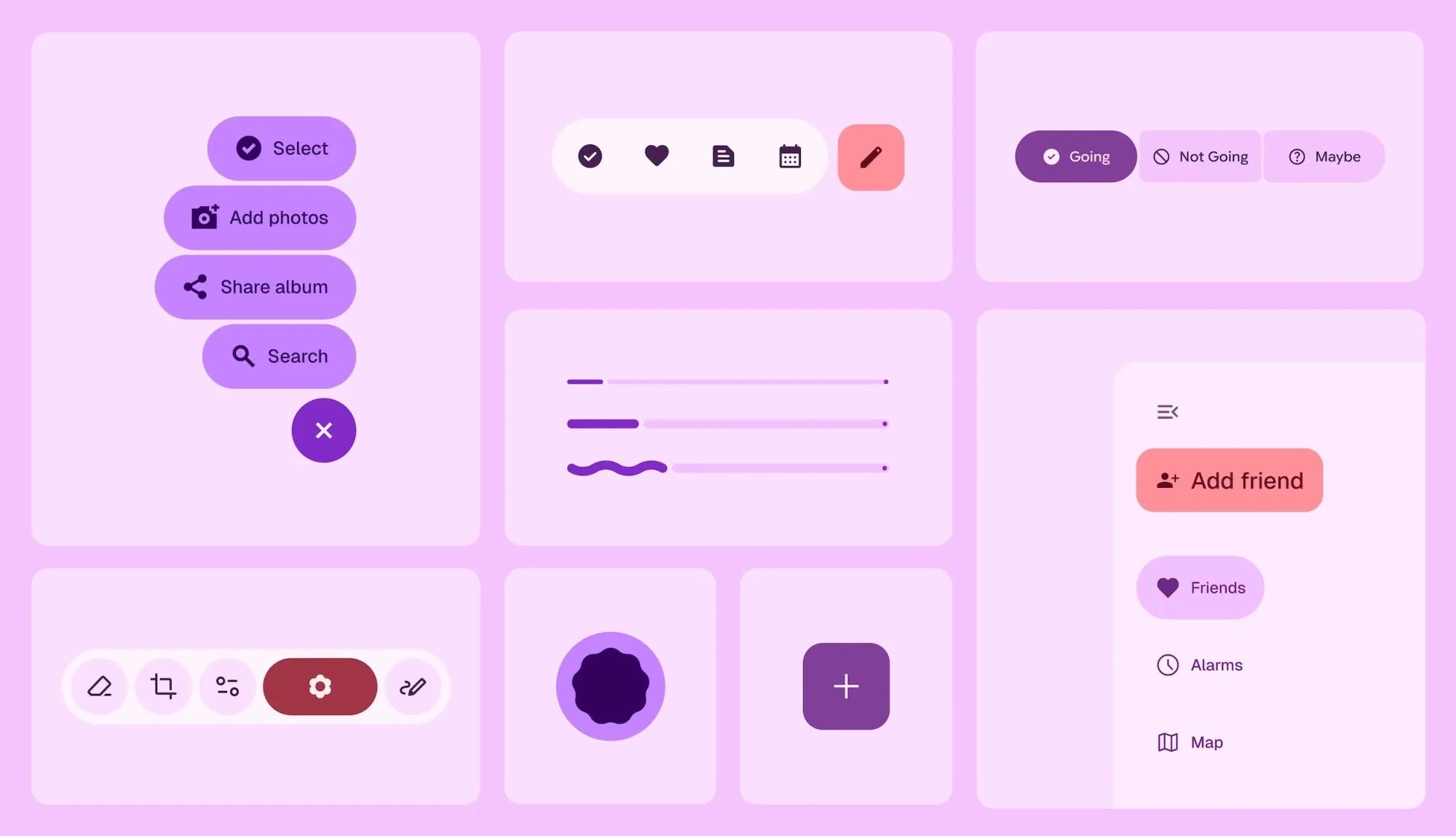
Source: Google (via 9to5Google)
Major UI refreshes are nothing new for Android veterans. In 2014, Material Design reinvented Android with a bold, minimalist design, which evolved in 2021 with the brighter and more customizable Material You. Our reaction to these evolutions was mostly positive. Material You stood out to us as it brought all the elements of our phone together under a unified design language. However, uniformity is the enemy of individualism, and as humans, we desire expression. Self-expression is linked to good mental health, connection, and well-being, but modern technology is inherently opposed to this vital human act. Material You might have looked amazing on the surface, but its flat colors and uniformity felt cold and impersonal. Google stumbled onto this realization thanks to a research intern in 2022 who was studying user sentiment toward Material Design. As described in Google’s blog post about the research behind Material 3 Expressive, this realization led to key questions about what felt off about Material Design.
Why did all these apps look so similar? So boring? Wasn’t there room to dial up the feeling?
I’m not naive enough to believe that Google suddenly has our mental well-being at heart. Material 3 Expressive is just another angle Google is taking to make sure we keep buying and using its products and services. But now and again, the goals of corporations and consumers align.
Google states that “Expressive design makes you feel something.” We want to feel something when we do something. It’s a simple idea, and Google has run with it to create Material 3 Expressive. And all signs point towards success.
Material 3 Expressive marries expressive design with customization
Minor customization updates can have an outsized impact
Human psychology aside for a moment, let’s talk about customization. While the line has become somewhat blurred in recent years, the biggest reason to choose Android over iOS remains freedom of choice. You can decide which phone manufacturer you want, which apps you use, and what your software looks like. However, most of the customization options hyped by Google lack the human touch we desire. Themed icons are the most recent example of this. While it was a neat way to take control of your app icons’ appearance, the result was a flat look that highlighted what made Material You feel inhuman.
Google hasn’t shown off all the new customization options included with Material 3 Expressive yet, but two notable updates highlight that Google is making great strides towards helping us customize our phones for practical and aesthetic reasons.
A redesigned Pixel Wallpaper app houses an exciting new feature
Ahead of Material 3 Expressive came news that a new Pixel Wallpaper app was in the works. Hidden in an Android 16 beta build was a new menu in the app that showed off six available app icon shapes to choose from. This might seem like a tiny change, but it’s a return to the early days of Android that I’ve long desired.
This update is nothing new for those of us who value customization over all else. Apps that allow us to change the appearance and shape of our app icons are a staple of the Play Store, they allow people to create stunning home screens. But I believe that you shouldn’t need to dive into the Play Store to make your phone feel yours, and this small change that harkens back to the glory days of Android customization is a signal that Google is on the right track.
Practical changes are just as important as aesthetic ones
Making our phone look the way we want is all well and good, but it’s the practical customization options that have the biggest effect on our day-to-day experiences with our phones. Google will now let us resize the Quick Settings tiles, allowing us to pack in four more tiles in the notification shade. The asymmetric layouts you can now create are exactly what Google should let us do with our phones.
The At a Glance widget, a lurking presence on all Pixel phones, is also being redesigned. Google hasn’t yet succumbed to our pleas to let us remove the At a Glance and Search widgets, but the new, smaller At a Glance widget allows us to pack in four more apps on our home screen. A small change, but a welcome one.
Material 3 Expressive combines expressive design with customization and useful UI elements
More information at a glance
The reason why I’m excited about Material 3 Expressive’s customization options is that the result will be a phone that I find more useful in every aspect. Even the changes to Wear OS might make me dig my Pixel Watch out of the cupboard it’s been languishing in for months. To me, this is what Android customization is all about: making an Android phone that works for you, not the other way around (Looking at you, iOS).
Helpful UI redesign is also on the way. Rather than solid blocks for Wi-Fi and mobile network indicators, Material 3 Expressive introduces segmented icons for better readability. The new horizontal battery icon also shows your battery percentage at a glance, so you don’t need to open the notification shade.
None of these ideas are innovative. Segmented Wi-Fi and mobile network indicators used to be an Android staple, and the new battery icon is almost identical to the one on iOS. But they show Google is trying to make an Android UI that works for us, rather than prioritizing soulless minimalism under a veneer of innovation.
Material 3 Expressive doesn’t stop at your Android home screen
Google is also updating its apps with Material 3 Expressive. We’ve seen these changes rolling out to Gmail amongst other apps. We can expect a complete Google app overhaul in the coming months.
But what I’m looking forward to are the small customization changes that have a big impact. Allowing us to take control of the seemingly insignificant parts of our phone is what Android is about. Hopefully, we’ll see more customization features revealed as the launch of Material 3 Expressive comes closer. You can also look forward to this redesign in third-party apps.
Related
