
IOS 26 And Its ‘Liquid Glass’ Redesign Is Being Compared To Ancient Android Skins [Video]
![ios-26-and-its-‘liquid-glass’-redesign-is-being-compared-to-ancient-android-skins-[video]](https://betadroid.in/wp-content/uploads/2025/06/25372-ios-26-and-its-liquid-glass-redesign-is-being-compared-to-ancient-android-skins-video.jpg)
Apple introduced its new “Liquid Glass” redesign of iOS 26 this week at WWDC and to say that the reactions have been mixed is an understatement. Amid the various comments, though, have been a bunch of comparisons between iOS 26 and ancient Android skins.
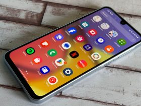
Android has evolved a lot over the years, looking almost unrecognizably different now compared to its early days, and that’s in part thanks to the freedom that Android has presented its users in regards to customization. You can do virtually anything you please on an Android phone to make the experience feel your own with the help of third-party launchers, icon packs, and countless other options.
While there are many examples of good customization in Android, there were also dark days full of heavy skins and over-the-top animations that just look gaudy by today’s standards.
That’s what Apple’s new iOS 26 redesign is being compared to.
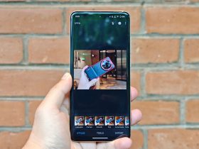
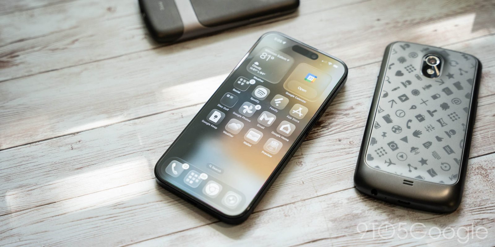
“Liquid Glass” is Apple’s new design language in iOS 26 and across all of its software platforms, and it introduces a polarizing new look. Particularly with icons and animations, it all feels a bit over-the-top at times, despite overall being quite familiar. Readability issues are also a hot topic to talk about. But for many, iOS 26 is just bringing back memories of some ancient Android experiences.
On Twitter/X, one user compared iOS 26 to “an insanely skinned Android phone” from “12 years ago,” with a video of a phone with a custom launcher and glass-like yellow icon pack applied.
Another user pointed to an iconic ad for CM Launcher 3D.
It’s not just older versions of Android that iOS 26 is being compared to, though. “Snazzy Labs” YouTuber Quinn Nelson compared the update to 2010’s “Glaskart” jailbreak theme for iOS, and he’s far from the only one making such a comparison.
If you had told me back in 2010 that in 15 years Apple would be copying the Glaskart jailbreak theme but with even less legible text, I’d have… well honestly, I’d have been very excited.
But that’s why 16-year-olds are dumb. pic.twitter.com/F3i3dXWYLt
— Quinn Nelson (@SnazzyLabs) June 10, 2025
It’s important to note that, with this just being a developer preview, Apple has plenty of time to revise this design to fix some of the more polarizing design choices. The company can also tone down animations and fix a lot of the bugs and quirks that have led to some of the more unpleasant looks in “Liquid Glass.”
Still, the comparisons to Android of old feel apt with the iOS 26 we have today.
That said, it’s not like “Liquid Glass” is without its redeeming qualities. From real-time reflections and updates based on the position of the phone, plus just the skeumorphic look of how UI elements interact like real glass, Apple’s attention to detail is amazing. It’s just obvious that the attention may have been on the wrong details.
What do you think?
More on iOS 26 from 9to5Mac:
- Apple unveils iOS 26 with Liquid Glass redesign, CarPlay updates, Games app, much more
- Here’s a closer look at the Liquid Glass design in iOS 26 on the iPhone
- iOS 26 adds light mode icon tinting and several new ways to customize icons
Follow Ben: Twitter/X, Threads, Bluesky, and Instagram
Add 9to5Google to your Google News feed.
FTC: We use income earning auto affiliate links. More.

