Here’s A Better Look At Gmail’s Material 3 Expressive Makeover, Rolling Out To Some Users

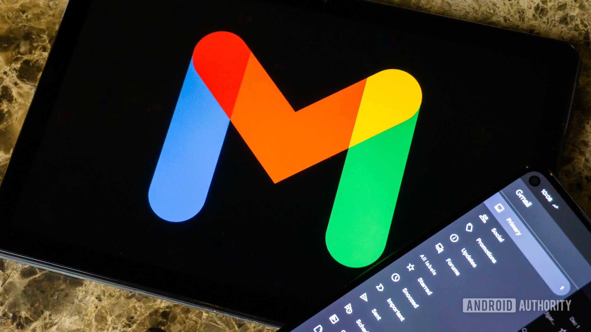
Edgar Cervantes / Android Authority
TL;DR
- Google has begun rolling out Gmail’s Material 3 Expressive redesign via a server-side switch to some users.
- Design updates include more color usage, rounded cards, minor changes to the Compose button, and a new swipe animation design.
Material 3 Expressive is the flavor of the season, even though the broader rollout for Android 16‘s core-system UX will happen later in the year. The design language has already debuted with Android 16 QPR1 beta, and we’re seeing plenty of Google apps get updated to adopt it. Google already showed off Gmail’s Material 3 Expressive makeover, but we now have a better look as it has begun rolling out to some users.
With the Gmail app v2025.05.11 release, Google seems to have flipped a server-side switch that enables Material 3 Expressive design changes to the Gmail app. User SparkRadar on Telegram received these changes and shared some of the screenshots below:
One of the bigger changes with Gmail’s Material 3 Expressive redesign is that you’ll see a bit more color throughout the app, with the card-based UI fostering more tonal variations.
Currently, Gmail uses a primary color accent on the main landing screen, except for the Search box, bottom tab, and Compose button, which are all differently accented. With its Material 3 Expressive redesign, the message list sits as a card on top of a lighter background, and you can make out the subtle rounded corners on the top and bottom. The compose button also uses a thicker font, and the pencil icon is now filled.
On one of their Gmail accounts, the account switcher also happens to sit outside the search bar, which is new. Some screenshots show the account switcher inside the search bar, as it is currently, because server-side features often get activated on a per-account basis.
We can see the card-based UI again in action within the email screen. While the card-based order summary snippet already existed, the email screen adopts the same, but with a different edge-to-edge width. Further, from what we can observe, the colors for the order summary snippet are now lighter.
Further, as Google had already highlighted, the Gmail app’s Material 3 Expressive release also includes a new pill-shaped button animation for the swipe gestures:
As mentioned, these changes are being gradually rolled out through a server-side switch. We expect more and more users to receive the new update in the coming days.
Got a tip? Talk to us! Email our staff at [email protected]. You can stay anonymous or get credit for the info, it’s your choice.
What’s your reaction?
Love0
Sad0
Happy0
Sleepy0
Angry0
Dead0
Wink0






![samsung-teases-galaxy-z-fold-7-with-an-absolutely-bizarre-‘ultra-experience’-[video]](https://betadroid.in/wp-content/uploads/2025/06/24059-samsung-teases-galaxy-z-fold-7-with-an-absolutely-bizarre-ultra-experience-video-370x250.jpg)
Leave a Reply
View Comments