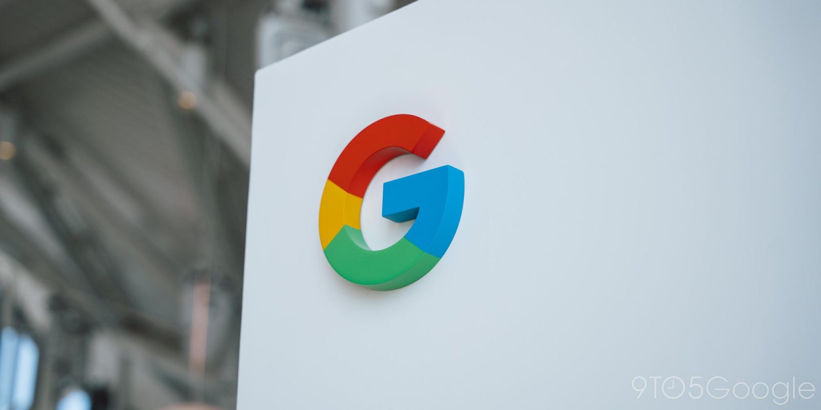
Following the last update nearly 10 years ago, Google is updating its iconic ‘G’ icon.
On September 1, 2015, Google significantly updated its logo (‘Google’) to a modern typeface called Product Sans. As part of that, the ‘G’ icon changed from the lowercase white ‘g’ on a blue background to the circular design we’ve now had for the past 10 years.
Google is now updating the icon so that there are no longer four solid color sections. Instead, red bleeds into yellow, yellow into green, and green into blue. It looks more vibrant and colorful. This modernization feels inline with the Gemini gradient, while AI Mode in Search uses something similar for a shortcut.
Old vs. new
Currently, this new icon is already in use by the Google Search app for iOS as of an update yesterday. We’re not seeing this on Android or the web yet. It’s a subtle change that you might not immediately notice, especially if the main place you see it is on your homescreen. It will be even less noticeable as a tiny browser favicon.
- Related: How and why Google made Material 3 Expressive
It does not appear that Google is changing its main six-letter logo today, while it’s unclear whether any other product logos are changing. In theory, some of the company’s four-color logos, like Chrome or Maps, could pretty easily start bleeding in their sections.
iOS app
Thanks all
Add 9to5Google to your Google News feed.
FTC: We use income earning auto affiliate links. More.
What’s your reaction?
Love0
Sad0
Happy0
Sleepy0
Angry0
Dead0
Wink0


Leave a Reply
View Comments