

Google On What Makes A High-Quality Android Widget
The Android team has long offered quality tiers for apps on Wear OS, Large Screen, and other form factors. As part of this week’s push, Google is highlighting the Android Widget Quality Tiers.
These quality tiers were introduced in October, with the goal of helping developers “evaluate and plan for a high quality widget,” so that they are functional, visually appealing, and user-friendly.
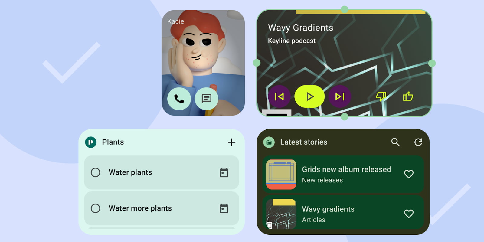
- Tier 3: Low Quality – don’t meet the minimum quality bar and don’t provide a great user experience.
- Tier 2: Quality Standard – is helpful, usable, and provides a quality experience.
- Tier 1: Differentiated – are exemplary widgets offering hero experiences that are personalized, and help users create unique and productive homescreens.
A “Low Quality” widget “does not meet standard layout, color, discovery, and content criteria.”

Starting with Content, a widget “must not be consistently stale or untimely.” They should update “after user completes an action from the widget” or within the app. Notably, Google says a “widget must let users manually refresh content, if there is an expectation the data refreshes more frequently than the UI.”
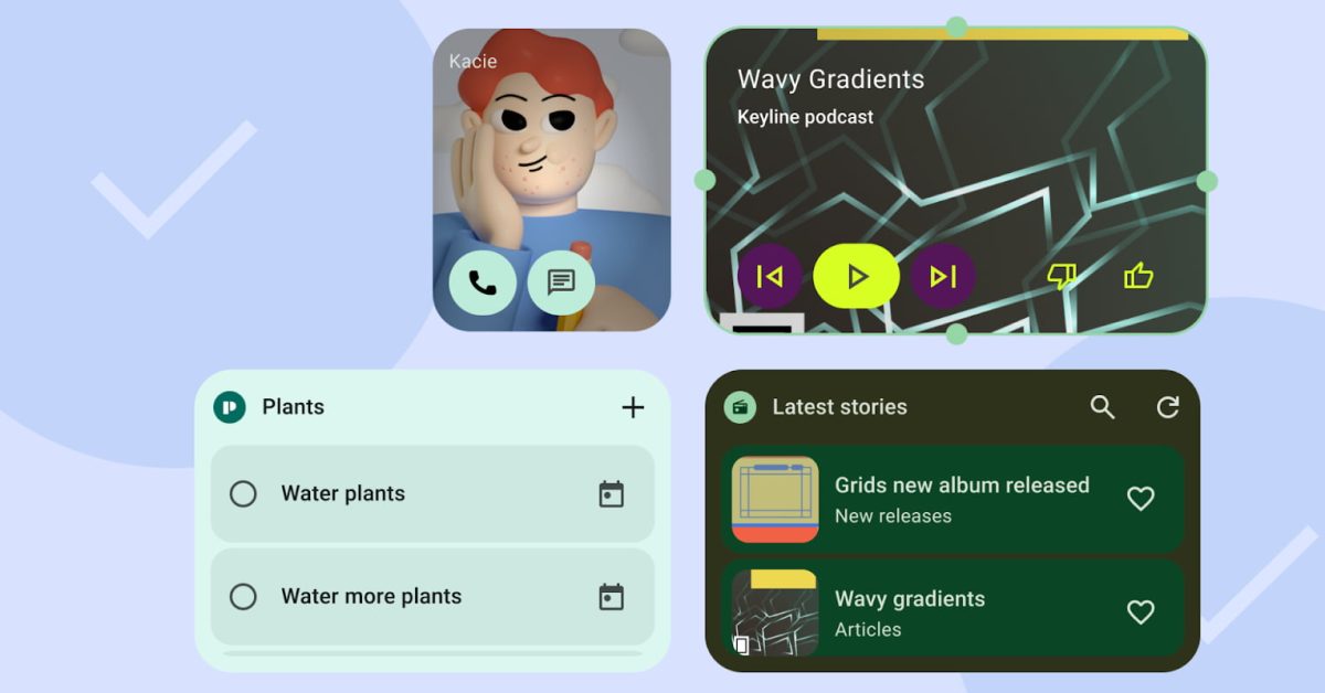
In terms of Layout, a “good” or Tier 2 quality widget “must touch at least two opposing edges of the [launcher] grid,” like top-to-bottom or span the left-to-right edges.
In other words, widgets don’t need to be rectangular. They can have custom shapes, as long as the edges of the shape touch at least two edges of the grid.
However, a Tier 1 widget “MUST hit all four edges of the bounds of the grid.” Looking at Google apps, newer first-party widgets go edge-to-edge (so to speak), but some that are a few years old do not.

- Related: Google Clock ‘Timer Starter’ widget comes to Pixel phones
Google also encourages the use of headers for scrolling lists and grids. They are a bit like miniature top/app bars with an Icon (for branding and app launch), Title (context), and Actions (like refresh or search).

On the Color front, Google at minimum wants “sufficient color contrast” (Tier 2), with more advanced theming ideal (Tier 3). That might include light/dark modes, Dynamic Color, or branded theme colors.

For Discovery, Google wants “accurate previews in the Widget picker,” but user-content previews (like an actual profile/image in the case of a contacts widget) is ideal. They should also be named and have unique descriptions.
The final aspect of a top tier widget is System Coherence, like how “Rectangular widgets must use the corner radius provided by system (OEM specific).” Progress indicators and transition animations (when entering/exiting the app) are also encouraged.

Add 9to5Google to your Google News feed.
FTC: We use income earning auto affiliate links. More.

