
Edgar Cervantes / Android Authority
TL;DR
- Google is working on a new design for Android’s volume slider and volume panel.
- The new design ditches the thick, pill-shaped sliders in favor of thinner, continuous sliders with handles.
- We don’t know when this new design will launch, but we presume it will appear in the Android 16 update.
Google will release Android 16 later this year. Android 16 will be the next major version of Android, and although we’ve already seen two developer previews for it, there’s still much we don’t know about what’s included in the update. I’ve been examining every Android build Google has released so far and have found enough evidence to suggest that Google is preparing major UI changes for Android 16. These include not only changes to the Quick Settings/notifications panels but also to the volume panel and volume slider.
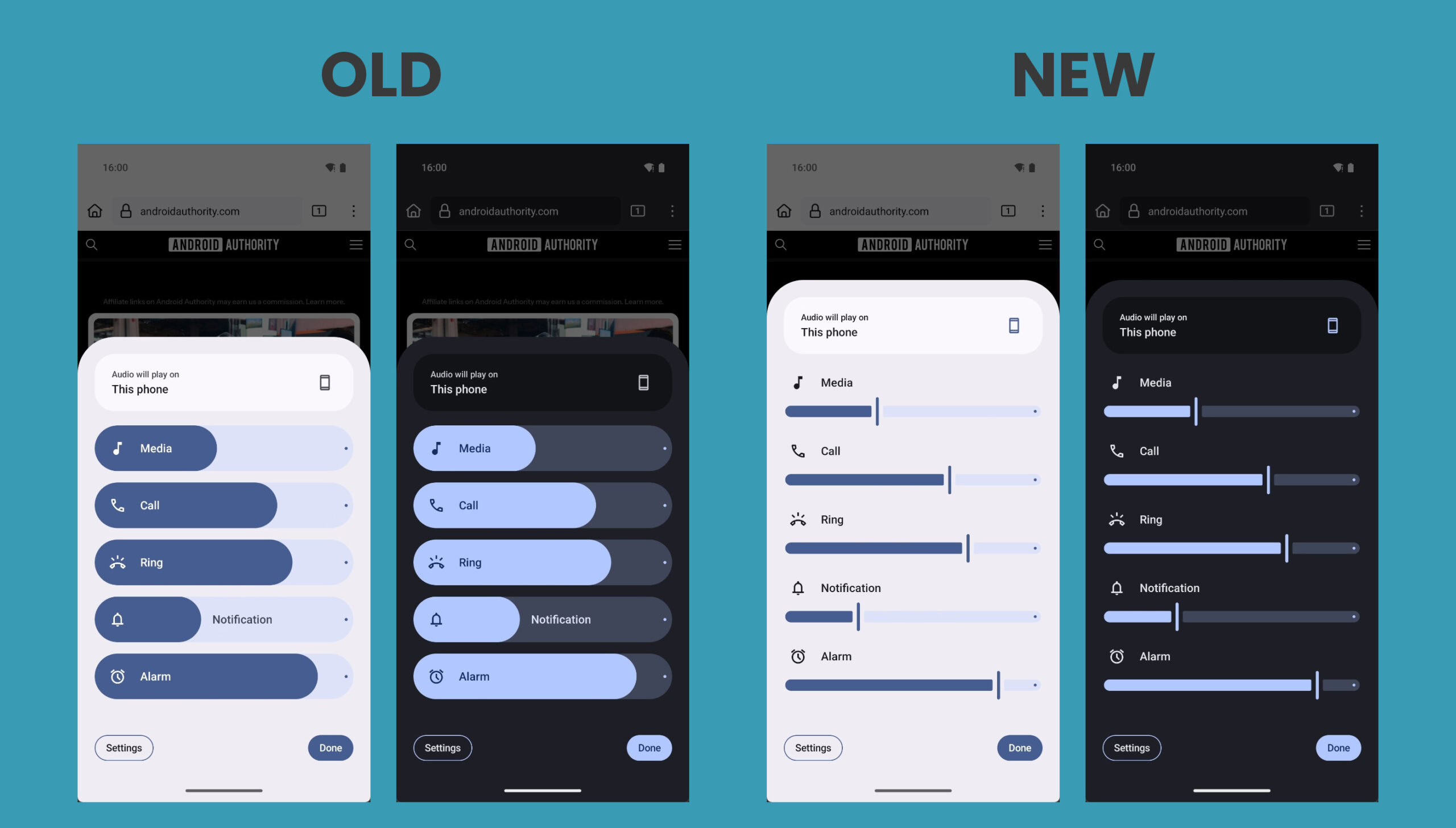
When Android 15 was released last year, it introduced a big redesign to the volume panel that made it collapsible. The new volume panel featured much thicker, pill-shaped sliders, a dot at the end of each slider, and tappable icons to quickly mute individual volume streams. It also swapped the “sound & vibration” header up top with a persistent media output shortcut and made the stream-name text move along with the slider.
With a bit of tinkering, I managed to activate an updated UI for the volume panel in Android 16 DP2. The volume panel that I surfaced ditches the thick, pill-shaped sliders in favor of thinner, continuous sliders with handles. This new design falls more in line with Google’s Material Design 3 guidelines for sliders. Some of you may not be fans of the newer, simpler volume panel design, but its simplicity makes it easier to estimate the exact volume level of a particular volume stream. Here’s an image that compares the volume panel UI in Android 15 vs. possible changes for Android 16:
Mishaal Rahman / Android Authority
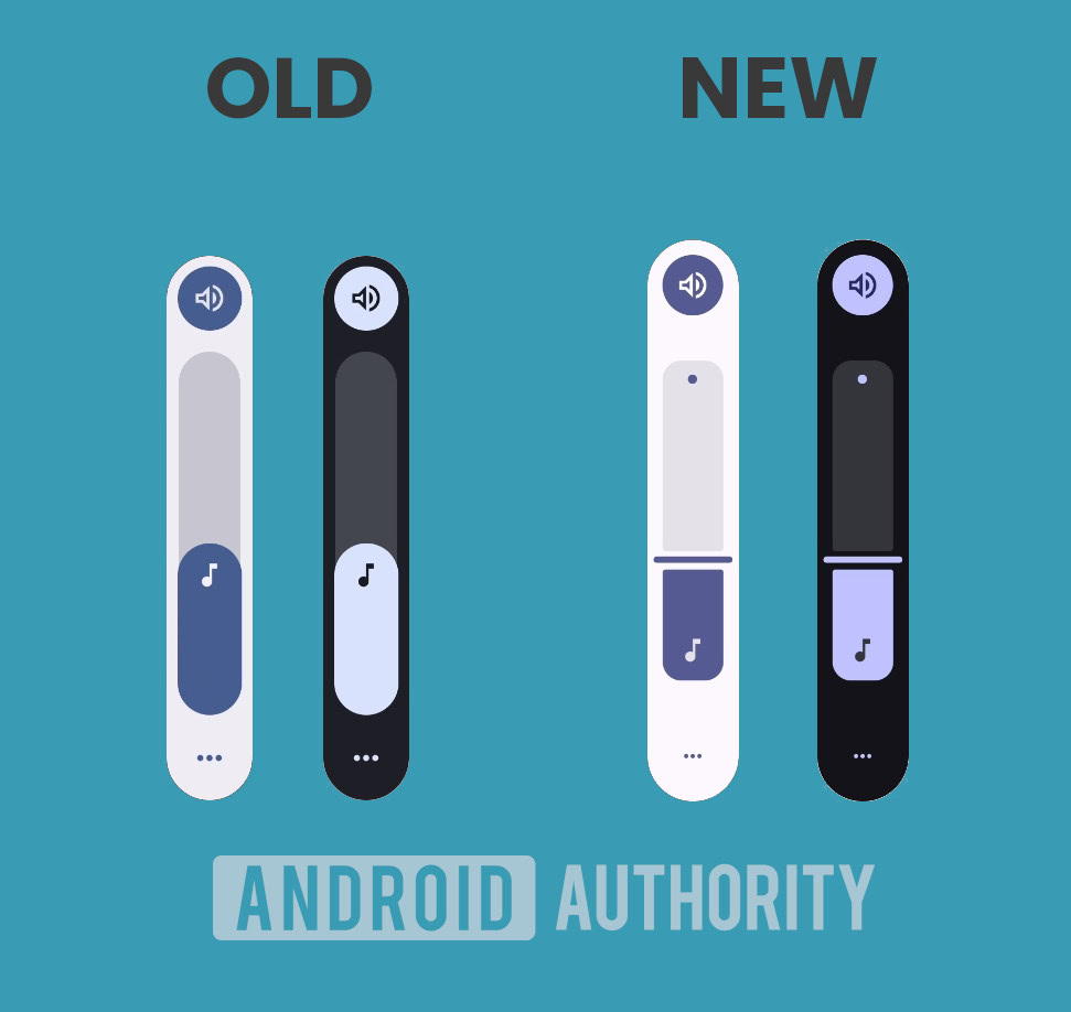
Google is also working to update the volume slider to match this new design. As you can see below, the volume slider in Android 16 will be less rounded and will have a thin rectangular handle. The icon indicating the current volume stream that’s being controlled will sit at the bottom of the slider instead of at the top. The three dots at the bottom, which open the full volume panel, are slightly smaller in the new design.
Mishaal Rahman / Android Authority
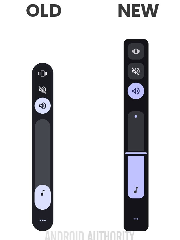
While the volume mode icon at the top hasn’t changed, the mode selector has been tweaked a bit to show other modes in discrete rounded rectangles.
Mishaal Rahman / Android Authority
I don’t know if the new volume panel and slider UIs I activated in DP2 will actually launch in Android 16. It’s possible Google will abandon this design entirely, so I’ll be monitoring future Android preview builds for signs of further developments. Let us know in the comments what you think of this new design!
Got a tip? Talk to us! Email our staff at [email protected]. You can stay anonymous or get credit for the info, it’s your choice.
What’s your reaction?
Love0
Sad0
Happy0
Sleepy0
Angry0
Dead0
Wink0

![google-messages-redesigns-gallery-+-camera,-adds-‘original-quality’-sending-[u]](https://betadroid.in/wp-content/uploads/2025/02/8273-google-messages-redesigns-gallery-camera-adds-original-quality-sending-u-280x210.jpg)

![google-messages-redesigns-gallery-+-camera,-adds-‘original-quality’-sending-[u]](https://betadroid.in/wp-content/uploads/2025/02/8273-google-messages-redesigns-gallery-camera-adds-original-quality-sending-u-370x250.jpg)

Leave a Reply
View Comments