


Google Is Working On A Big UI Overhaul For Android: Here’s An Early Look
Contents

Mishaal Rahman / Android Authority
TL;DR
- Google is working on a big redesign of Android, and we have an early look at what the new UI looks like.
- Android will apply background blur to Quick Settings and other areas, will use thinner sliders for volume, will use new icons and font in the status bar, and more.
- These UI changes aren’t enabled yet in the latest beta, and we don’t know when they’ll roll out.
When Google released the fourth beta of Android 16 this month, many users were disappointed by the lack of major UI changes. As Beta 4 is the final beta, it’s likely the stable Android 16 release won’t look much different than last year’s release. However, that might not hold true for subsequent updates. Google recently confirmed it will unveil a new version of its Material Design theme at its upcoming developer conference, and we’ve already caught glimpses of these design changes in Android—including a notable increase in background blur effects. Ahead of I/O next month, here’s an early look at Google’s upcoming Android redesign.
You’re reading an Authority Insights story. Discover Authority Insights for more exclusive reports, app teardowns, leaks, and in-depth tech coverage you won’t find anywhere else.
Before we begin, a word of caution: What we’re about to show you are hidden design changes found in Android 16 Beta 4. None of these are enabled by default in Beta 4, and we don’t know for certain when Google will activate them. While it’s highly likely we won’t see this full redesign in the stable release of Android 16, parts or all of it could appear in a future quarterly update. We’ll hopefully get more clarity next month during The Android Show or Google I/O 2025, where the company plans to unveil its new, more “expressive” version of Material Design, dubbed Material 3 Expressive.
New status bar icons and clock font
One of the more obvious visual differences appears in the status bar, where Google has tweaked the icons for Wi-Fi, mobile data, airplane mode, and battery level. The Wi-Fi and mobile data icons are now segmented, while the 5G and airplane mode icons are much bolder. Android’s new battery icon is also more colorful, sporting a green background when the device is charging and turning red when the battery is low.
Mishaal Rahman / Android Authority
Old vs new battery charging icon in Android
A more subtle change involves the font used for the text clock. It’s now slightly larger and bolder than before, making it marginally easier to read at a glance.
New design for the combined notifications and Quick Settings panel
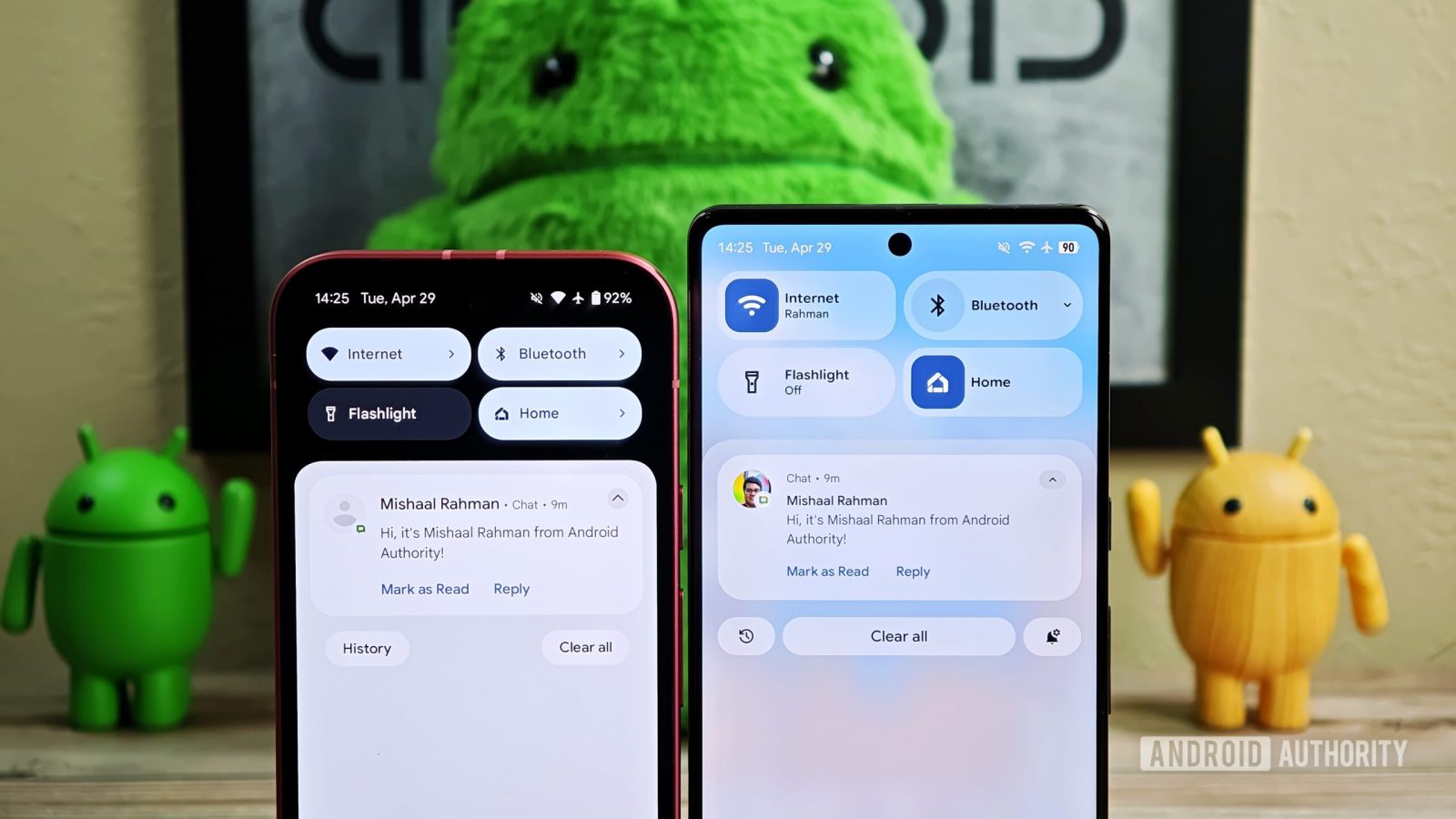
Last year, we reported that Google was preparing a major overhaul of the notifications and Quick Settings area. As part of this redesign, Google planned to split the notifications and Quick Settings panels into separate pages. This split design aimed to create more space for both notifications and tiles but represented a dramatic departure from the current combined layout.
While Google is still refining this split design and might offer it as an option later, the company currently seems to be moving forward with a different approach for the main interface. This newer design keeps the Quick Settings and notifications panel combined but retains many quality-of-life improvements developed alongside the split concept. These include resizable Quick Settings tiles, new one-click toggles for Wi-Fi and Bluetooth, a more organized tile editor, and one-click shortcuts for adding or removing tiles. It also introduces a redesigned brightness slider, downward-facing arrows (instead of rightward) for expandable tiles, and the new segmented Wi-Fi icon mentioned earlier, but the overall layout remains familiar.
Although the basic layout is similar, the look and feel change dramatically. Instead of a solid black background, the panel now displays a blurred version of the content underneath. The blur effect is less intense beneath the Quick Settings tiles compared to the notification area; this helps ensure notifications remain readable even with some transparency applied. When light mode is enabled, the background takes on a frosted glass appearance. In dark mode, the background and toggles shift to a darker gray, with transparency applied to both.

Mishaal Rahman / Android Authority
Old vs new Quick Settings panel design in Android
What this new design potentially sacrifices in contrast and immediate readability, it arguably gains in aesthetics. In my opinion, background blur is a feature long overdue in stock Android. Other Android-based operating systems, like Xiaomi’s HyperOS, have used background blur extensively for some time, but Google has largely avoided it until now. I personally find the revamped combined panel quite sleek and am curious to see if or how Google might apply similar blur effects should the split panel design resurface as an option.
Blur, blur, and more blur
The Quick Settings panel isn’t the only place Google is applying a blur effect. A blurred background also appears in the Pixel Launcher’s app drawer, the recents menu (multitasking view), and the PIN entry screen. Currently, these areas use a solid light or dark gray background depending on the system theme (light or dark mode).
A cleaner, more compact lock screen
Google is preparing to change the lock screen layout in a subtle but meaningful way. In the new Pixel lock screen layout we spotted recently, Google moves the date and weather information either below or beside the clock, relocating the contextual information complication elsewhere. Specifically, the date and weather appear below the clock when it’s centered, and to the clock’s right when it’s positioned at the top. Meanwhile, the contextual information complication now sits at the top when no notifications are present, shifting below the clock when notifications appear. This separation results in a cleaner overall look.

Mishaal Rahman / Android Authority
Old vs new lock screen layout in Android on Pixel phones
Complementing this layout change is a new compact notification shelf. This optional setting collapses notifications on the lock screen. Instead of showing the full notification preview, only the app’s icon appears in a small, slightly transparent chip located below the contextual information complication (ensuring it doesn’t obstruct the wallpaper). Tapping this chip expands the notification shade, revealing all pending notifications. This compact view isn’t enabled by default but can be turned on under Settings > Notifications > Notifications on lock screen.

Mishaal Rahman / Android Authority
Old vs new lock screen notification shelf in Android
A less subtle change affects the PIN entry page. In addition to the aforementioned blurred background, the dots for each number you’ve entered now use dynamic colors, in line with Material You theming. The numbers are also now slightly larger and bolder, similar to the updated text clock font. Given that these buttons are static, it’s unlikely many people struggled to tap the correct one quickly, but the visual refresh is still a nice touch.

Mishaal Rahman / Android Authority
Old vs new lock screen PIN entry screen UI in Android
A less bubbly volume and media output UI
With Android 15 last year, Google introduced a redesigned, collapsible volume panel featuring thick, pill-shaped sliders for each audio stream. In contrast, the new volume UI Google is working on replaces those thick sliders with thinner ones that include distinct handles. This updated slider design aligns more closely with Google’s existing Material Design 3 guidelines, suggesting it might remain consistent even with the upcoming Material 3 Expressive theme.

Mishaal Rahman / Android Authority
Old vs new volume panel UI in Android
Alongside the main volume panel, the volume slider that appears when you press a volume key is also changing. This new slider is less rounded and features a thin rectangular handle. Additionally, the sound mode selector at the top has been tweaked; other modes now appear within discrete rounded rectangles.
Elsewhere, Android’s media output switcher is getting a redesign too. Notable changes include relocating the “Connect a device” button significantly higher and swapping the thick, pill-shaped volume slider for the newer thin style with a handle. Furthermore, the connected device’s name now appears above the slider instead of inside it, and the large pill shape enclosing each device under the “Speakers & Displays” header has been removed.

Mishaal Rahman / Android Authority
Old vs new media output switcher UI in Android
A more expressive Settings app
Google is preparing a significant redesign of Android’s Settings app to align it with the new Material 3 Expressive design language. We know this redesign is linked to Material 3 Expressive because Google used the internal code-name “expressive” during its development.
This Settings overhaul will introduce several visual changes: colorful icons will return to the homepage, newer Material Design 3 switches will be implemented, each menu item will be placed within separate cards, and right-facing arrows will indicate subpages. Furthermore, the page header appears at the very top by default, allowing more items to be visible immediately when entering a settings page.
New icon shape options
Lastly, Google is preparing to introduce some fun new icon shape options for the Pixel Launcher. While Google won’t let you fully customize the icon shapes on your Pixel’s home screen, it will let you pick from five new icon shapes, including “square”, “four-sided cookie”, “seven-sided cookie”, “arch”, and “complex clover.” The default icon shape is still a circle, but these new options include less rounded shapes as well as more complex geometric ones. The icon shape is applied not only to the home screen but also to the app drawer, but it’s not visible anywhere else.
Mishaal Rahman / Android Authority
Old vs new app grid and icon shape options in Pixel Launcher
Those are all the new design changes we spotted so far while digging through the Android 16 betas. Again, we don’t know when these changes will roll out, but we hopefully won’t have to wait long to find out. We’ll be live on site at Google I/O to bring you all the latest news right from the event!
What do you think of Android’s new UI? Let us know in the comments below!
Got a tip? Talk to us! Email our staff at [email protected]. You can stay anonymous or get credit for the info, it’s your choice.
