


Google Announces Android 16’s Material 3 Expressive Redesign

At The Android Show: I/O Edition, Google today announced a big Material 3 Expressive redesign for Android 16 that is coming later this year, starting on Pixel.
M3 Expressive for Android 16
With Material 3 Expressive, Google wants to add emotion to the interface while making everything more engaging and easier to use.
Google touts natural, springy animations. For example, when dismissing a notification, you’ll feel a “satisfying haptic rumble,” while other alerts next to it will “subtly respond to your drag.” Other examples of this include “dismissing an app in your recent apps screen, fidgeting with the volume slider, or flinging down the [notification] shade.”
Background blur in the Quick Settings and Notifications panel, as well as Recents multitasking, adds a sense of depth and preserves context when navigating your device. The updated design language includes new responsive components, “emphasized” typography, and “updated dynamic color themes.”
Google says everything will remain performant and that these updates won’t impact battery life.
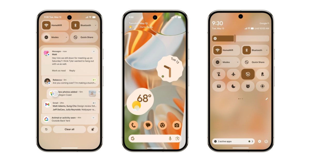
These changes (for Pixel) start on the lockscreen, with Google moving some elements around. For example, when you have notifications, the day/date and At a Glance weather now appear to the right of the corner clock. Otherwise, it appears underneath the full time just above the fingerprint circle.
Live Updates will show alerts from delivery, rideshare, and navigation apps on the lockscreen and always-on display (AOD). When your phone is unlocked, you can tap the Live Updates pill next to the time to show the full notification, while it will appear as the first thing in notifications.
The status bar features new icons that generally separate things into distinct elements. At a Glance on the homescreen is a bit more compact.
When you pull down for the shade, you’ll notice that blur so your wallpaper (in the above example) is visible in the background. At the bottom, you get pill-shaped buttons for Notification history, Clear all, and alert preferences.
That effect is present when opening the full Quick Settings panel, with resizable tiles that allow you to fit more actions. In general, QS Tiles shift from pills to rounded rectangles when activated. There’s a blockier brightness slider at the top with a prominent handle, with the volume slider also getting the same treatment.
This Material 3 Expressive redesign is coming with Android 16 later this year, starting on Pixel. Material 3 Expressive will also start appearing in Google apps, with the updated Google Keep and new Gemini widgets belonging to this new design language.
- Wear OS 6 brings Material 3 Expressive redesign, Gemini
- Gemini coming to Android Auto with Live, automatic translation, more [Video]
- Gemini is still replacing Assistant on Google TV, but not until ‘later this year’
- Google’s Find My Device app is now ‘Find Hub’
- Google’s Advanced Protection will bring a max security button to Android 16
- Key Verifier will offer advanced protection against Google Messages scams
M3 Expressive for apps
Material 3 Expressive is described as an evolution of Material 3, which was announced in 2021. It’s not “M4” or a new version of the design system. Google says “Expressive interfaces have an emotional impact, fostering connection by evoking a feeling or mood through visual design and interaction.”
It starts with fifteen new or updated components that are more configurable with new “shape options, emphasized text, and other expressive updates.” New components today include: Button groups, FAB menu, Loading indicators, Split button, and Toolbars.
Meanwhile, Google has updated: App bars, Carousel, Common buttons, Extended FAB, FABs, Icon buttons, Navigation bar, Navigation rail, and Progress indicators.
Then you have a new Motion-physics system that “makes interactions and transitions feel more alive, fluid, and natural.”
Spatial springs mirror the physics of how objects actually move, making animations clear and predictable. Effects springs create seamless transitions for color and opacity changes.
Material 3 Expressive uses typography styles to emphasize information hierarchy and important actions:
New type styles for variable and static fonts can be used to express a range of emotional states, automatically adjust variables for readability, and support bold editorial layouts.
Google touts a new set of 35 shapes that can be used for avatars, image croups, and other decorative details.
A built-in shape-morph animation allows smooth transitions from one shape to another. This can be dynamic, or as simple as a square changing to a circle.

On the color front, there’s an expanded range to “sharpen hierarchy and clarify key actions.”

expressive screens from a speculative messaging app, showing off the range of possible color
themes
Google offers developers expressive tactics to “help guide the viewer’s attention to the most important elements of the screen.” This includes leveraging shapes color, typography, containers, and motion.
Add 9to5Google to your Google News feed.
FTC: We use income earning auto affiliate links. More.
