First Look: Android 16 Is Testing A Fresh Design For The Pixel Lock Screen
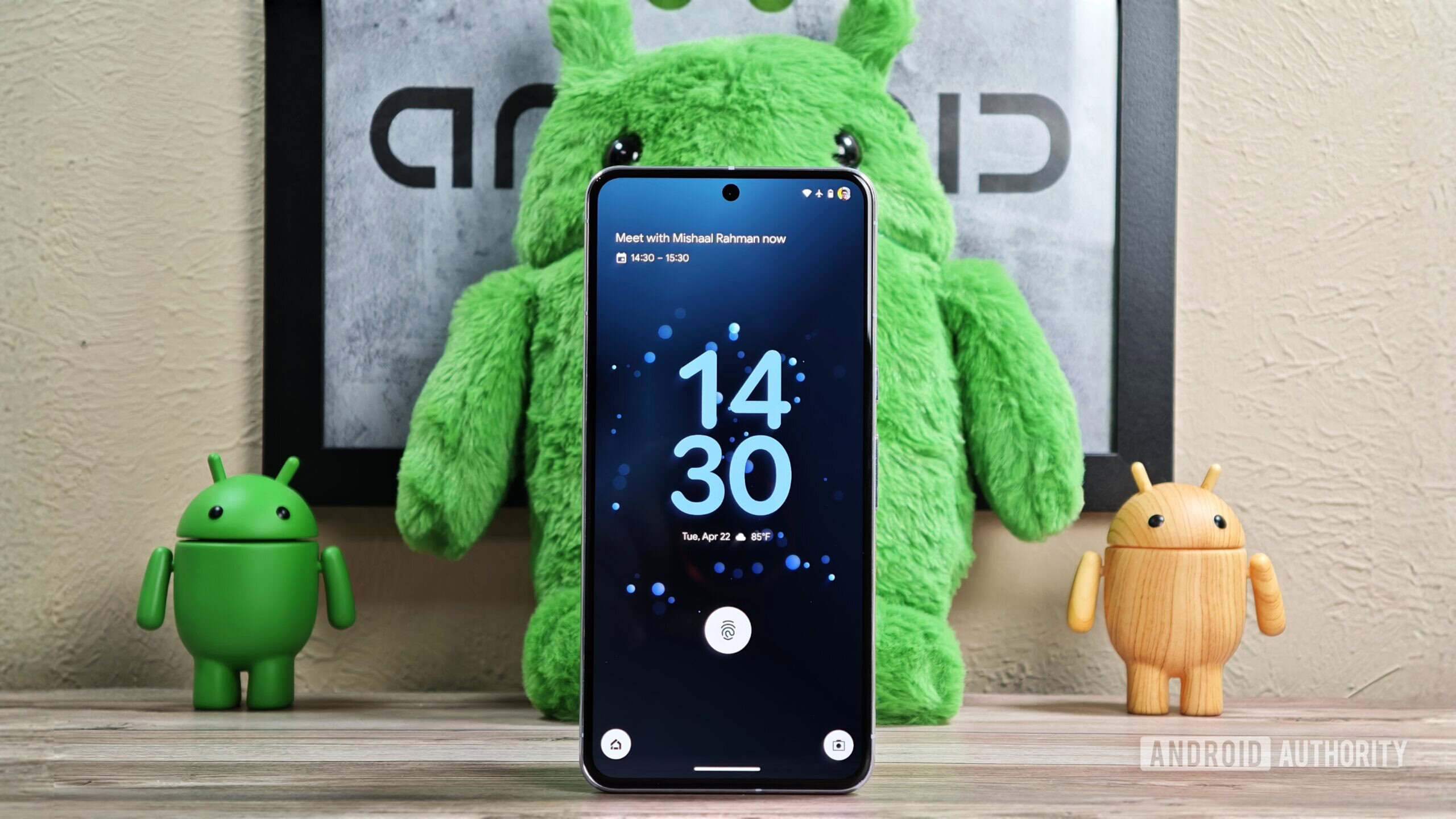
Mishaal Rahman / Android Authority
TL;DR
- Google is testing a cleaner lock screen layout for Pixels that repositions elements of the At a Glance widget.
- The date and weather are moved below or beside the clock, while the informational complication is separated.
- Spotted in Android 16 Beta 4, this cleaner layout isn’t enabled by default yet and its official release date is unknown.
One of the best Pixel-only features is the tight integration of Google’s At a Glance widget with the Pixel Launcher and the lock screen. While the At a Glance widget is available on other Android devices, the Pixel version offers significantly more features. The At a Glance widget is prominently positioned at the top of the Pixel Launcher homepage on Pixel devices, but its placement is more dynamic on the lock screen. The current lock screen placement can feel cluttered, though, so Google is working on a new, cleaner layout.
You’re reading an Authority Insights story. Discover Authority Insights for more exclusive reports, app teardowns, leaks, and in-depth tech coverage you won’t find anywhere else.
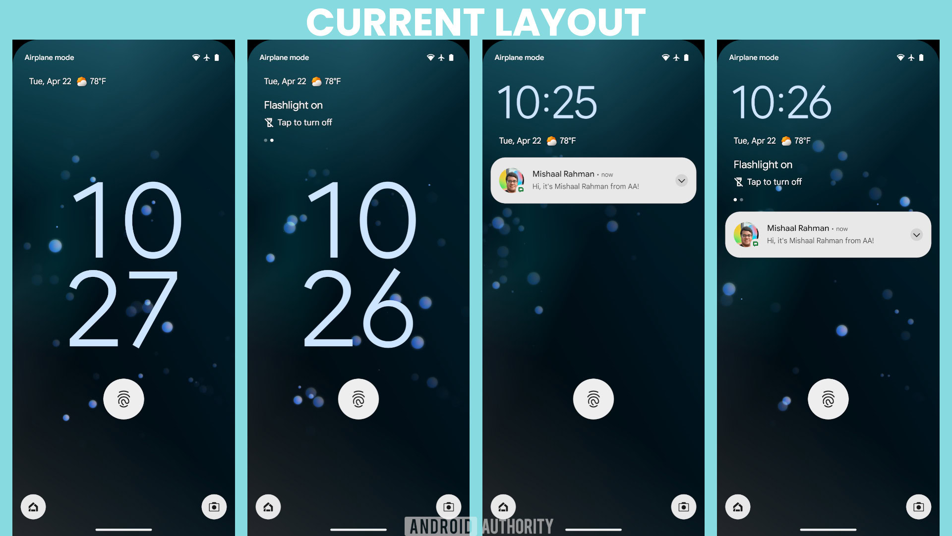
The current lock screen layout on Google Pixel phones places the At a Glance widget above the clock when the clock is centered, and below the clock when it’s at the top. The widget has three complications: one showing the date, another showing the weather, and a third displaying snippets of information from the OS and select apps (like Google Clock) in a horizontally scrolling carousel. (Android’s widget APIs don’t allow for horizontally scrolling widgets, which is why At a Glance isn’t technically a widget, but it’s the closest term.)
Notifications appear below the At a Glance widget. The number of notifications that can fit on the screen depends on whether the third informational complication is visible, as its presence reduces the space available for notifications.
Here’s a set of screenshots showing the current lock screen layout in Android 15 for reference:
Mishaal Rahman / Android Authority
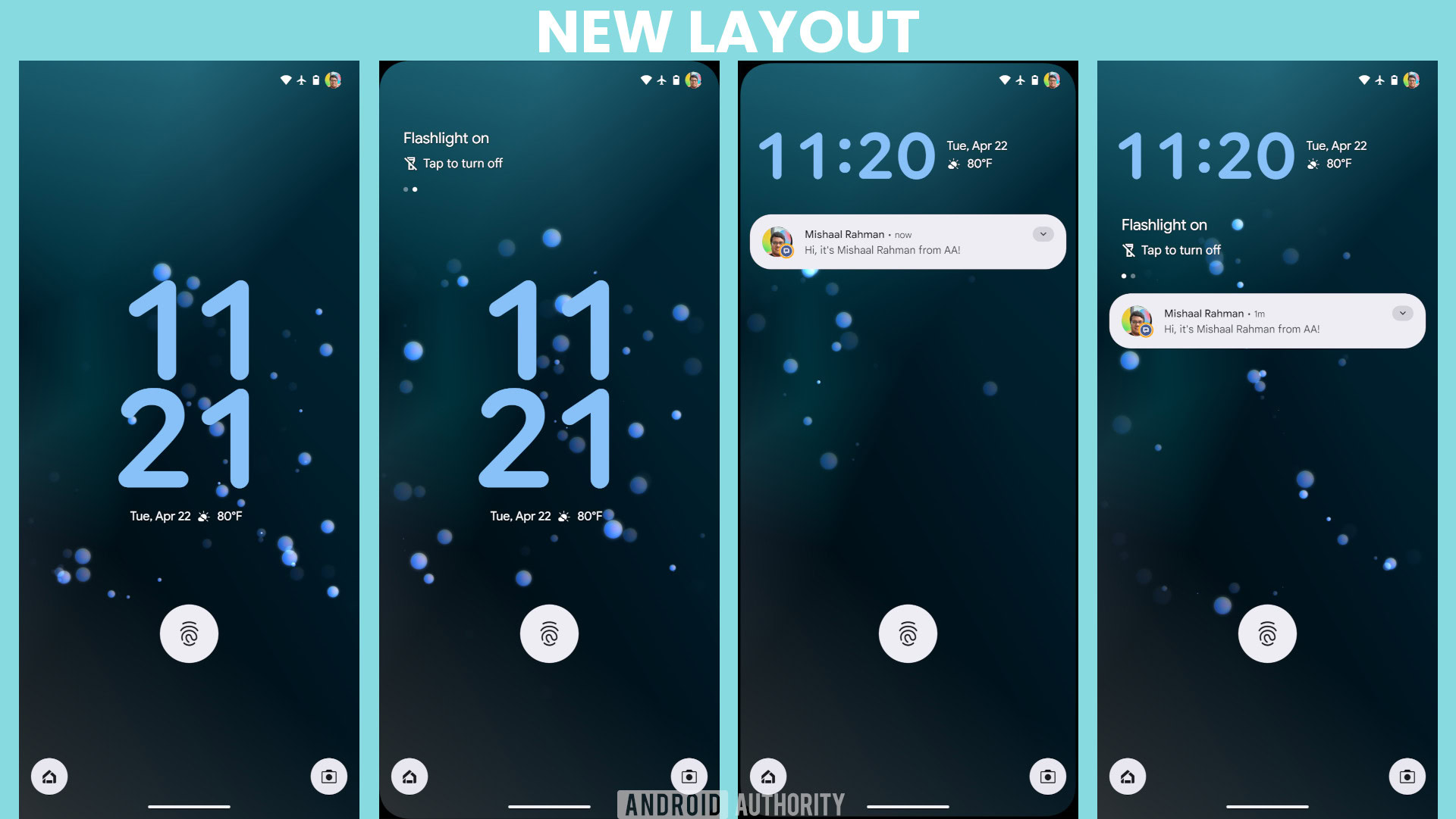
Hidden in the fourth beta of Android 16 is a new lock screen layout that relocates the At a Glance widget’s complications. The date and weather complications move below the clock when it’s centered and to the right of the clock when it’s at the top. The informational complication is now separate, sitting at the top when there are no notifications and below the clock when notifications are present. This separation results in a cleaner overall look for the lock screen.
Here’s a set of screenshots showing the new lock screen layout that Google is testing:
Mishaal Rahman / Android Authority
The new lock screen layout isn’t enabled by default in Android 16 Beta 4, but it’s fully functional once manually activated. We don’t know when Google plans to release this new layout, but it might arrive alongside other lock screen changes, such as the new compact notification shelf. Google is experimenting with several changes to declutter the lock screen; some, like this new layout and the compact shelf, seem likely candidates for release, while others, like the transparent notifications feature, seem less likely to launch. We think Google will probably roll out this new lock screen layout, but likely not in the upcoming stable release of Android 16.
See also Nearly 300,000 People Dumped Verizon Because Of Price Hikes. Are You Still Sticking Around?
Got a tip? Talk to us! Email our staff at [email protected]. You can stay anonymous or get credit for the info, it’s your choice.
What’s your reaction?
Love0
Sad0
Happy0
Sleepy0
Angry0
Dead0
Wink0



![[open-thread]-are-google-apps-still-great,-or-just-getting-in-their-own-way?](https://betadroid.in/wp-content/uploads/2025/05/21214-open-thread-are-google-apps-still-great-or-just-getting-in-their-own-way-370x250.jpg)

Leave a Reply
View Comments