

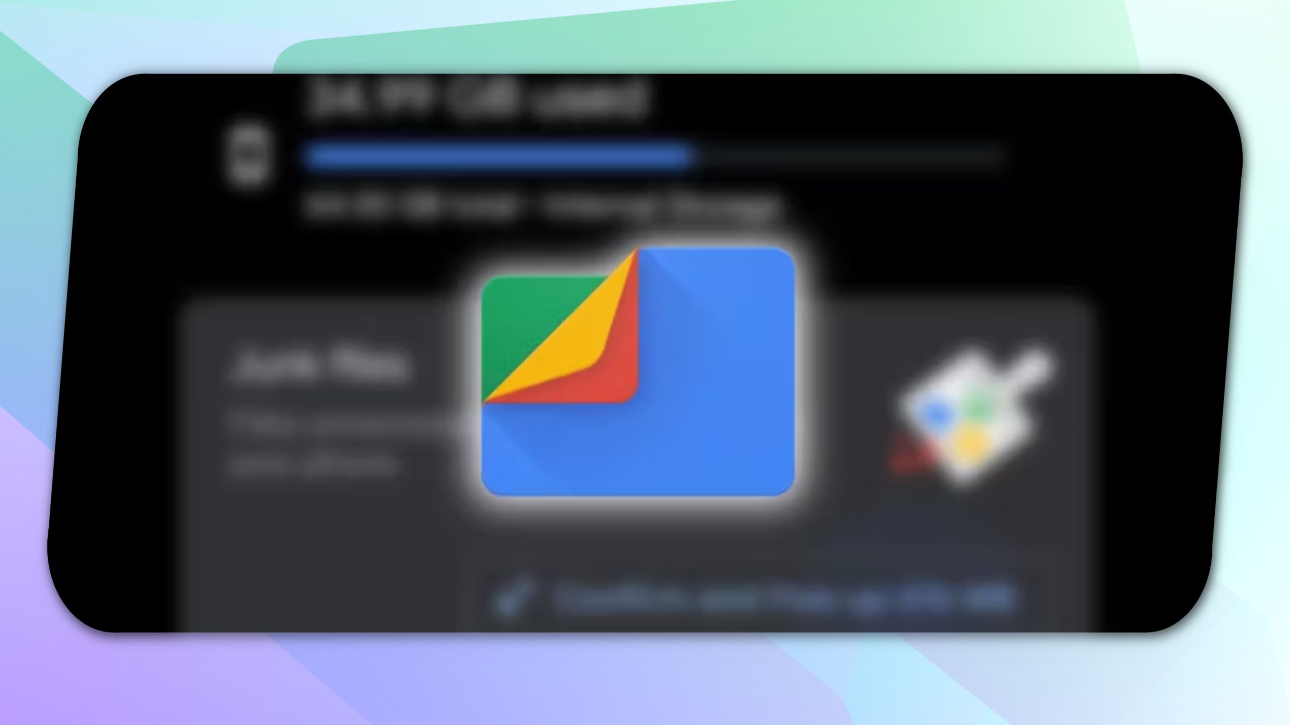
Files By Google Could Drop Its Old Look For Something Bolder


Sign in to your Android Police account
Summary
- Google is working on a Material 3 Expressive redesign for its Files by Google app.
- The redesign includes changes to the landing page (relocated FABs), image viewer (combined FABs), a new curvy progress bar, and a smaller sidebar.
- These Files app changes are still a work in progress, so the final avatar of the Files app may look different.
Android 16 is a big update and includes “expressive” UI elements, though these changes won’t be available right away after the Stable release next month. Those expressive interfaces will be available later in the year with a Pixel Feature Drop later in the year, allowing Google to revamp the design of not only the OS but also all its apps to achieve better design consistency.
Related
If not for all, the Mountain View tech giant has plans to give a design makeover in the form of Material 3 Expressive to at least some of its prominent apps, including the Files app. We’ve recently seen evidence of Google working towards introducing the new Material design to the Calendar app. Now, Android Authority’s APK teardown of the Files by Google v1.7528 beta suggests Material 3 Expressive for its file management app is also in the works.
What can we expect in a redesigned Files app?
Upon activating codes for Material 3 Expressive components, the folks over at Android Authority found some noteworthy changes to the app’s landing page, image viewer, sidebar, and the progress bar.
The updated landing page in the Files app features Quick Share and File Scanner FABs, but instead of appearing in the bottom right corner, they can now be spotted together in a pill-shaped UI element in the middle. This looks cleaner and minimal, but since they now appear side-by-side, we can’t rule out the possibility of you tapping the wrong option by mistake. In the same way, Edit and Circle to Search FABs are also being clubbed in a single pill-shaped UI in the image viewer of the Files app.
Image source: Android Authority
Another major change Google is working on in the Files app is a curvy design for the progress bar. As things stand in the current implementation, the curvy progress bar appears when you install an APK file or compress something into a ZIP file. Also, unlike the current progress bar, the updated one appears in the middle.
Of all the changes spotted in the APK teardown, the least exciting ones belong to the Sidebar, which now takes up less space on your screen because of its reduced size. We also notice that the space between the contents on the Sidebar has increased. Additionally, the “Privacy Policy” and “Terms of Service” options now appear on top of each other at the bottom.
Google is currently working on these changes, and the fact that Android Authority managed to activate them suggests that the company may be giving them a final touch. It’ll be interesting to see whether the Files app with Material 3 Expressive design rolls out along with the release of Pixel Feature Drop later in the year. Only time will tell whether these upcoming changes, if they make it to the final release, will play any role in helping the Files app climb the ranks of the best file managers.
