

Chrome’s Latest Android Update Stretches Edge-To-Edge For A Full-Screen Vibe

Sign in to your Android Police account
Summary
- With Chrome 135 on Android, the gesture bar now floats over content instead of blocking it with a solid chunk.
- Content now stretches to the screen’s edge, right under the navigation bar for that extra immersive feel.
- Even if you’ve updated Chrome 135, the edge-to-edge look is a server-side update and might roll in anytime this week if you haven’t seen it yet.
For a long time, Android apps could go full screen right up under the status and navigation bars, but most just didn’t bother. Even though the option was there, a lot of developers stuck with the old-school layout. With the release of Android 15, Google is now making edge-to-edge the new standard, meaning all apps have to play along. Some were already ahead of the game, but Google Chrome is just now catching up. With its latest update, the browser finally goes fully edge-to-edge, giving more users a clean, immersive look.
Related
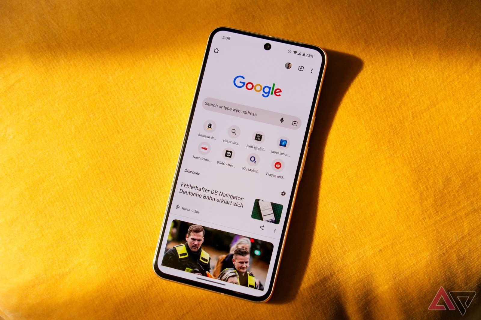
As spotted by the folks over at 9to5Google, Chrome 135 for Android is now rolling out a cleaner edge-to-edge look at the bottom of the screen. Now, when you scroll through a webpage, the gesture navigation bar just floats over the content, removing the solid background behind it.
No more solid navigation bar background
Google started testing this tweak last month on Chrome for Android. Now, with the latest update, content scrolls all the way down to the bottom edge of your screen. Basically, the viewport now dips into the space where the gesture navigation bar lives. As shown in the screenshot, Chrome’s UI hugs the bottom of your display, letting content flow underneath the navigation bar for a more immersive vibe.
This change doesn’t actually show more of the page, but it does bring Chrome in line with the edge-to-edge style that is becoming the norm on Android these days.
It’s a big departure from the old setup, where the gesture bar sat on a solid, opaque background. Now, content flows right behind it, giving Chrome a more fluid look that feels way more modern.
9to5Google reports that while Chrome 135 is rolling out widely via the Play Store, this edge-to-edge makeover is actually a server-side switch. More users have started spotting the new look this week, meaning it could pop up on your device any time now.
For now, this edge-to-edge look is hitting smaller phones first, while tablet support is coming later. However, it only works if you’re using gesture navigation. If you’re still rocking the classic three-button setup, this one’s not for you.
