


Android’s Media Output Switcher Could Get Its First Big Redesign Since Android 11

Mishaal Rahman / Android Authority
TL;DR
- Google is testing a new design for the media output switcher in Android 16 Beta 4, updating a UI largely unchanged since its Android 11 debut.
- Notable changes include moving the “connect a device” button higher and tweaking the volume slider to a thinner, continuous design matching Material Design 3.
- While the large pill around listed devices is removed, it remains uncertain if these changes are part of Google’s expected expressive new theme.
On the surface, the upcoming Android 16 release looks similar to the past several Android releases. That’s because the user interface changes Google is working on are still under development and aren’t ready to be shown to the public, including the redesigned media output switcher we spotted today.
You’re reading an Authority Insights story. Discover Authority Insights for more exclusive reports, app teardowns, leaks, and in-depth tech coverage you won’t find anywhere else.
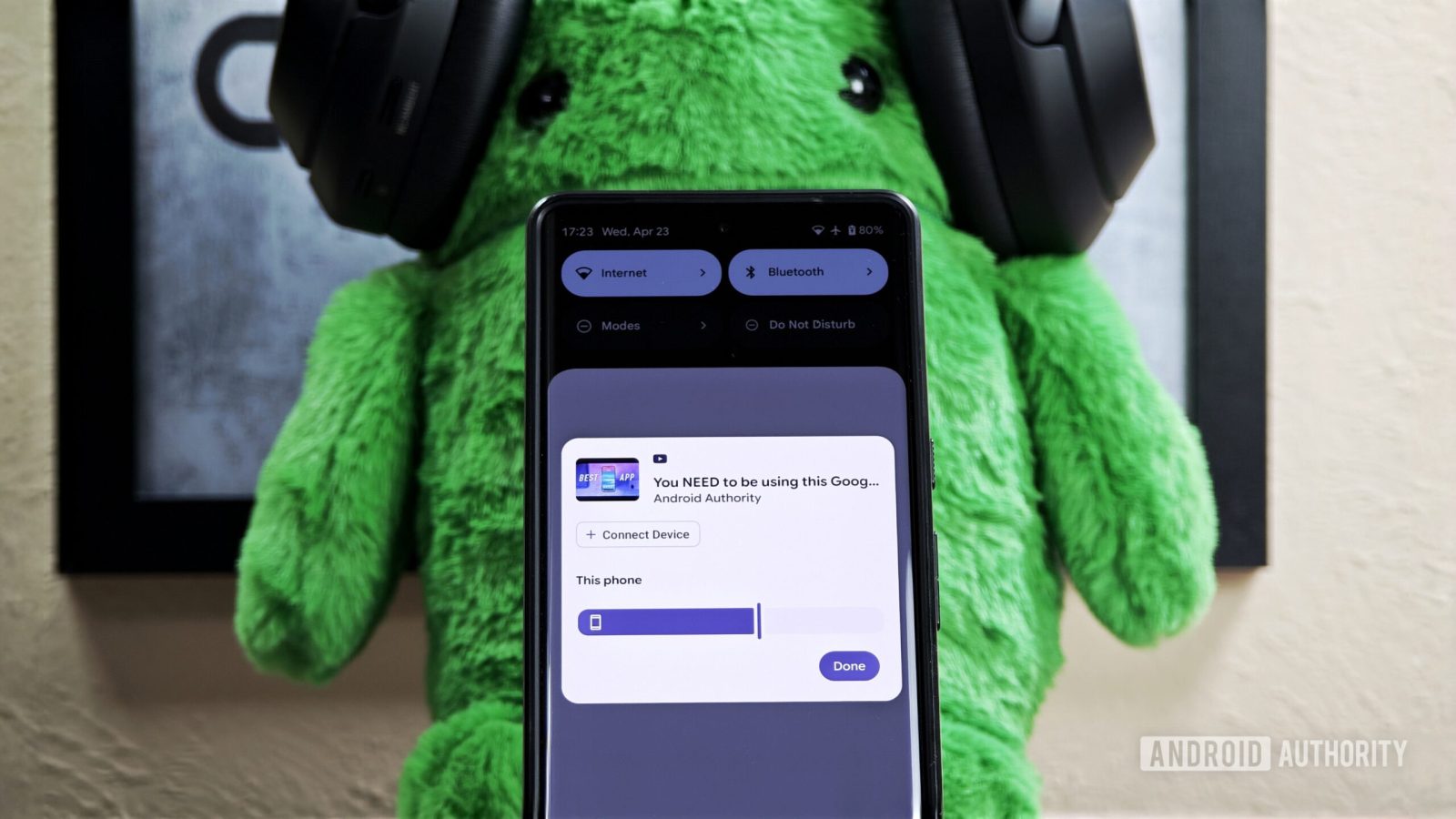
While digging into the new Android 16 Beta 4 update that Google released last week, we discovered the company is testing a new design for the media output switcher. This is the panel that pops out when you tap the chip in the top right of any media playback notification. It was introduced with Android 11 in 2020, but its UI has stayed relatively the same, except for a slight update in Android 14 which added a “Speakers & Displays” heading.
The current UI for the media output switcher, as seen in Android 15 on a Pixel device, is shown below.

Mishaal Rahman / Android Authority
In contrast, here’s the new UI for the media output switcher that Google is experimenting with in Android 16 Beta 4:

Mishaal Rahman / Android Authority
While the new UI isn’t dramatically different, there are a few noticeable changes. First, the “connect a device” button has moved from the bottom of the list to just below the media info at the top. Second, the slider controlling the volume for the current output device has been tweaked. Instead of a thick, pill-shaped slider with the device name enclosed within, it’s now a thinner, continuous slider with the device name placed above the handle. This new volume slider design aligns better with Google’s Material Design 3 guidelines for sliders and matches the new volume UI we previously spotted in an earlier Android 16 release. The slider also shows a more appropriate icon for connected devices – in this case, a pair of earbuds. Lastly, the large pill enclosing each device under “Speakers & Displays” is gone, which I feel is the only downgrade in this redesign.
It’s hard to say whether these design changes are part of Google’s expressive new Material Design theme, but given the timing of this discovery relative to the other UI changes we spotted, there’s a distinct possibility. We’ll hopefully find out more about Google’s design plans at next month’s event. In the meantime, what do you think of this new design for the media output switcher? Let us know in the comments below!
Got a tip? Talk to us! Email our staff at [email protected]. You can stay anonymous or get credit for the info, it’s your choice.
