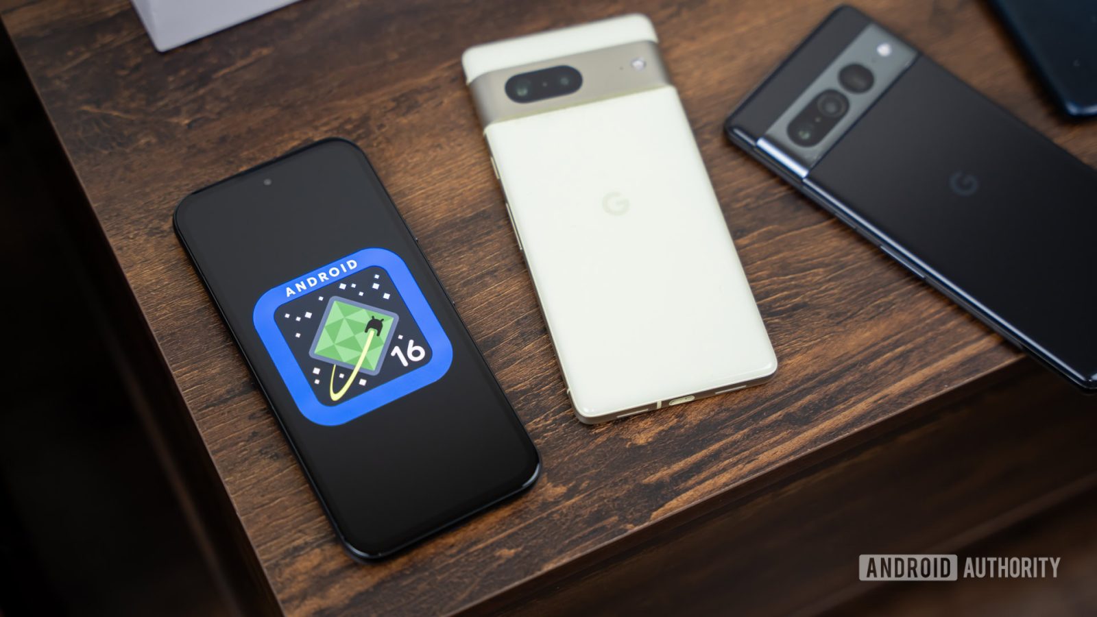

Edgar Cervantes / Android Authority
TL;DR
- Android 16 Quarterly Platform Release 1 Beta 1 is now available for Pixel devices enrolled in the beta program.
- This new beta build has some Material 3 Expressive aesthetic changes, including a new signal strength bar indicator when using multiple SIMs.
- The dual SIM signal strength indicator looks very similar to iOS, with two signal bars on top of each other, but the main SIM being slightly larger.
With the rise of eSIMs, more and more phones support dual-SIM connectivity, often pairing your main physical SIM card with a secondary eSIM, so you can have two phone numbers on (possibly) multiple carriers. Not everyone needs to use more than one SIM at a time very often, but it’s particularly useful for international travel or work. Right now, Android displays two signal strength indicators side-by-side, which isn’t the best layout, but that’s changing in Android 16.

New dual-SIM signal bars in Android 16 QPR1 Beta 1. (Credit: rbrtxd / Reddit)

New dual-SIM signal bars without Wi-Fi in Android 16 QPR1 Beta 1. (Credit: rbrtxd / Reddit)

Current dual-SIM signal bars in Android 15. (Credit: nedamdam / Reddit)
Google is updating the look of the signal strength indicators in the status bar in the latest Android 16 Quarterly Platform Release 1 Beta 1. As spotted by Reddit user rbrtxd, the new icon has two signal bars on top of each other, with the main SIM on top appearing slightly larger than the secondary SIM on the bottom.
This new look is a lot easier to understand than the previous one, which features two signal strength icons next to each other with no discernible difference between them. It’s also hard to tell the actual level of strength with the current one, since there are no separation indicator between the signal bars.

It looks like Google is taking some pages out of Apple’s playbook, however. This new dual SIM signal strength icon looks very much like what is currently in iOS 18, and Google also seems inspired by Apple with the upcoming battery icon changes too.
Despite looking like Google’s inspired by Apple, it seems like users are mostly welcoming of this change. From the Reddit discussion, users weren’t big fans of the previous design, saying that this new look is good and long overdue, and saves spacein the status bar. Another user commented that it now “looks like the phone is surprised that it has a mobile signal,” as it looks like four exclamation marks (!!!!).
Got a tip? Talk to us! Email our staff at [email protected]. You can stay anonymous or get credit for the info, it’s your choice.
What’s your reaction?
Love0
Sad0
Happy0
Sleepy0
Angry0
Dead0
Wink0


Leave a Reply
View Comments