

Android 16 Could Offer A Bigger UI Refresh Than Previously Expected, And We’re All For It
Contents
Summary
- Hidden visual changes discovered in Android 16 Beta 4 suggest Google is preparing a significant UI refresh, though it might not materialize with the initial stable release.
- These design tweaks are expected to roll out in future quarterly updates and are linked to the new “expressive” Material Design 3 language Google will soon unveil.
- The upcoming changes include more background blur effects, redesigned status bar icons, an updated Quick Settings panel, a cleaner lock screen, refreshed volume controls, and new customization options like icon shapes.
Google might be working on a massive revamp of Android’s UI, and hints pointing at it are hidden right within mid-April’s Android 16 Beta 4.
Although said UI changes aren’t expected to go live with the initial stable release of Android 16 sometime in June, the same can not be said for subsequent quarterly updates, and with Google expected to show off its new “expressive” Material 3 design language at I/O or at ‘The Android Show’ later in May, this feels like a repeat of 2021’s Material You unveiling.
Related
There’s a slew of changes that enthusiasts can look forward to — revealed courtesy of Android expert Mishaal Rahman in a report for Android Authority. Some of these changes have been spotted in the past, while others are entirely new. Regardless, they all share one thing in common, and you might or might not like it — they make Android look more like One UI and iOS.
Here’s a breakdown of several, but likely not all, changes that users can expect with eventual quarterly releases.
New status bar icons
Related
First spotted all the way back in April 2024, Google’s revamped status bar icons were initially expected to go live with Android 15, but that never happened. They’re now expected to land in the later stages of Android 16’s lifecycle, bringing not just thicker airplane mode and 5G icons, but also color-coded battery indicators and an iOS-like Wi-Fi signal strength icon.
- White: Indicates that your device has sufficient battery and isn’t charging.
- Green: Indicates that your device is charging.
- Red: Indicates that your phone is running low on battery.
One-tap toggles for Wi-Fi and Bluetooth might be on the way
Related
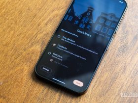
Google was previously reported to be eyeing a notification and Quick Settings panel split, akin to the change made by Samsung with OneUI 7. Although that change is reportedly still in the works, it will likely not be released any time soon, considering that Google is working on other quality of life tweaks for the familiar combined panel.
Rahman suggests that these changes could very well have been designed for the split menu, but they’ll likely be integrated with the unified one. Changes include one-tap toggles for Wi-Fi and Bluetooth, resizable Quick Settings Tiles, better organization for tiles, and an overall distinct look with blurred backgrounds.
Eagle-eyed users would have also spotted that expandable tiles now feature a down-pointing arrow (˅) instead of a right-pointing one (>). Elsewhere, the tweaked Wi-Fi icon, as seen in the new status bar, also makes its way to its designated Quick Setting tile, alongside a revamped brightness slider that is less curved than what users are currently familiar with.
Elsewhere, taking a page straight out of iOS and OneUI, the potentially upcoming panel (seen on the right in the three images above) will introduce blurred backgrounds, essentially letting hints of your chosen wallpaper shine through when you’re toggling through settings. However, the Quick Settings/Notification panel isn’t the only area that will let your home screen wallpaper shine through.
App drawer, ‘recents’ menu and PIN screen might also gain background blur
All the above-mentioned screens currently surface a solid light gray or dark gray background. If Google goes through with the background blur change, these areas will also highlight your chosen wallpaper, as seen in the images above.
These changes might clean up your lock screen
Related
The previously-spotted compact notification shelf could be paired with a subtly refined lock screen layout. Rahman suggests that a future Android 16 release might relocate your lock screen’s clock, date, and weather information. You’ll reportedly be able to move the clock to the center of your lock screen, with date and weather information dynamically appearing right below it.
The PIN-input screen, on the other hand, could align with Material You, highlighting the entry dots in accordance to your theme. Elsewhere, while not a huge change, the numbers on the PIN input screen will likely be bigger and bolder than before.
Source: Android Authority
Volume and icon changes
Akin to the Google Search widget’s Transparency slider, Google might give all Android 16 volume sliders a dedicated handle. Spotted in action earlier in January this year, the thick, pill-shaped sliders might be replaced with sleeker sliders on all relevant screens, including the main volume panel, the slider that appears when you press a volume key, and the media output switcher.
Additionally, to bring additional customization to your home screen and app drawer, Google might also finally unlock a new icon shape customization option. For what it’s worth, you won’t be able to create your own custom shapes, but you will be able to pick from five new pre-made options. These include square, four-sided cookie, seven-sided cookie, arch, and complex clover.
Some of these changes could be here with the initial Android 16 stable rollout, though a majority of the changes, especially the ones that exude ‘expressive-ness,’ like the previously spotted Settings and Google Account management revamps, will have to wait until later.
Related
