![what’s-new-in-android’s-may-2025-google-system-updates-[u:-5/19]](https://betadroid.in/wp-content/uploads/2025/05/21380-whats-new-in-androids-may-2025-google-system-updates-u-5-19-280x210.jpg)


Android 16 Could Bring A Splash Of Color To Your Otherwise Dull Google Account Management Screen

Summary
- Android 16 Beta 4, the final beta before the stable release, contains hints about features coming in later updates beyond the initial June launch.
- A notable upcoming change is a revamped Google account settings menu with a more colorful design, a vertical list layout replacing the old carousel, distinctive icons, and updated section views.
- This colorful account settings redesign is expected to roll out alongside a similar system settings refresh, likely arriving in a future Feature Drop rather than with the initial Android 16 stable release.
April is coming to a cose, and that means there’s only the month of May between us and the coveted release of Google’s Android 16 in stable.
The Operating Sytem (OS), for reference, hit platform stability with the release of Android 16 Beta 3 back in March, followed by Beta 4, which brought some polishing touches and bug fixes. Hidden within the final beta, however, are also clues that point to future updates, ones that would likely arrive with subsequent quarterly releases.
Related
Said features could include an option to let Pixel users turn off their screens with a double-tap gesture, a new lock screen layout, the expansion of Identity Check to non-Google and Samsung devices, and more.
Now, the latest clues point to Android 16 bringing a revamped Google account settings menu, one that looks similar to the previously-spotted system settings menu refresh.
Source: Android Authority
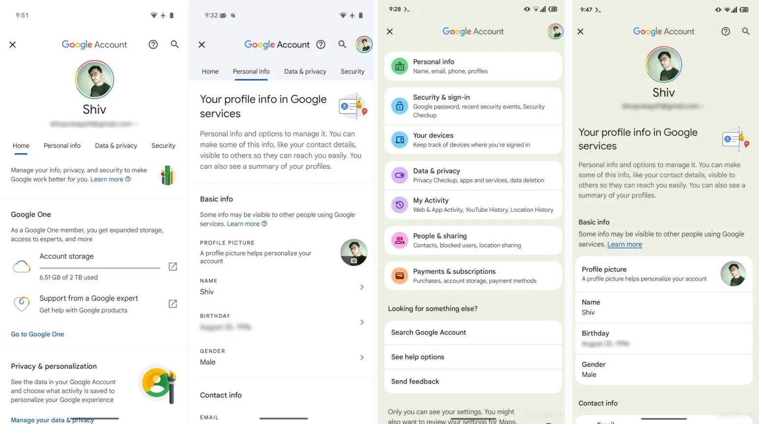
Current, current, new, new
The redesign, which is clearly more color-heavy than the UI we have now, changes the page’s carousel layout to a vertical list — complete with distinctive and colorful icons for each setting, as highlighted by the folks over at Android Authority.
It gives My Activity its own setting page, where users can go through their “Web & App Activity, YouTube History, Location History,” paired with a name change for the current Security setting into Security & sign-in. Additionally, while the redesign is apparent on the main Google account management screen, the pages for each subsequent listed setting appear to have been tweaked too.
The Personal info section, for example, now houses information within bubbles with curved edges. Previously, said information was laid out within less visually defined areas.
It is currently unclear whether the UI redesign will make its way to user devices with the forthcoming Android 16 stable release in June. It is very likely that the Google account management screen’s redesign will only go live when the initial native Settings one does, and previous information suggests that this may not occur until a subsequent Feature Drop.
