![bring-back-unique-smartphones-[video]](https://betadroid.in/wp-content/uploads/2025/05/22489-bring-back-unique-smartphones-video-280x210.jpg)


5 Material 3 Expressive Changes I’m Already Loving In Android 16 QPR1 Beta 1
Google’s big I/O keynote address this week was almost entirely about AI: we saw real-time AI translation, AI video (now with sound!), AI music, enterprise AI tools — on and on. Google jammed most of its I/O-adjacent Android info into a separate streamed presentation that aired the week before its annual developer conference started.
One of the more exciting bits of the pre-I/O Android Show detailed Material 3 Expressive, Google’s new UX design language. Expressive isn’t coming in the forthcoming Android 16 release, but shortly after I/O keynote address, Google dropped the first beta for Android 16 QPR1, which features a lot of Material 3 Expressive’s new odds and ends. I started using the beta that day, and I gotta say, I really like what I’m seeing. Here are five of my favorite expressive changes as tested on my Pixel 9 Pro.
5 Clearer status bar icons
Material 3 Expressive brings with it updated status bar icons that are more rounded and easier to read. In contrast to the solid, angular look the Wi-Fi and mobile data indicators have carried for the past few years, in Android 16 QPR1, those icons are segmented into three and four discrete parts respectively, more clearly illustrating your levels of reception.
There’s also a new battery icon that’s in horizontal orientation rather than the vertical version we’ve gotten used to. Being bigger, the updated icon makes it easier to see at a glance how much juice you’ve got left.
In screenshots that surfaced before Material 3 Expressive was available to try, I wasn’t especially excited about the new iconography here. It looks more like software from other manufacturer’s software than the old designs did — iOS in particular. But by being more legible, the new status bar icons work toward Material 3 Expressive’s goal of making software easier to parse at a glance, and I can’t complain about that.
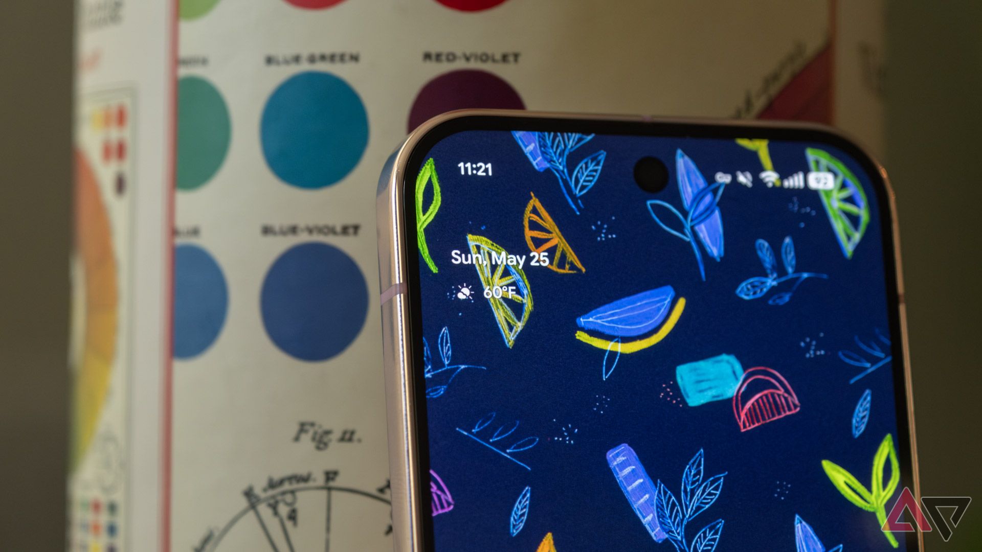
4 The new lock screen
Android’s lock screen is getting a facelift with Material 3 Expressive. When there are no notifications to display, the date and weather are moved under the clock, giving the interface a cleaner, more symmetrical look.
More importantly, there’s a change to lock screen notifications seemingly inspired by Samsung’s One UI. In Android 16 QPR1, notifications are automatically collapsed on the lock screen, displayed as small app icons rather than full-size notification banners. This has been a work in progress since at least November.
Unlike Samsung’s implementation, though, in Google’s flavor of Android, your most recent notification will still be displayed as a banner until you expand your notifications, after which it’ll shrink down to an icon. I think that’s a great tweak: it helps you parse at a glance whether you have any unseen notifications or you can go back to ignoring your phone after a quick peek at the lock screen.
Of course, if you’re not into it, you do have the option to revert back to the older full-banner style.
3 Bouncy new animations
Material 3 Expressive brings a lot of flavorful new animations that aren’t exactly crucial to the experience, but make navigating your phone more fun and tactile. When slowly swiping away notifications, they’ll sort of stick together until the one you’re dismissing *snaps* away from the rest. On Pixel 9, this animation is accompanied by a subtle haptic effect that mirrors what you’re seeing on-screen.
There’s a similar animation when you start to swipe an app away in your recent apps menu, then release it — the app bounces back down into place, causing a sort of ripple effect on the adjacent app’s cards. None of this stuff is all that big for usability, but it makes Android *feel* better to navigate. It’s also just plain fun.
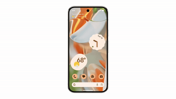
On Pixel, Android 16 QPR1 Beta 1 shrinks the persistent At a Glance home screen widget, a change that frees up more space for apps and other widgets. By default, the reconfigured home screen grid has room for an additional five-space-wide row. I don’t generally max out my home screen real estate, but the option to cram more apps and widgets into a single view is a win for more intensive users.
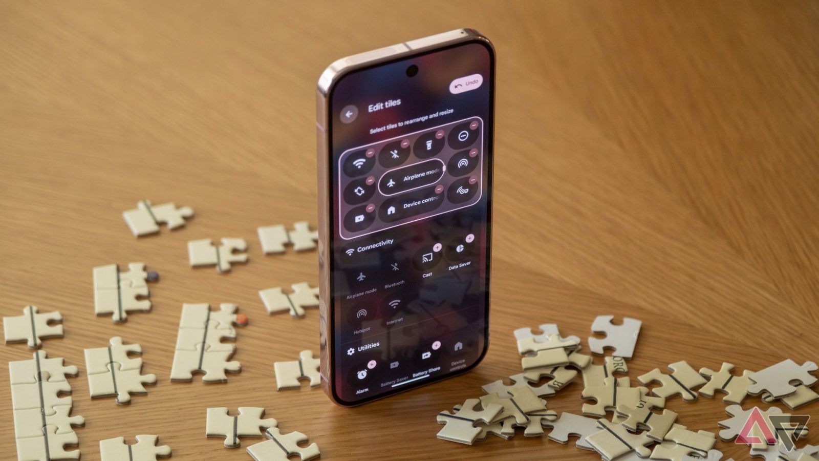
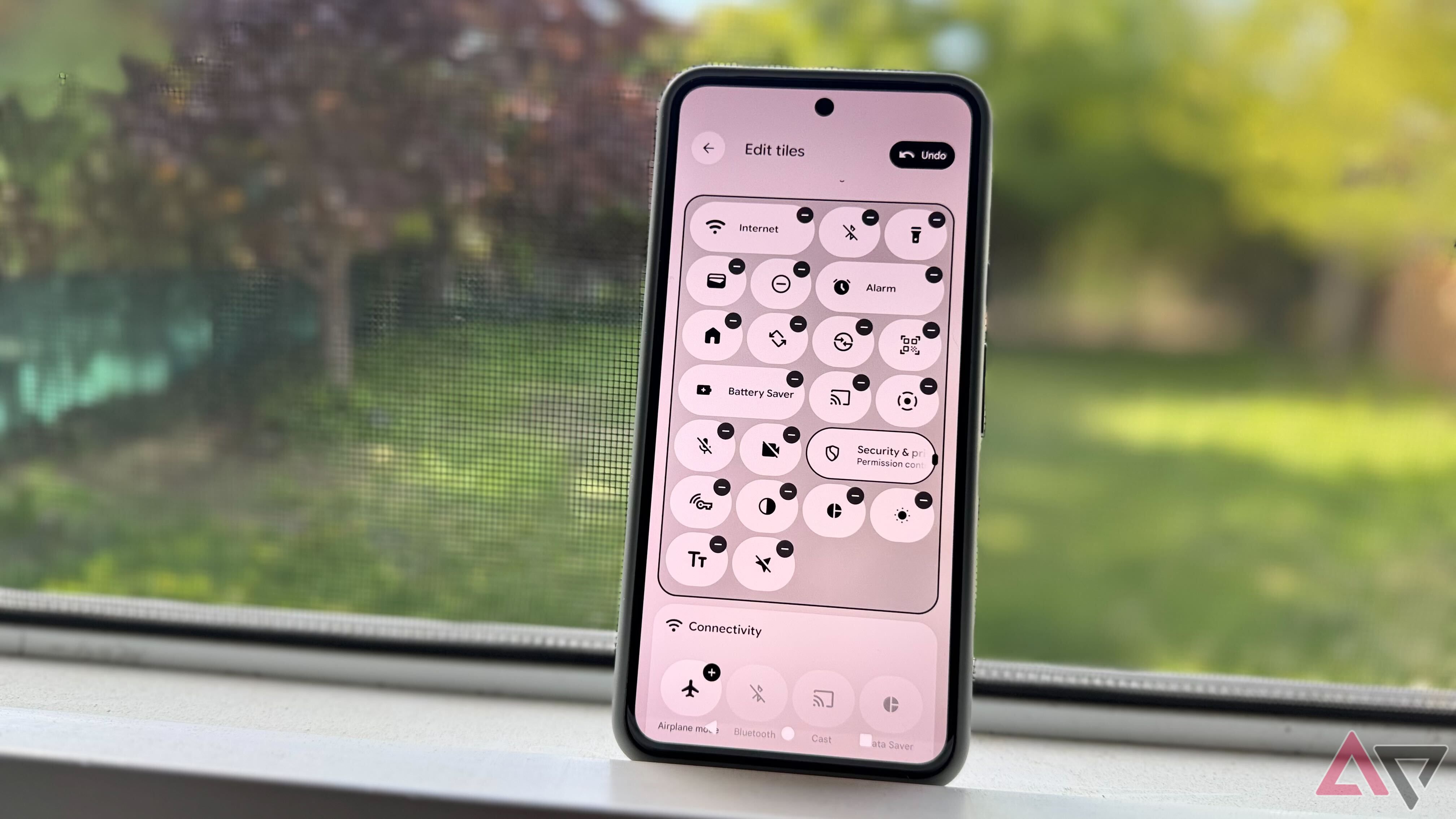
1 Improved quick settings
Android 16 QPR1 Beta 1 introduces major changes to Android’s quick settings panel. It’s got a new look, with some refreshed iconography and tiles that change shape depending on whether the given setting is active or not — they’re squarer when they’re on and more rounded when they’re off.
The big change, though, is that you can now resize the quick settings tiles. They’re the same size as before by default, but if you press and hold on one in the editing view, you can shrink it down to half size. That means you can have up to eight quick settings tiles visible without having to fully expand the panel, up from four in previous designs.
I wish this were part of Android 16’s stable rollout
Android’s had the same basic look and feel for a few years running now, so Material 3 Expressive feels like a breath of fresh air. The changes present in Android 16 QPR1 Beta 1 are significant enough to enhance the experience around the margins, but not so drastic that they’ll be difficult to come to grips with for more casual users. It’s a shame Material 3 Expressive isn’t rolling out with stable Android 16 next month, but the latest beta feels smooth and stable — at least on my 9 Pro.
And of course, this is Google’s Android — competing OEMs apply their own skins that will cover up most of these tweaks. Ideally, the changes Google is making here will influence the way other manufacturers craft their own software, but it’ll likely be months before we see if that’s the case.
Android 16 QPR1 Beta 1 is available for Pixel devices right now with Material 3 Expressive elements in tow. Google says that the new design language will come to stable Android and the company’s own apps later this year.
