Sign in to your Android Police account

Summary
- Google is testing a dynamic resizing carousel for the “Recents” view in Files by Google, where thumbnails animate and resize as you scroll, similar to the Google Photos app.
- This potential update also includes a subtle layout tweak, moving the three-dot menu for file options from the bottom to the top of the thumbnails.
- These changes are currently not live and require manual enabling in the latest app build, suggesting Google is actively exploring this updated interface for a future release.
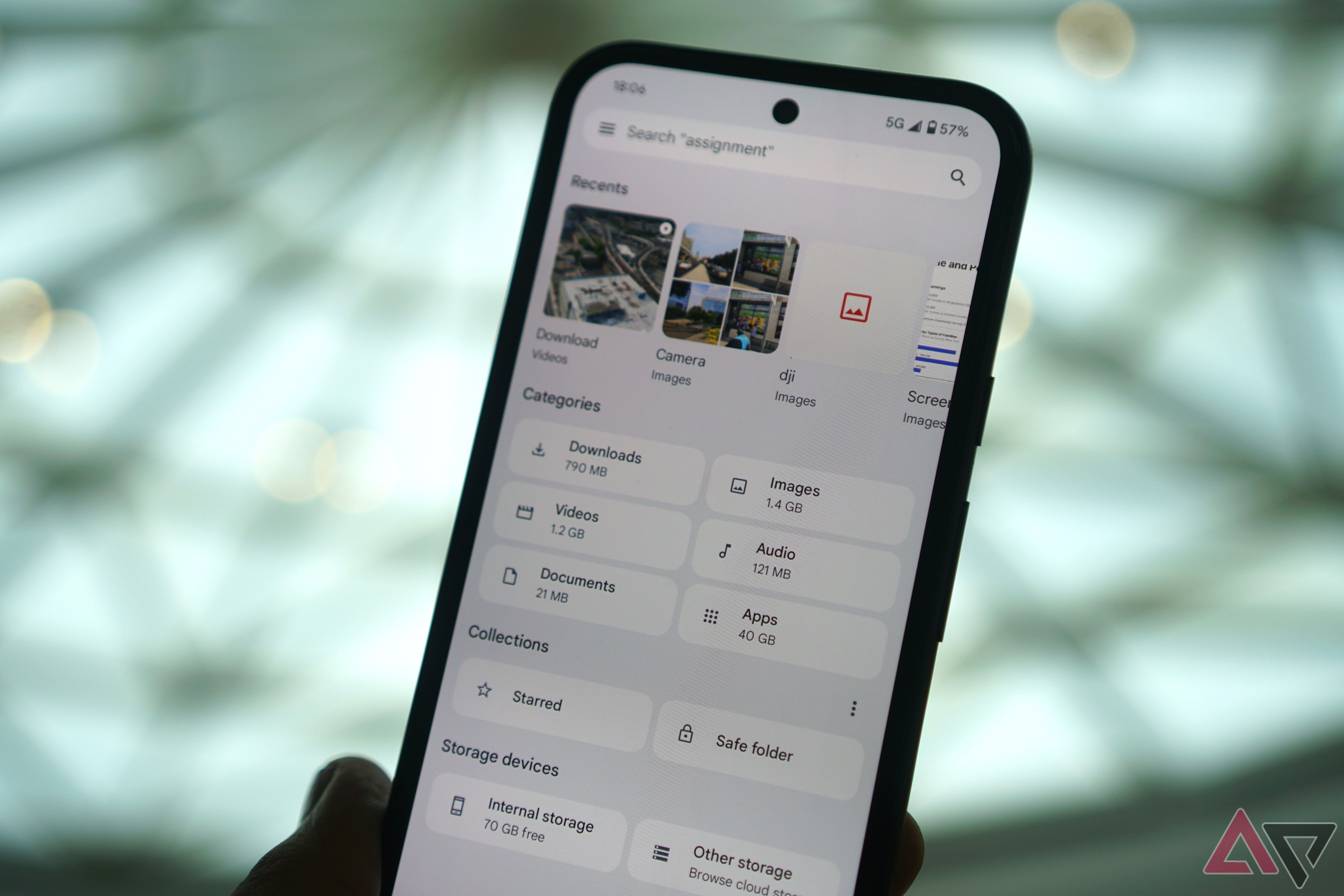
Files by Google, colloquially also known as Google Files, is a solid tool for users looking to seamlessly manage the countless images, videos, documents, and apps that they’ve hoarded on their Android device. Not only does the app automatically categorize files into relevant folders, like Downloads, it also lets you check your device and cloud storage at a glance, paired with scanning and Quick Share support built-in.
Back in late July last year, the app gained a quality-of-life UI tweak that changed its static 2×2 view of ‘Recents’ folders to a side-scrolling carousel that highlighted your 10 most recent screenshots, downloads, camera photos, and more.

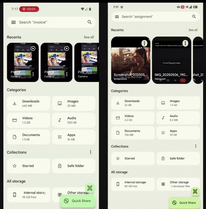
Not only did the UI tweak make it easier to find relevant files quickly, it also gave the app a significantly more modern look and feel. Now, in an attempt to do more of the same, Google is reportedly working on another tweak to the Recents carousel, one that makes it more dynamically active.
Spotted in a new Files by Google build (version 1.7388.754580060.0-release), the folks over at Android Authority shared a video of the tweak in action, with the carousel donning a ‘dynamically-resizing’ look similar to Google Photos.
Expect the tweak to be generally available soon

Source: Android Authority
Old (left), new (right)
Subtle tweaks include the relocation of the file’s three-dot-menu from the bottom right to the top right, paired with, of course, the dynamically changing carousel. The file thumbnails themselves appear larger than before, with more of the file’s name now being highlighted.
For what it’s worth, the incremental alterations aren’t live yet; they had to be manually enabled. However, there’s little doubt that Google is actively exploring rolling out the tweak in a future update.
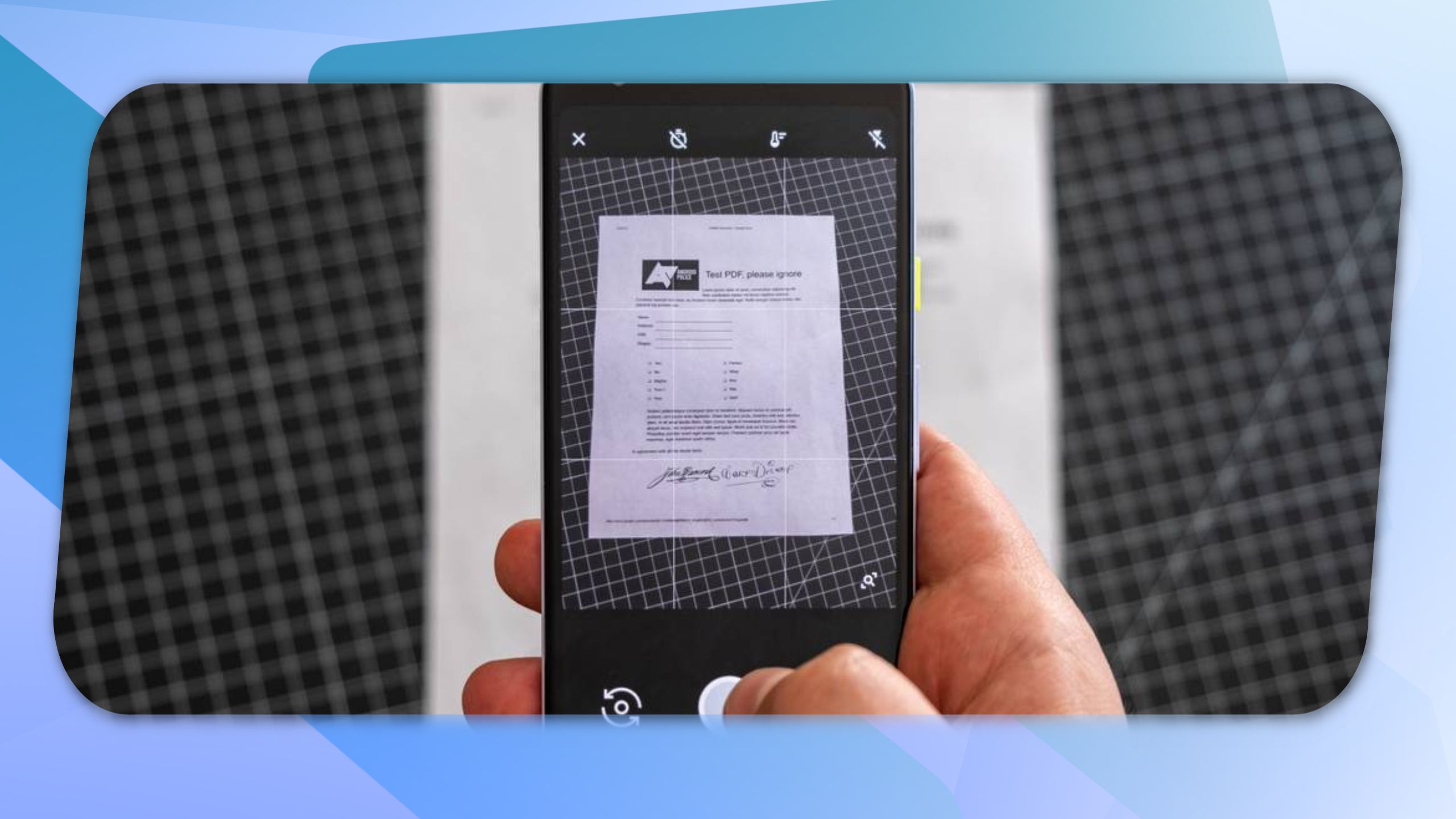
This comes soon after Google pushed updates to its MLKit document scanner, which brings enhancements to apps like Files by Google and Drive. These apps now enhance newly-scanned documents automatically, a feature that was previously only available manually.