


Signing up for a paid online service takes fewer steps than canceling a subscription, and Unsubscribe links in newsletters are tiny and at the bottom. Also, some shopping sites have countdown timers on their offers. These aren’t arbitrary design choices. These are examples of dark patterns, experiences designed to influence user behavior in ways that benefit the business, often at the user’s expense.
For instance, imagine adding one of the best rugged Android phones to your online cart, and a pop-up invites you to include a protection plan to your purchase. By making the Decline button smaller or placing it in a less intuitive spot, the business subconsciously nudges you into buying something you didn’t intend to. Dark patterns are all over the web and are worryingly deceptive, so it’s worth knowing how to identify them.

Related
How do dark patterns work?
They’re everywhere and come in many flavors
Dark patterns rely on flaws and traits of human behavior to serve the needs of a business. One of them is our tendency to take the path of least resistance. That’s why allowing a website to collect personal data, which helps it make more money by serving more effective advertisements, takes a single click. However, the button to opt out may be in a different sub-menu and labeled in a way that confuses you into allowing data collection. When the screen gives you radio buttons to make your selection, the option picked by default is the one the business wants you to choose.
Other dark patterns try to create a sense of urgency or scarcity, increasing the chance of a user making an impulse purchase. Examples of this are common on booking sites, which have countdown timers for when a price (allegedly) expires or a ticker for every time another user makes a reservation. Spoiler alert: Sometimes these are fake, as revealed by Computer Clan on YouTube in his scam-exposing videos.
Then there are a bunch of tricks dark patterns use to play on our emotions. A famous example is that of Duolingo and its owl mascot, which popped up crying in your email inbox if you didn’t use the app for a set time. Also, some mobile games remind you regularly that your virtual pets miss your company. It’s not uncommon for apps and websites to use manipulative language to shame you for canceling a subscription or declining the 10% coupon you’d get if you sign up for their newsletter.

Related
Are dark patterns effective?
Yes, absolutely!
Popular examples of dark patterns: misleading buttons, nagging notifications, confusing labels, and disingenuous discounts.
The subtle tricks that apps and websites leverage to manipulate the user experience fall on a broad spectrum. Some are more effective than others. A 2021 study published in the Journal of Legal Analysis found that even mild use of dark patterns significantly impacted a test group of American consumers. A more aggressive set had an even stronger effect, with people “almost four times as likely to subscribe” to a fictional service.
Another study published in 2022 by Cambridge University Press concluded that scarcity tactics and social confirmations (for example, user reviews) result in a “significantly higher buying impulse”. So yes, dark patterns work, which is why they are common across the web.

Related
6 apps that help you monitor and reduce screen time
Reclaim your time with these Android apps designed to reduce smartphone addiction
So, what’s wrong with that?
One might argue that it’s natural for businesses to seek expansion, and I agree with that. To survive and grow, a company must sell more and keep its visitors engaged and satisfied. However, it’s not okay to deceive and mislead users away from their best interest solely to boost profits.
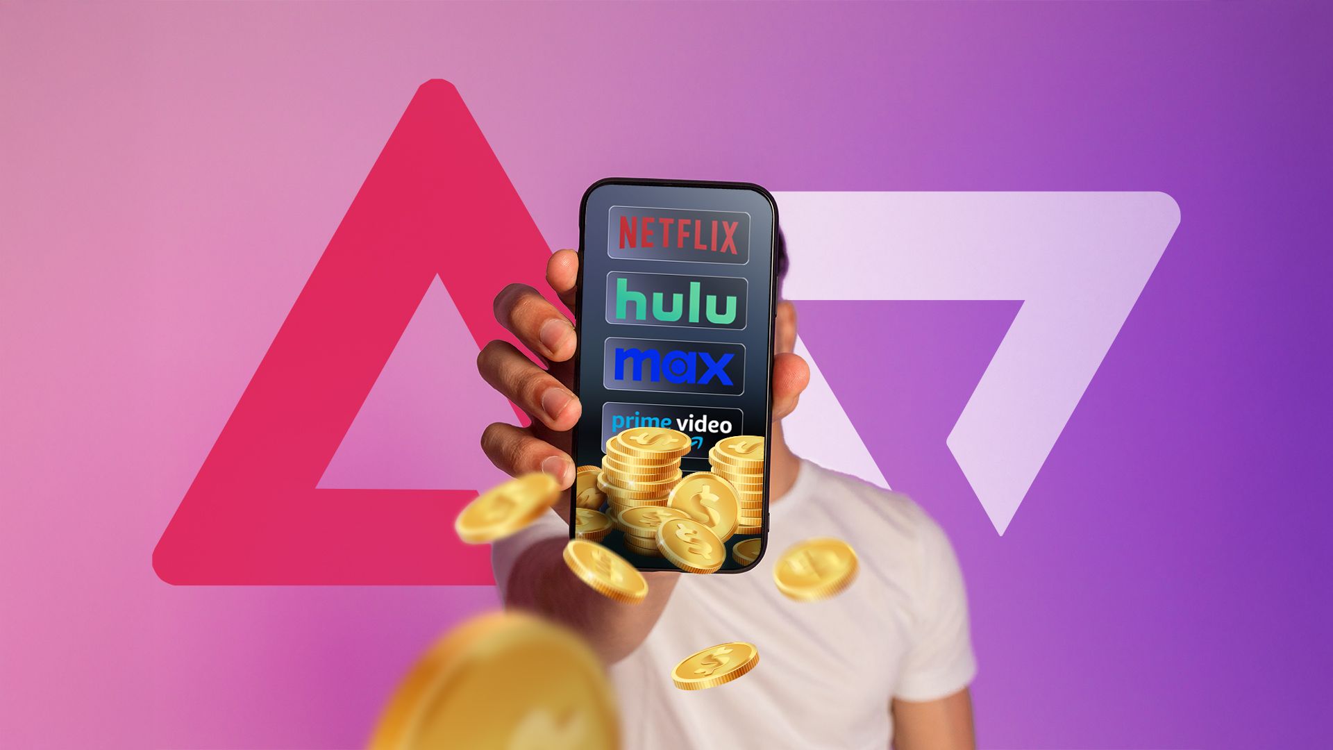
I’m not the only one who feels this way. In 2024, the FTC finalized its Click-to-Cancel rules, taking action against prohibitively difficult cancelation processes for memberships and subscriptions. The rules resulted from Adobe obscuring the cancellation fees that came with its plans, but they apply to almost every subscription service, whether online or in the real world. Canceling a membership must be as easy as signing up for it.
Are dark patterns here to stay?


I believe aggressive and unethical deceptive designs have a lower chance of long-term survival. Despite their greater effectiveness, I expect rules and regulations to hurt their popularity, while increased awareness and digital literacy should make it easier for users to identify them.
However, the tamer, milder dark patterns are probably here to stay. Even if a business minimizes questionable tactics in the name of honesty and transparency, it risks losing customers to competitors who are less concerned with ethics. It’s up to us to read the fine print, do our research, and resist the urge to buy things we don’t need. While we’re at it, we could be more cautious with the online subscriptions we sign up for.

