


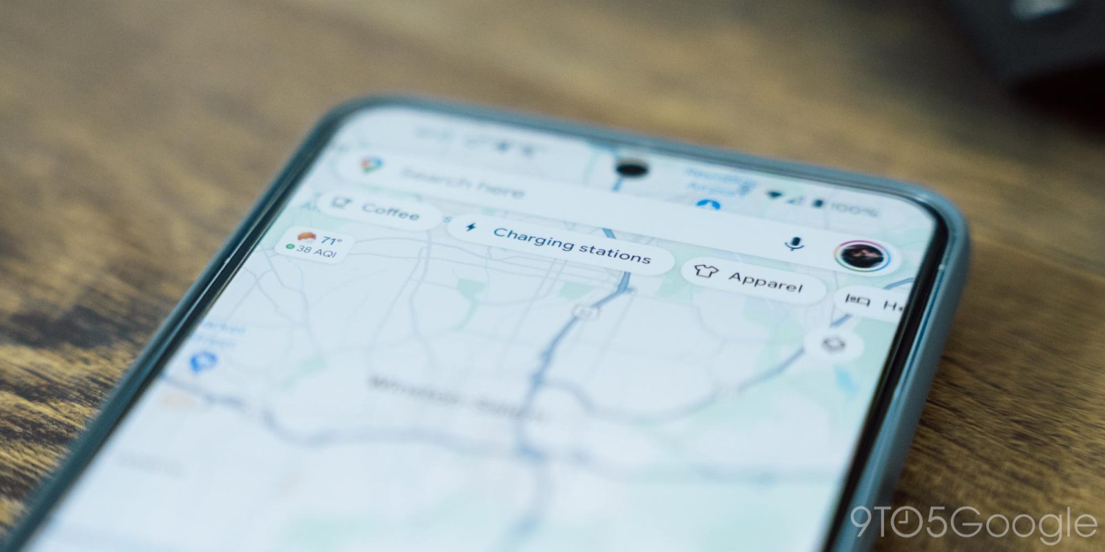
If something about Google Maps on Android and iOS looks different to you, it’s because the logo that appears in the bottom-left corner of every single map has been updated.
Previously, the four-color “Google” logo (with a white border) appeared in the bottom-left corner of the map layer. On tablets, foldables, and desktop, it’s centered at the bottom edge of the right column.
In recent weeks (the “old” screenshot at the left is from mid-May), it became “Google Maps” with black or white text depending on your system/device theme. Like other first-party product logos, “Google” is thicker than “Maps.”
Old vs. new
This is an interesting branding change for the application, which already has the multi-color pin icon in the search bar. Black/white is somewhat less distracting than the four-color version, especially in fullscreen mode (swipe up on the search field). Then again, the map layer is already pretty busy, so this isn’t a huge reduction.
We’re seeing this Google Maps logo change widely rolled out on Android (version 25.21) and iOS (25.22). It has yet to be updated on maps.google.com.
More on Google Maps:
- Google Maps lets you customize your car icon on Android Auto and CarPlay – how to do it
- Google Maps for iPhone can now scan your screenshots to save places
- Google confirms removal of Assistant ‘Driving Mode’
- Google Maps rolling out full sheet redesign on Android
Add 9to5Google to your Google News feed.
FTC: We use income earning auto affiliate links. More.


