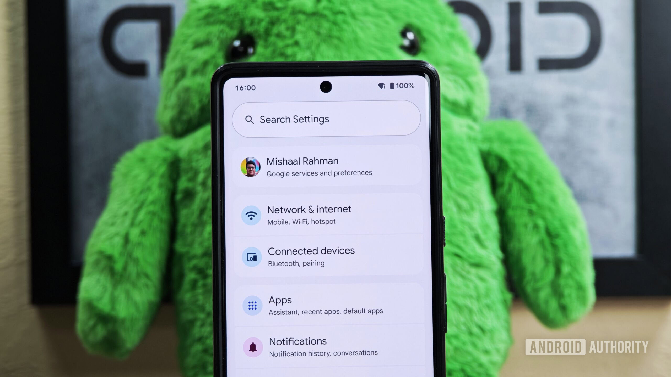
Mishaal Rahman / Android Authority
TL;DR
- Google is preparing to make the icons on the Settings homepage more colorful.
- This is part of Google’s effort to redesign the Settings app to be more expressive.
- It’s unclear if colored icons are part of Google’s new Material Design 3 Expressive theme.
Earlier this week, we found evidence indicating Google will introduce an expressive new Material Design theme at next month’s Google I/O developer conference. Although several mentions and potential examples of this new theme have surfaced, the specifics of what the updated framework entails remain unclear. However, in the latest Android beta released recently, we spotted new evidence suggesting that colorful icons could be part of Google’s updated design guidelines.
While the fourth beta of Android 16 doesn’t bring major UI changes, Google did introduce updates to the expressive redesign it’s developing for Settings. Specifically, the Settings homepage (the first page displayed when opening the app) is getting colorful new icons for each entry. Currently, these entries feature simple gray, borderless icons to the left of the text. In the expressive redesign, however, these same icons are now enclosed within circles of different colors, adding some visual flair to the page.
Here’s what the Settings homepage currently looks like in the latest Android 15 release:
And here’s what the Settings homepage looks like in Android 16 Beta 4 with the expressive redesign enabled:
The ‘Digital Wellbeing & parental controls’ entry retains its gray icon because it’s supplied by the separate Digital Wellbeing app, not the Settings app itself. This inconsistency shows Google still has work to do before rolling out the expressive redesign. As a result, we don’t expect this new design—or the colorful icons—to appear in the initial stable release of Android 16. Instead, the updated Settings look will likely debut in a later Android 16 quarterly release, or perhaps even be held back until Android 17 next year.
It’s possible the colors and iconography could change before this new design officially rolls out. Currently, there’s no apparent logic behind the specific background color choices for each icon, although some related entries do seem to share the same color.
What do you think of these colorful new icons in the Settings app? Are you a fan, or do you prefer the old grayscale look? Let us know in the comments below!
Got a tip? Talk to us! Email our staff at news@androidauthority.com. You can stay anonymous or get credit for the info, it’s your choice.

Leave a Reply