

Sign in to your Android Police account


Summary
- Android Auto is testing a new media playback UI on its home screen’s media card, rearranging the buttons to place the Play/Pause control on the left, closer to the driver in left-hand drive vehicles.
- The updated design also features a larger, color-accented Play/Pause button, aiming to improve ease of access while driving.
- Despite the potential for easier access, this UI change is expected to disrupt users’ established muscle memory with the traditional media control layout.
Google’s transition from Google Assistant to Gemini on all surfaces has already begun. Google confirmed that the former will be phased out by the end of the year, with clues pointing to Gemini’s arrival already appearing on some surfaces.
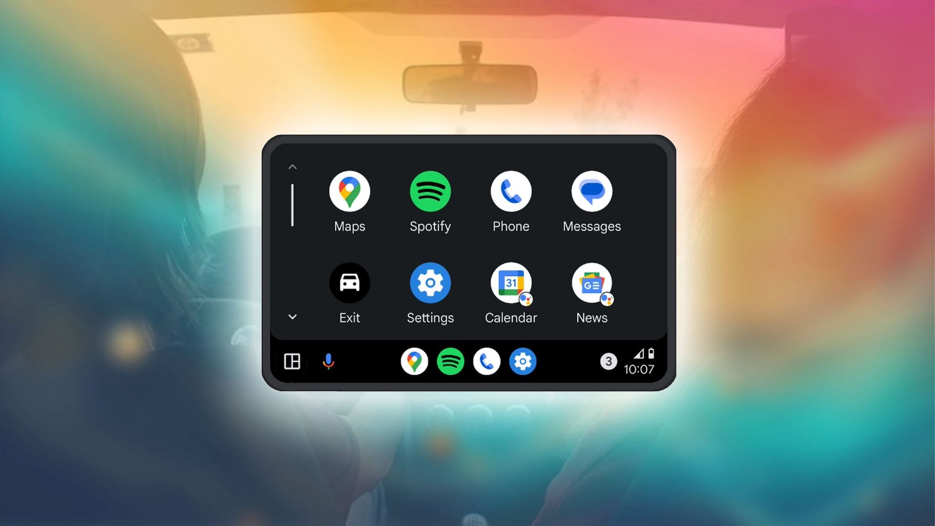
The AI assistant is coming to the one place where it makes the most sense — your car. Hints surrounding Gemini’s arrival on Android Auto first surfaced all the way back in January, long before Google announced that it would begin phasing out the Google Assistant. Subsequently, early UI leaks gave us a sneak peek at what the AI assistant’s implementation would look like, spotlighting a look similar to what Google ultimately showed off at its Android Show.

Now, early leaks point at other aspects of Android Auto changing, and if the past is any indication, this new change could be out over the coming weeks and months.
The upcoming change essentially rearranges the media card’s UI on Android Auto’s home screen, making the Play/Pause control easier to access in left-hand drive markets, first highlighted by Android Authority.

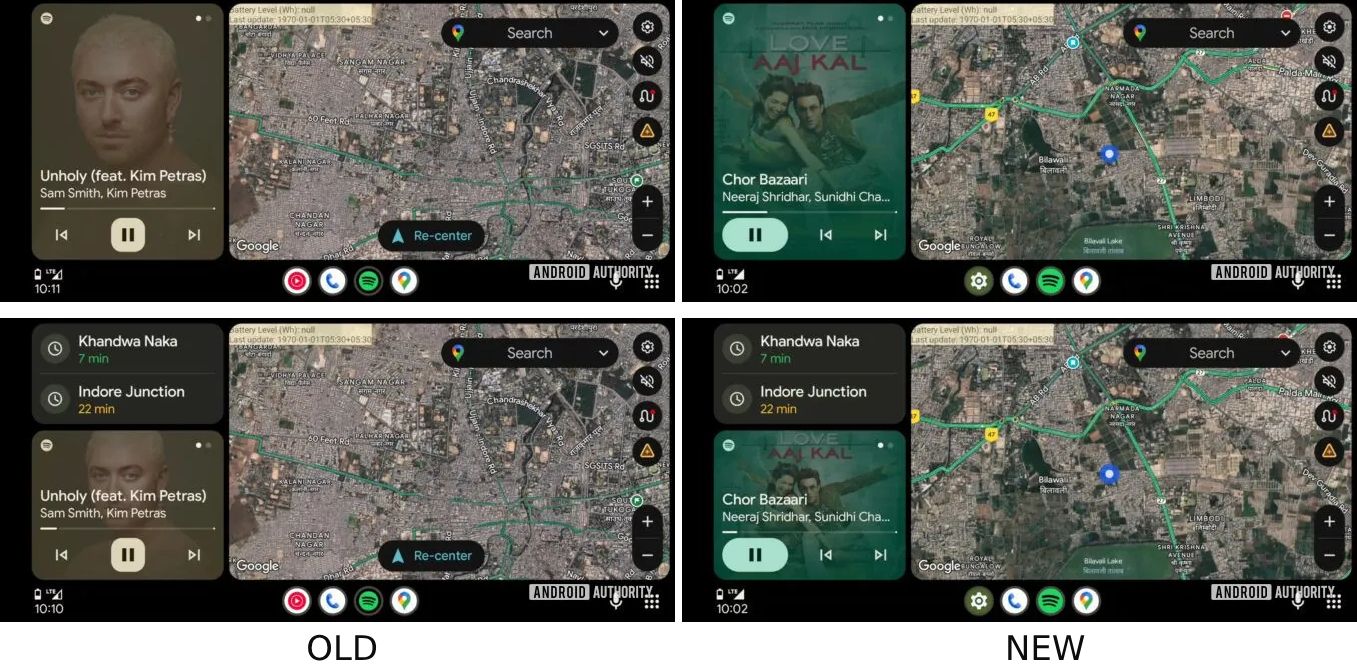
Source: Android Authority
As seen in the screenshots above, instead of the regular Previous, Pause/Play, and Next order, the updated UI puts the Pause/Play button towards the very left (closest to the driver), followed by the Previous and Next controls. The screenshots highlight Spotify, but this isn’t an app-specific change. The same UI also surfaces when music is played through YouTube Music.
Apart from the positioning change, the pause button itself now appears within a larger pill, highlighting the most dominant hue found in the song/album cover art. This change, too, should make it easier for the vehicle driver to Play/Pause music or other content. Regardless of the advantages, though, it’s clear that the redesign will mess with users’ muscle memory, potentially leading to initial frustration and outweighing the apparent benefits when the change first rolls out.