
![google-messages-redesigns-gallery-+-camera,-adds-‘original-quality’-sending-[u]](https://betadroid.in/wp-content/uploads/2025/02/8273-google-messages-redesigns-gallery-camera-adds-original-quality-sending-u-280x210.jpg)

Google Design Team Reveals Why It Changed YouTube’s Color From Red To… Red

Edgar Cervantes / Android Authority
TL;DR
- YouTube updated its signature red to a cooler shade and introduced a red-to-magenta gradient, aiming for a fresher and more dynamic look.
- The change fixes issues with the old red, which appeared too harsh, caused screen burn-in, and looked orange on some displays.
- Accessibility and usability were also key factors in the design team’s thinking.
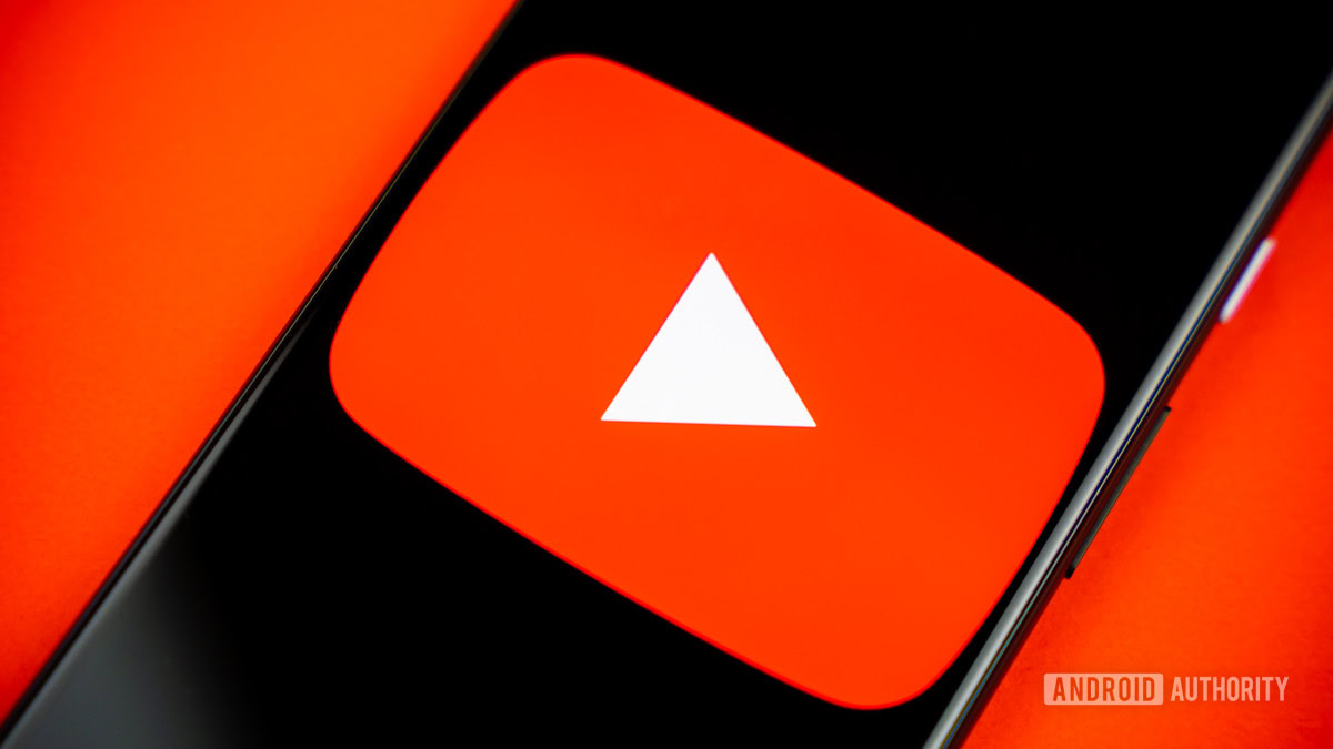
If you’ve noticed something a little different about YouTube lately but couldn’t quite put your finger on it, you’re not alone. The platform quietly tweaked its iconic red in the last few months, shifting to a cooler shade and introducing a red-magenta gradient in key elements like the progress bar.
The change was subtle, but YouTube’s design team took it very seriously. In a deep dive into the decision-making process, they explained how this seemingly minor color adjustment was the result of extensive research, accessibility considerations, and technical factors.
YouTube’s signature red has evolved multiple times over the years, but a mix of practical and aesthetic concerns prompted this update. The previous red, introduced in 2017, had some unexpected issues — it looked too intense in key UI moments, sometimes appeared orange on certain screens, and even contributed to screen burn-in on TVs.
By shifting to a slightly cooler red, YouTube aimed to create a more balanced and approachable look while resolving these technical problems. “We wanted an evolution, not a revolution,” said Robyn Lee, one of YouTube’s visual design leads.
Beyond tweaking the red itself, YouTube also added a red-to-magenta gradient, which now appears in several places across the platform, including the progress bar and certain UI elements. According to Visual Design Lead Robyn Lee, magenta represents “imagination and evolution” and was chosen over orange or yellow to bring a fresh but cohesive look to YouTube’s branding. YouTube’s motion designers also saw it as a way to add more depth and movement, making the interface feel more dynamic.
Accessibility also played a role in refining the colors. Different shades of red and magenta were tested, and motion elements were designed to adapt to different devices to prevent user performance issues or visual discomfort.
Got a tip? Talk to us! Email our staff at [email protected]. You can stay anonymous or get credit for the info, it’s your choice.
