
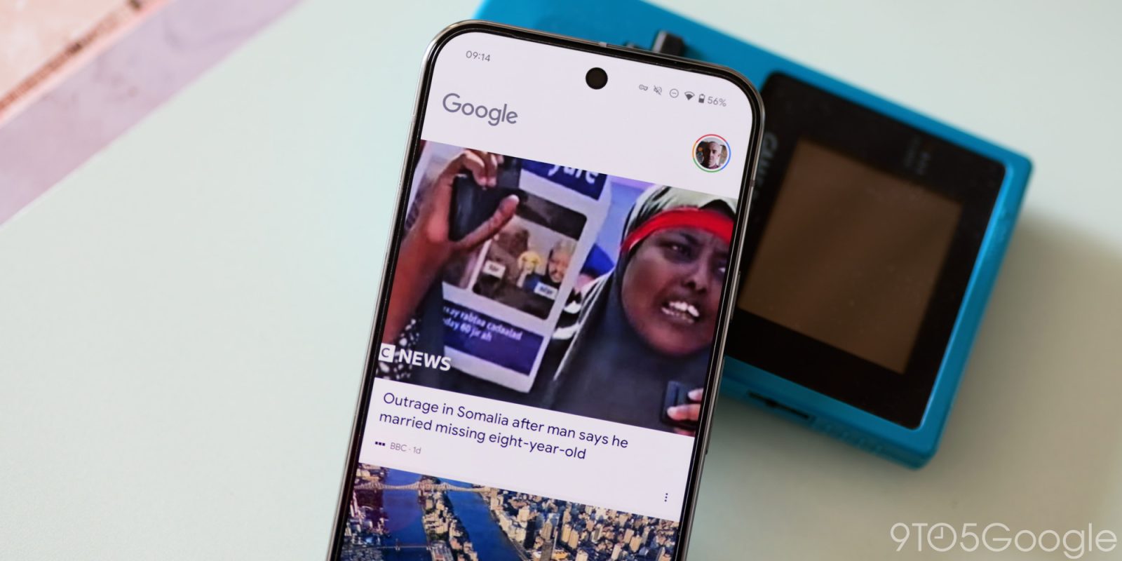
Google is rolling out questionable changes to the Discover feed with a full-width, zero-margin layout now appearing across more and more devices.
The change initially seemed like a bug. However, it has since rolled out widely to a vast array of Android devices both in the Google app and on the left homescreen page of devices that use it by default. For those trying to ascertain what has changed; previously, articles and posts of interest would show images with borders. Now, the images utilize the full width of your screen and can, in many cases, cut off some portions and even some context of the original media to adhere to this updated layout.
What’s interesting is that the text or title margin appears to have increased when compared to the previous layout. This could be a temporary measure before yet another change to Discover feed as the full-width images do not fit with other Material 3 design changes added over the past few months.


Google Discover was testing a feed redesign that placed each item in a card that was not full-width, but this has not been either rolled back or skipped in favor of this latest change. Given how widely this change has been adopted, it’s still not clear if this is a bug or intended. It certainly looks out of place to our eyes.
More on Google:
- Google app mysteriously shows up on Android Auto
- Pixel 9 Pro wins ‘Smartphone of the Year’ award, Google’s second in a row
- Google ‘voluntary exits’ continue with PeopleOps team amid efficiency push
Add 9to5Google to your Google News feed.
FTC: We use income earning auto affiliate links. More.
What’s your reaction?
Love0
Sad0
Happy0
Sleepy0
Angry0
Dead0
Wink0


Leave a Reply
View Comments