


Most free apps generate revenue for their developers through ads, subscriptions, or in-app purchases. There’s nothing wrong with that. Making quality software takes time and skills, and devs deserve fair compensation. However, some apps and games go to great lengths to keep you scrolling or nudge you into spending money. The tactics they use range from annoying to manipulative.
Sometimes, the solution is to pay the devs to remove the ads or gain full access to their software. If you have one of the best Android phones for gaming, you may be able to afford it. However, paying to remove questionable features or deceptive design choices isn’t an option in many instances. Because of this, it’s worth knowing what shady schemes to look out for in today’s apps and games.

Related
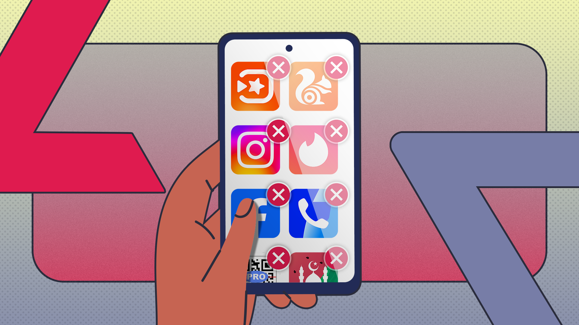
5 ways to quickly identify and delete apps you no longer use on Android
If your phone feels sluggish, it might be time for a digital declutter
5 Manipulative user interfaces
Screens and buttons designed to trick you

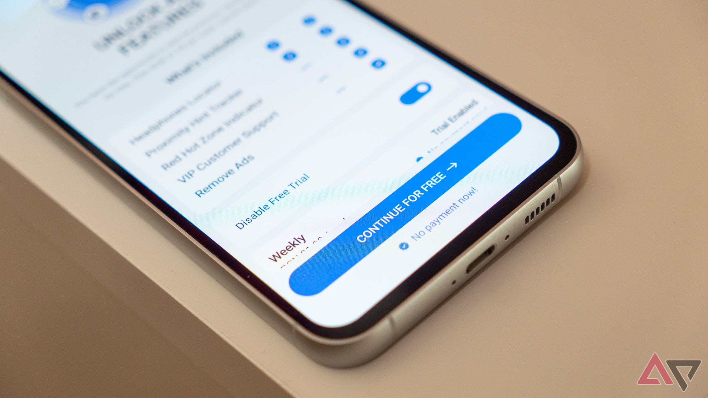
I recently downloaded several apps from the Play Store that would supposedly help me find a lost Bluetooth device. They’re the inspiration for this article. Before I got to the first app’s home screen, it invited me to unlock all its features by starting a free trial. That’s fine, technically. I’d happily pay if the tool helped me find my lost earphones. After all, the wireless headphones can cost several hundred dollars to replace.
Frustratingly, every element on that screen is intentionally laid out to trick people into starting a free trial or paying straight up. First, you see a big blue Continue for FREE button with No payment now! written underneath. Pressing that button brings up the Google Play screen to confirm the subscription. There’s also a Disable Free Trial toggle, which means you pay for a subscription right away, before using the app. If that’s not sketchy enough, the free trial lasts three days, and the subscription costs $17 per week. With a UI like this, subscribing by accident is a likely scenario if you’re in a rush and not paying attention.
There is a free way to use the app, albeit with ads on practically every screen. You must press the tiny grayed-out X button in the upper corner of the free trial screen. Suspiciously, if you scroll down to read some (probably fake) user reviews, the X button disappears from the screen. No reviews and ratings for the app appear on the Play Store, even though it invites you to leave a review. In case you’re wondering, the app barely works and is no better than free alternatives on the Play Store like BLE Scanner.

Related
4 Annoying notifications
Apps begging me to open them
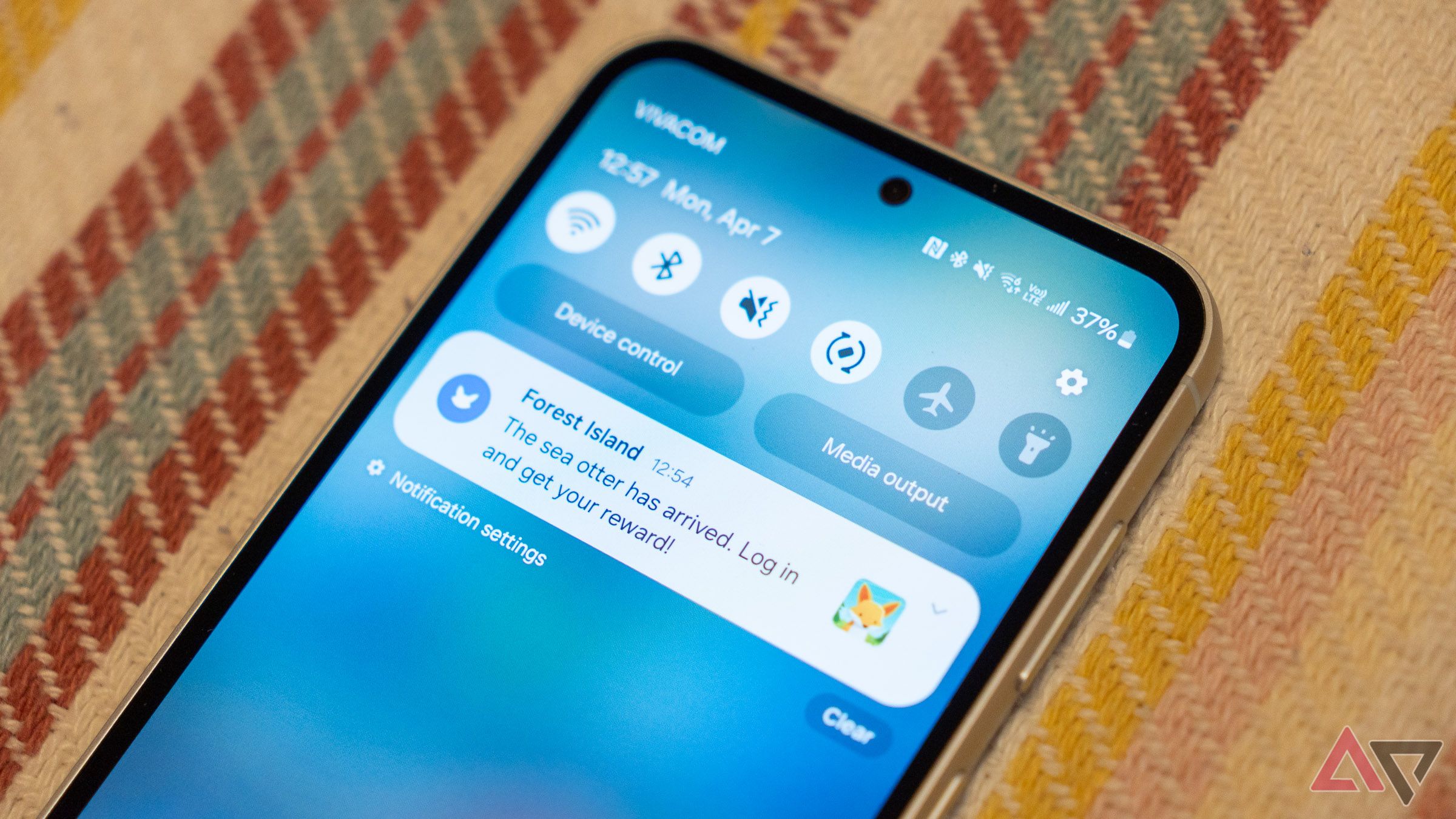
There’s no denying the usefulness of notifications, but it’s no fun when they bombard you constantly. Games are particularly guilty of this because their developers want you to play as much as possible. Some notifications are welcome, such as those informing you of an in-game event like getting extra lives or a hero leveling up. However, it’s a dirty move when the pop-ups are crafted to play emotional tricks on you, such as sparking FOMO or saying how much your virtual pets miss you.
Some less scrupulous developers may push notifications intended to deceive you. For instance, Redditor MarshmallowWASwtr shared a screenshot of a pop-up disguised as a missed call notification. If you browse the subreddits exposing such scammy tactics, you’ll see ads with fake low-battery warnings popping up. The ads with fake hair or specs of dust, which you may instinctively touch, are also pretty creative.
3 Algorithmic feeds
There’s no escaping the algorithm
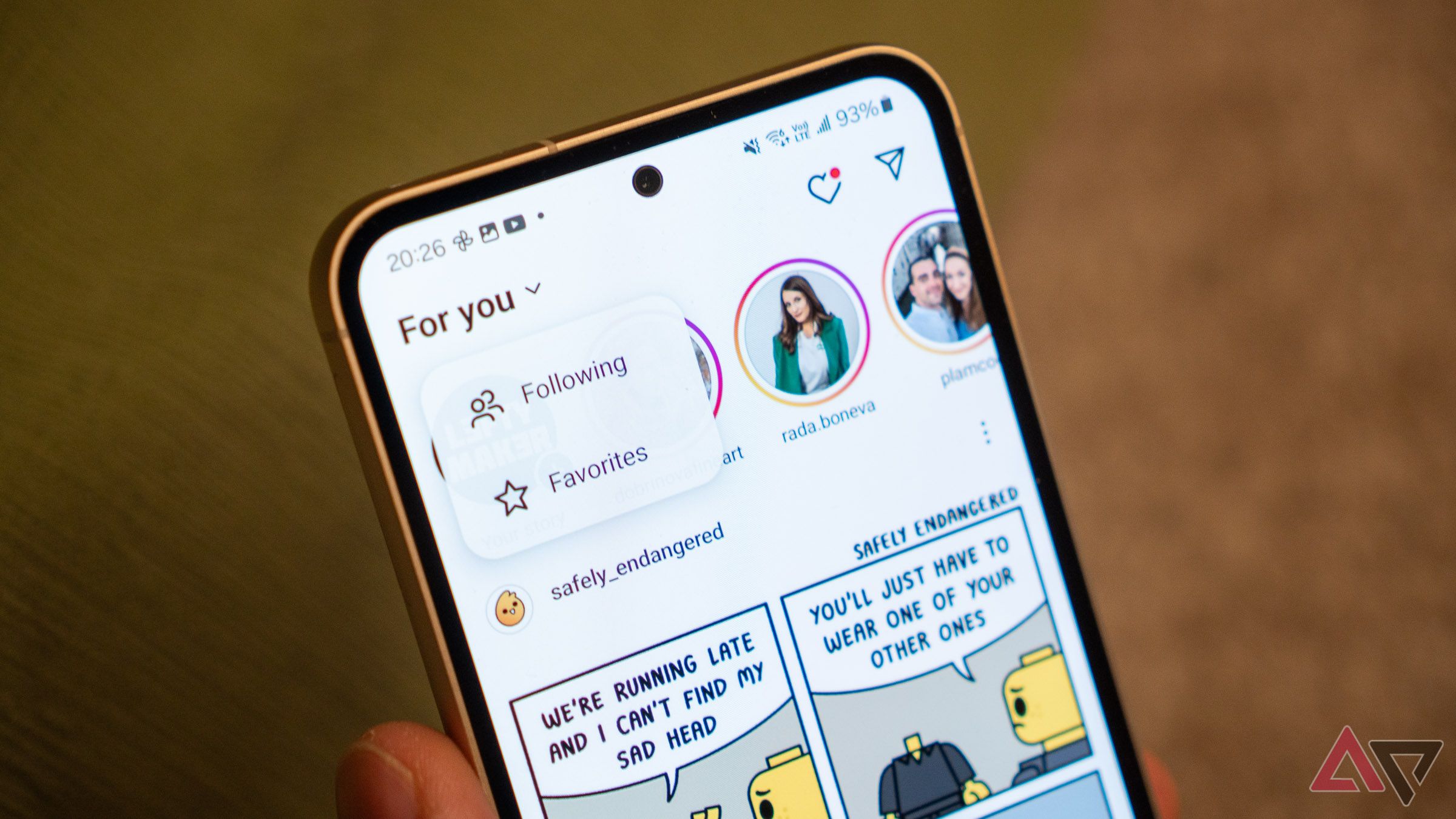
You don’t have to agree with me on this, but I am not a fan of the algorithmically curated screens in popular social media apps. When I open Facebook, I want to see a chronological feed, preferably one not littered with reels and friend suggestions. When I go on Instagram, I want to see the accounts I follow by default. On YouTube, I want to see my subscriptions first, not Shorts or whatever videos the algorithm picked for me.
Options to make these UI changes permanently do not exist, and it’s easy to guess why. Social media apps want to keep you on the platform for as long as possible. They want to hook you up with their most engaging content, which they show you when you land on them. Content served by algorithms can be informative and entertaining, but also addicting and overwhelming. Mustering the discipline to move your eyes away from the screen is becoming increasingly difficult.

Related
6 apps that help you monitor and reduce screen time
Reclaim your time with these Android apps designed to reduce smartphone addiction
2 Apps making choices for me
And it’s the one they want

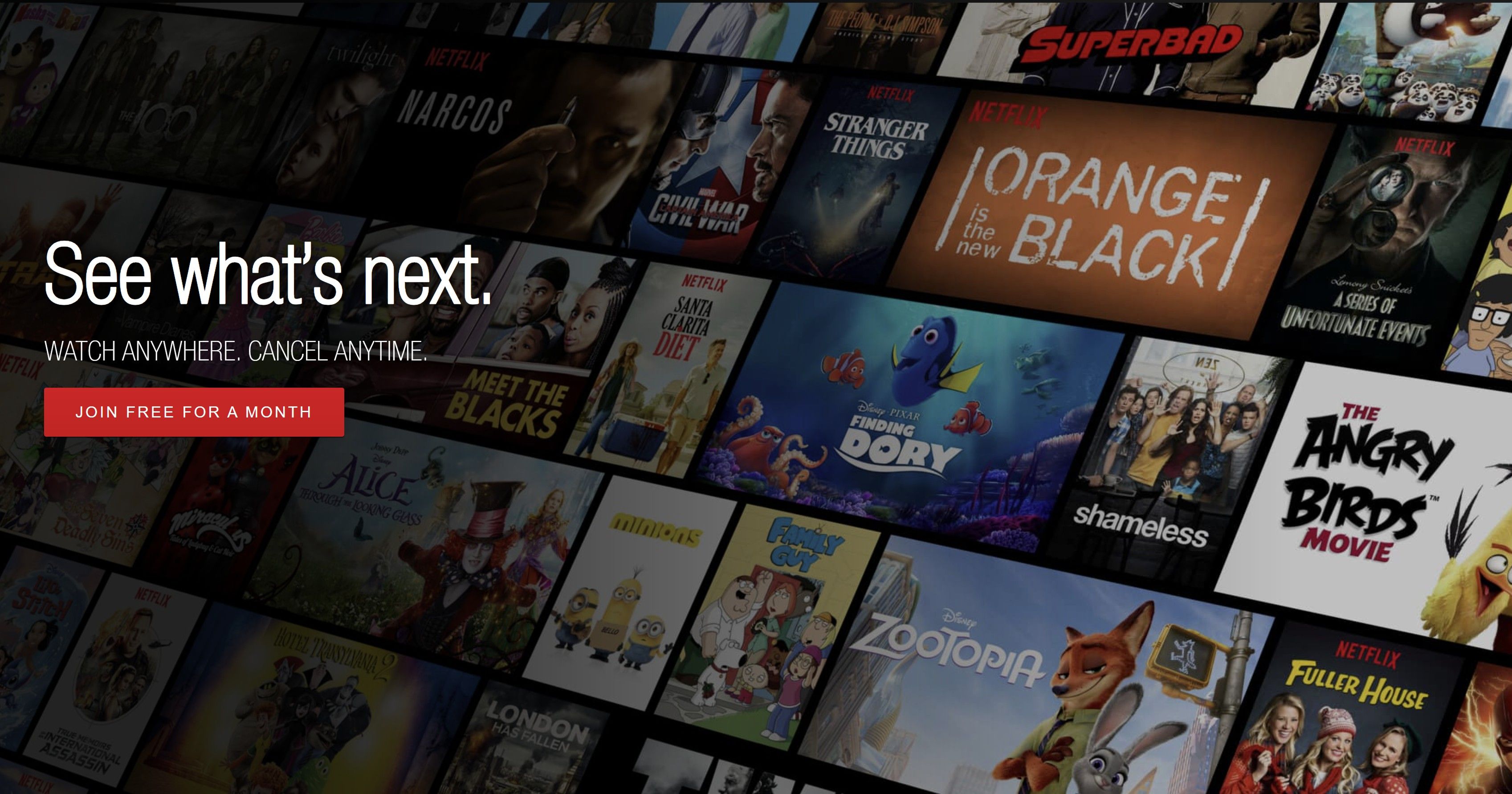
Source: Netflix/The Wayback Machine
Fun fact: In 1982, the number of organ donors in Austria increased by 400% after a simple yet effective legal change. People were considered donors by default unless they actively opted out. The story demonstrates people’s tendency to stick with the default, and app developers are aware of this phenomenon.
That is why the app has a suggestion ready when you have to make a choice. For example, if you have to pick a subscription plan for a service, one of the tiers is pre-selected, and it’s typically the one the developers want you to choose, even if it’s not the best plan for you. When there’s a more expensive tier to pick from, companies may intentionally make it look like bad value. This makes the default seem like a bargain, a technique known as price anchoring.
1 Ads overload
When the ads are just too many
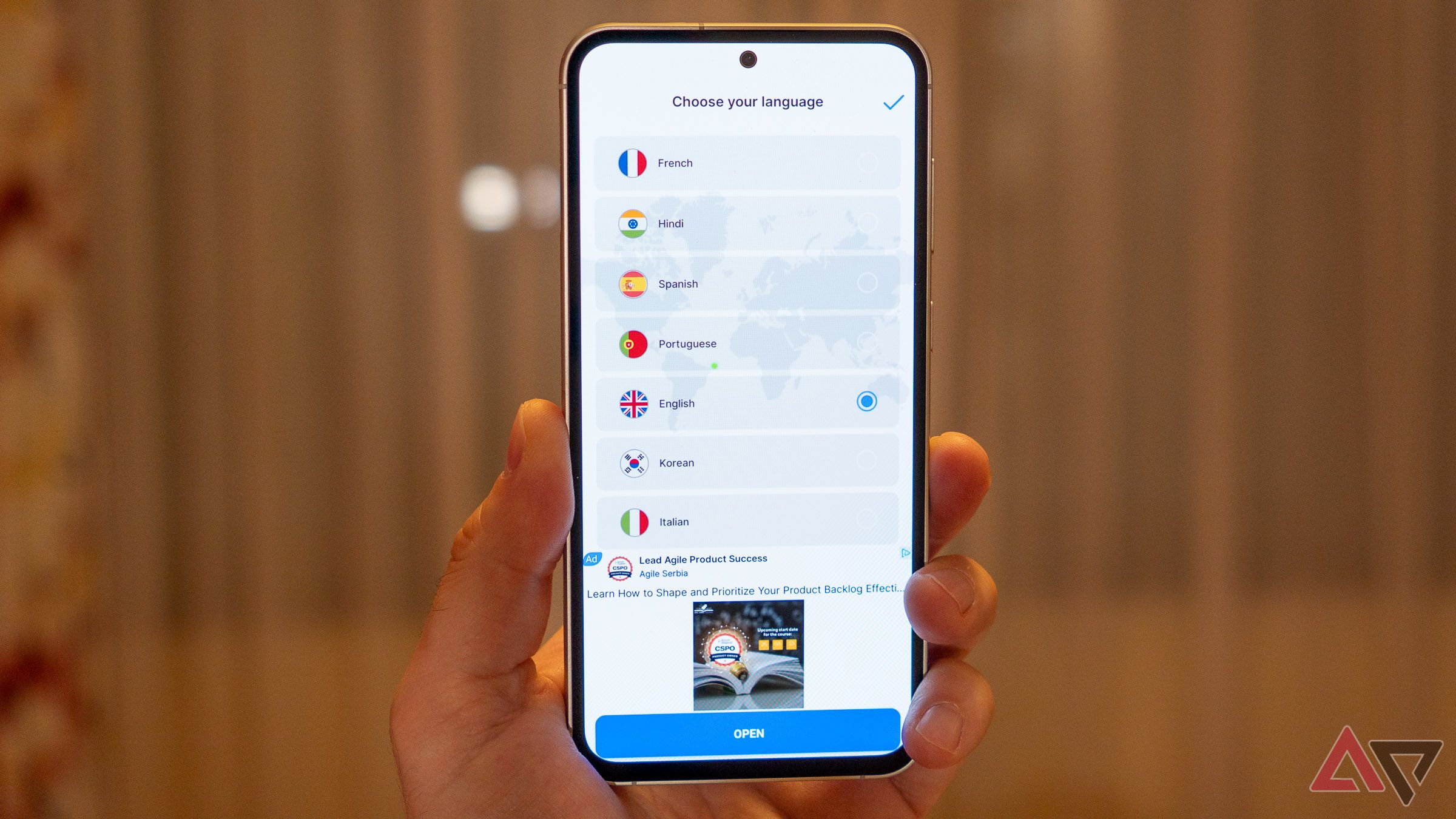
Apps need to show ads to fund their existence, and I’m fine with that. Advertisements allow many services to operate free of charge, which keeps them accessible to everyone. Still, some devs use manipulative tactics to make you click. For example, in the image above, the app asks you to pick a language while showing an advertisement in the bottom third. The big blue Open button opens the ad instead of taking you to the next screen. The tiny button to confirm your choice is in the upper corner.
Then comes a four-page tutorial, and a full-screen ad appears between each slide. In the aforementioned Bluetooth device finder app, I had to watch 60 seconds of ads before I could use any feature. Overloading the app with ads increases the risk of users leaving and trying something else. However, developers may not see a problem with that when they know people won’t return anyway.
Related
Why are some apps this annoying?
It seems like every app and website online is hungry for your attention. Any that don’t use all the tricks in the book to keep you engaged risk losing business and falling behind their competitors. That’s how we got here. That’s why some developers design every button, every page layout, and every color palette to draw your attention or to inspire a specific emotion. Maximizing revenue is also why signing up for a service takes a couple of clicks, but canceling it takes you through hoops and hurdles.
But there’s light at the end of the tunnel. In 2024, the FTC finalized its Click-to-Cancel rules for companies, demanding clear and easy processes for canceling subscriptions and memberships. In Europe, tech giants cannot collect exorbitant amounts of user data without consent. Without a doubt, many tech giants and for-profit app developers will stick to questionable tactics, so long as they don’t break the law, but at least now you should be much better at identifying them.

